── Attaching core tidyverse packages ──────────────────────── tidyverse 2.0.0 ──
✔ dplyr     1.1.3     ✔ readr     2.1.4
✔ forcats   1.0.0     ✔ stringr   1.5.0
✔ ggplot2   3.4.4     ✔ tibble    3.2.1
✔ lubridate 1.9.3     ✔ tidyr     1.3.0
✔ purrr     1.0.2
── Conflicts ────────────────────────────────────────── tidyverse_conflicts() ──
✖ dplyr::filter() masks stats::filter()
✖ dplyr::lag()    masks stats::lag()
ℹ Use the conflicted package (<http://conflicted.r-lib.org/>) to force all conflicts to become errors1 Objectives
- Estimate slopes of regressions;
- Test regression models;
- Plot regression lines;
- Examine residual plots for deviations from the assumptions of linear regression.
2 Start a Script
For this lab or project, begin by:
- Starting a new
Rscript - Create a good header section and table of contents
- Save the script file with an informative name
- set your working directory
Aim to make the script a future reference for doing things in R!
3 Introduction
In the previous computer lab we learned about one technique for analysing associations between numeric variables (correlation). A correlation coefficient quantifies the strength and direction of an association between two variables. It will be close to zero if there is no association between the variables; a strong association is implied if the coefficient is near -1 or +1. A correlation coefficient tells us nothing about the form of a relationship. Nor does it allow us to make predictions about the value of one variable from the value of a second variable. In contrast to correlation, a regression analysis does allow us to make precise statements about how one numeric variable depends on the values of another.
In contrast to correlation, a regression analysis does allow us to make precise statements about how one numeric variable depends on the values of another. Graphically, we can evaluate such dependencies using a scatter plot. We may be interested in knowing:
- Are the variables related or not? There’s not much point studying a relationship that isn’t there:
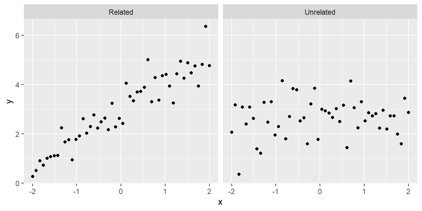
- Is the relationship positive or negative? Sometimes we can answer a scientific question just by knowing the direction of a relationship:
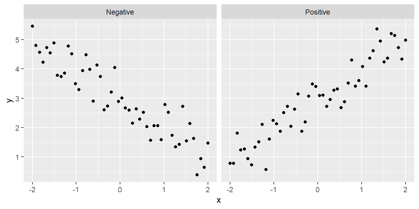
- Is the relationship a straight line or a curve? It is important to know the form of a relationship if we want to make predictions:
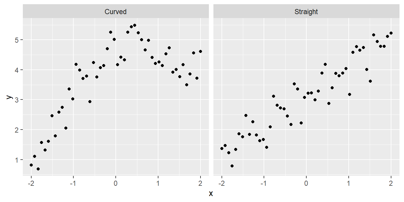
Although sometimes it may be obvious that there is a relationship between two variables from a plot of one against the other, at other times it may not. Take a look at the following:
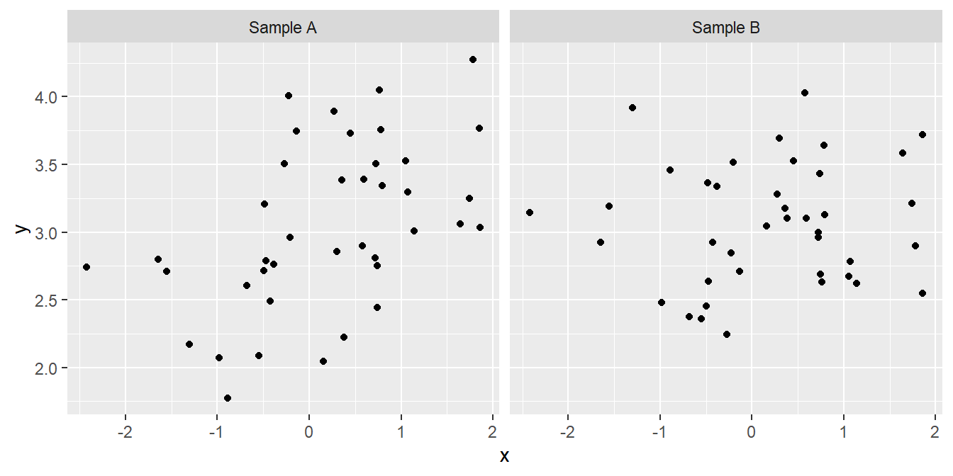
We might not be very confident in judging which, if either, of these plots provides evidence of a positive relationship between the two variables. Maybe the pattern that we perceive can just be explained by sampling variation, or maybe it can’t. We need a procedure—a statistical test—to evaluate how likely it is that the relationship could have arisen as a result of sampling variation. In addition to judging the statistical significance of a relationship, we may also be interested in describing the relationship mathematically – i.e. finding the equation of the best fitting line through the data.
A linear regression analysis allows us to do all this.
4 What Does Linear Regression Do?
Simple linear regression allows us to predict how one variable (called the response variable) responds or depends on to another (called the predictor variable), assuming a straight-line relationship.
What does the word ‘simple’ mean here? A simple linear regression is a regression model which only accounts for one predictor variable. If more than one predictor variable is considered, the correct term to describe the resulting model is ‘multiple regression’. Multiple regression is a very useful tool but we’re only going to study simple regression in this book.
What does the word ‘linear’ mean here? In statistics, the word linear is used in two slightly different, but closely related ways. When discussing simple linear regression the term linear is often understood to mean that the relationship follows a straight line. That’s all. The more technical definition concerns the relationship between the parameters of a statistical model. We don’t need to worry about that one here.
Writing ‘simple linear regression’ all the time becomes tedious, so we’ll often write ‘linear regression’ or ‘regression’. Just keep in mind that we’re always referring to simple linear regression in this book. These regression models account for a straight line relationship between two numeric variables, i.e. they describe how the response variable changes in response to the values of the predictor variable. It is conventional to label the response variable as ‘\(y\)’ and the predictor variable as ‘\(x\)’. When we present such data graphically, the response variable always goes on the \(y\)-axis and the predictor variable on the \(x\)-axis. Try not to forget this convention!
How do we decide how to select which is to be used as the response variable and which as the predictor variable? The decision is fairly straightforward in an experimental setting: the manipulated variable is the predictor variable, and the measured outcome is the response variable. Consider the thermal tolerance example from earlier. Temperature was manipulated in that experiment, so it must be designated the predictor variable. Moreover, a priori (before conducting the experiment), we can reasonably suppose that changes in temperature may cause changes in enzyme activity, but the reverse seems pretty unlikely.
Things are not so clear cut when working with data from an observational study. Indeed, the ‘response vs. predictor’ naming convention can lead to confusion because the phrase ‘response variable’ tends to make people think in terms of causal relationships, i.e. that variation in the the predictor somehow causes changes in the response variable. Sometimes that is actually true, such as in the experimental setting described above. However, deciding to call one variable a response and the other a predictor should not be taken to automatically imply a casual relationship between them.
Finally, it matters which way round we designate the response and predictor variable in a regression analysis. If we have two variables A and B, the relationship we find from a regression will not be the same for A against B as for B against A. Choosing which variable to designate as the response boils down to working out which of the variables needs to be explained (response) in terms of the other (predictor).
5 What Do You Get Out of a Regression?
A regression analysis involves two activities:
Interpretation. When we ‘fit’ a regression model to data we are estimating the coefficients of a best-fit straight line through the data. This is the equation that best describes how the \(y\) (response) variable responds to the \(x\) (predictor) variable. To put it in slightly more technical terms, it describes the \(y\) variable as a function of the \(x\) variable. This model may be used to understand how the variables are related or make predictions.
Inference. It is not enough to just estimate the regression equation. Before we can use it we need to determine whether there is a statistically significant relationship between the \(x\) and \(y\) variables. That is, the analysis will tell us whether an apparent association is likely to be real, or just a chance outcome resulting from sampling variation.
Let’s consider each of these two activities…
5.1 Interpreting a regression
What is the form of the relationship? The equation for a straight line relationship is \(y = a + b \times x\), where
\(y\) is the response variable,
\(x\) is the predictor variable,
\(a\) is the intercept (i.e. where the line crosses the \(y\) axis), and
\(b\) is the slope of the line.
The \(a\) and the \(b\) are referred to as the coefficients (or parameters) of the line. The slope of the line is often the coefficient we care about most. It tells us the amount by which \(y\) changes for a change of one unit in \(x\). If the value of \(b\) is positive (i.e. a plus sign in the above equation) this means the line slopes upwards to the right. A negative slope (\(y = a - bx\)) means the line slopes downwards to the right. The diagram below shows the derivation of an equation for a straight line.
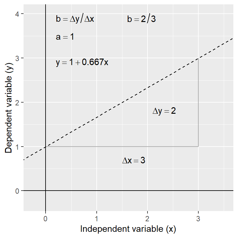
Having the equation for a relationship allows us to predict the value of the \(y\) variable for any value of \(x\). For example, in the thermal tolerance example, we want an equation that will allow us to work out how fitness changes with temperature. Such predictions can be made by hand (see below) or using R (details later).
In the above diagram, the regression equation is: \(y = 1 + 0.66 x\). So to find the value of \(y\) at \(x = 2\) we use: \(y = 1 + (0.667 \times 2) = 2.32\). Obviously, by finding \(y\) values for 2 (or preferably 3) different \(x\) values from the equation, the actual line can easily be plotted on a graph manually if required—plot the values and join the dots! It’s much easier to use R to do this kind of thing though.
5.2 Inference
There is more than one kind of significance test that can be carried out with a simple linear regression. We’re going to focus on the most useful test: the F test of whether the slope coefficient is significantly different from 0. How do we do this? We play exactly the same kind of ‘gambit’ we used to develop the earlier tests:
We start with a null hypothesis of ‘no effect’. This corresponds to the hypothesis that the slope of the regression is zero.
We then work out what the distribution of some kind of test statistic should look like under the null hypothesis. The test statistic in this case is called the F-ratio.
We then calculate a p-value by asking how likely it is that we would see the observed test statistic, or a more extreme value, if the null hypothesis were really true.
6 Correlation or Regression?
It is worth considering the difference between regression and correlation analyses. Whilst regression and correlation are both concerned with associations between numeric variables, they are different techniques and each is appropriate under distinct circumstances. This is a frequent source of confusion. Which technique is required for a particular analysis depends on
- the way the data were collected and
- the purpose of the analysis.
There are two broad questions to consider—
6.1 Where do the data come from?
Think about how the data have been collected. If they are from a study where one of the variables has been experimentally manipulated, then choosing the best analysis is easy. We should use a regression analysis, in which the predictor variable is the experimentally manipulated variable and the response variable is the measured outcome. The fitted line from a regression analysis describes how the outcome variable depends on the manipulated variable—it describes the causal relationship between them.
It is generally inappropriate to use correlation to analyse data from an experimental setting. A correlation analysis examines association but does not imply the dependence of one variable on another. Since there is no distinction of response or predictor variables, it doesn’t matter which way round we do a correlation. In fact, the phrase ‘which way round’ doesn’t even make sense in the context of a correlation.
If the data are from a so-called ‘observational study’ where someone took measurements but nothing was actually manipulated experimentally, then either method may be appropriate. Time to ask another question…
6.2 What is the goal of the analysis?
Think about what question is being asked. A correlation coefficient only quantifies the strength and direction of an association between variables—it tells us nothing about the form of a relationship. Nor does it allow us to make predictions about the value of one variable from the values of a second. A regression does allow this because it involves fitting a line through the data—i.e. regression involves a model for the relationship.
This means that if the goal is to understand the form of a relationship between two variables, or to use a fitted model to make predictions, we have to use regression. If we just want to know whether two variables are associated or not, the direction of the association, and whether the association is strong or weak, then a correlation analysis is sufficient. It is better to use a correlation analysis when the extra information produced by a regression is not needed, because the former will be simpler and potentially more robust.
7 Regression in R
Regression in R is a two-step process similar to the steps used in ANOVA. In fact, we again start by using lm() to fit a linear model to the data. Both ANOVA and regression are special cases of linear models, which also can be used to generate much more complicated analyses than these. We then give the output of lm() to the function summary() to see many useful results of the analysis. We are going to use data collected by a plant physiologist who is studying the process of germination in the broad bean (Vicia faba) and is interested in the relationship between the activity of the enzyme amylase, and the temperature at which the germinating beans are kept. As part of this work she carries out an experiment to find the relationship between glucose release (from the breakdown of starch by amylase) and temperature (over the range 2 - 20C). The data obtained from such an experiment are given below.
# Data from a study of the effect of temperature on glucose release from germinating broad beans
temp <- c(2, 4, 6, 8, 10, 12, 14, 16, 18, 20)
glucose <- c(1.0,   0.5, 2.5, 1.5, 3.2, 4.3, 2.5, 3.5, 2.8, 5.6)

# Put the data into a data frame
data <- data.frame(temp, glucose)
We want to do is work out whether there a statistically significant relationship between temperature and glucose release (and hence, presumably, amylase activity).
7.1 Visualising the data
The first thing to do is to plot the data to see what they look like. We can do this using ggplot2 as usual. We’ll use a scatter plot with a line of best fit. We’ll also add a 95% confidence interval for the line of best fit. This is a band around the line that shows the range of values that the line could take if the experiment were repeated many times. The confidence interval is a measure of the uncertainty in the estimate of the line of best fit. We’ll also add a title and axis labels.
# Load the ggplot2 package
library(ggplot2)

# Plot the data
ggplot(data, aes(x = temp, y = glucose)) +
  geom_point() +
  labs(title = "Relationship between temperature and glucose release",
       x = "Temperature (C)", y = "Glucose release (ug mg dry weight)") +
  geom_smooth(method = "lm")
`geom_smooth()` using formula = 'y ~ x'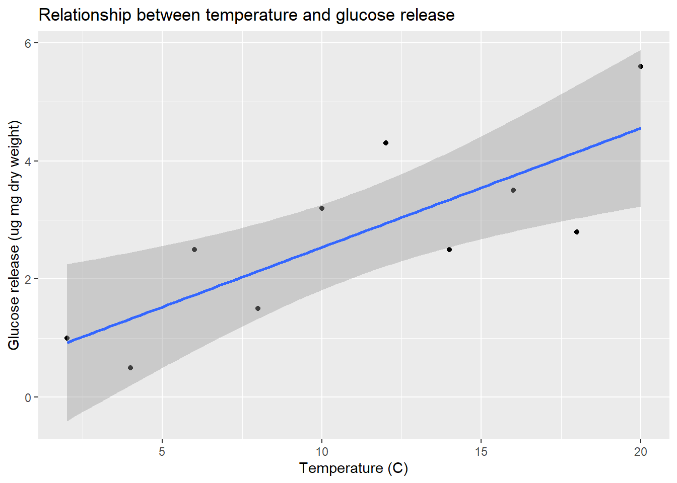
Remember, Glucose is the response variable and Temperature is the predictor variable, so they belong on the y and x axes, respectively. The plot shows a clear positive relationship between temperature and glucose release.
7.2 Fitting a linear model
Carrying out a regression analysis in R is a two step process.
The first step involves a process known as fitting the model (or just model fitting). In effect, this is the step where R calculates the best fit line, along with a large amount of additional information needed to generate the results in step two. We call this step model fitting because, well, we end up fitting the straight line model to the data.
How do we fit a linear regression model in R? We will do it using the lm function. The letters ‘lm’ in this function name stand for ‘linear model’. We won’t say much more at this point other than point out that a linear regression is a special case of a general linear model. R doesn’t have a special regression function. Here is how we fit a linear regression in R using the enzyme data:
vicia_model <- lm(glucose ~ temp, data = data)This should look quite familiar. We have to assign two arguments:
The first argument is a formula. We know this because it includes a ‘tilde’ symbol:
~. The variable name on the left of the~should be the response variable. The variable name on the right should be the predictor variable. These areGlucoseandTemperature, respectively. Make sure you get these the right way round when carrying out regression.The second argument is the name of the data frame that contains the two variables listed in the formula (
vicia_germ).
**How does R knows we want to carry out a regression?**

How does R know we want to use regression? After all, we didn't specify this anywhere. The answer is that R looks at what type of variable `Temperature` is. It is numeric, and so R automatically carries out a regression. If it had been a factor or a character vector (representing a categorical variable) R would have carried out a different kind of analysis, called a one-way Analysis of Variance (ANOVA). Most of the models that we examine in this course are very similar, and can be fitted using the `lm` function. The only thing that really distinguishes them is the type of variables that appear to the right of the `~` in a formula: if they are categorical variables we end up carrying out ANOVA, while numeric variables lead to a regression.

The key message is that you have to keep a close eye on the type of variables you are modelling to understand what kind of model R will fit.
Notice that we did not print the results to the console. Instead, we assigned the result a name (vicia_model). This now refers to a fitted model object. What happens if we print a regression model object to the console?
print(vicia_model)
Call:
lm(formula = glucose ~ temp, data = data)

Coefficients:
(Intercept)         temp
     0.5200       0.2018
This prints a quick summary of the model we fitted and some information about the ‘coefficients’ of the model. The coefficients are the intercept and slope of the fitted line: the intercept is always labelled (Intercept) and the slope is labelled with the name of the predictor variable (Temperature in this case). We’ll come back to these coefficients once we have looked at how to compute p-values.
The second step of a regression analysis involves using the fitted model to assess statistical significance. We usually want to determine whether the slope is significantly different from zero. That is, we want to know if the relationship between the \(x\) and \(y\) variables is likely to be real or just the result of sampling variation. Carrying out the required F test is actually very easy. The test relies on a function called anova. To use this function, all we have to do is pass it one argument: the name of the fitted regression model object…
anova(vicia_model)Analysis of Variance Table
Response: glucose
          Df  Sum Sq Mean Sq F value   Pr(>F)
temp       1 13.4411 13.4411  14.032 0.005657 **
Residuals  8  7.6629  0.9579
---
Signif. codes: 0 '***' 0.001 '**' 0.01 '*' 0.05 '.' 0.1 ' ' 1Let’s step through the output to see what it means. The first line informs us that we are looking at an Analysis of Variance Table—a set of statistical results derived from a general tool called Analysis of Variance. The second line just reminds us what response variable we analysed (Glucose). Those parts are simple to describe at least, though the Analysis of Variance reference may seem a little cryptic. Essentially, every time we carry out an F-test we are performing some kind of Analysis of Variance because the test boils down to a ratio of variances (or more accurately, mean squares).
The important part of the output is the table at the end:
Df Sum Sq Mean Sq F value Pr(>F)
temp 1 13.4411 13.4411 14.032 0.005657 **
Residuals 8 7.6629 0.9579 This summarises the different parts of the F-test calculations: Df – degrees of freedom, Sum Sq – the sum of squares, Mean Sq – the mean square, F value – the F-statistic, Pr(>F) – the p-value. If you followed along in the last chapter these should be at least somewhat familiar.
The F-statistic (variance ratio) is the key term. When working with a regression model, this quantifies how much variability in the data is explained when we include the best fit slope term in the model. Larger values indicate a stronger relationship between \(x\) and \(y\). The p-value gives the probability that the relationship could have arisen through sampling variation, if in fact there were no real association. As always, a p-value of less than 0.05 is taken as evidence that the relationship is real, i.e. the result is statistically significant.
We should also note down the two degrees of freedom given in the table as these will be needed when we report the results.
7.3 Extracting more information
There is a second function, called summary, that can be used to extract a little more information from the fitted regression model:
summary(vicia_model)
Call:
lm(formula = glucose ~ temp, data = data)

Residuals:
     Min       1Q   Median       3Q      Max
-1.35273 -0.77909 -0.08636  0.74227  1.35818

Coefficients:
            Estimate Std. Error t value Pr(>|t|)
(Intercept)  0.52000    0.66858   0.778  0.45909
temp         0.20182    0.05388   3.746  0.00566 **
---
Signif. codes:  0 '***' 0.001 '**' 0.01 '*' 0.05 '.' 0.1 ' ' 1

Residual standard error: 0.9787 on 8 degrees of freedom
Multiple R-squared:  0.6369,    Adjusted R-squared:  0.5915
F-statistic: 14.03 on 1 and 8 DF,  p-value: 0.005657
This is easiest to understand if we step through the constituent parts of the output. The first couple of lines just remind us about the model we fitted
Call:
lm(formula = glucose ~ temp, data = data)
The next couple of lines aren’t really all that useful—they summarise some properties of the residuals–so we’ll ignore these.
The next few lines comprise a table that summarises some useful information about the coefficients of the model (the intercept and slope):
Coefficients:
            Estimate Std. Error t value Pr(>|t|)
(Intercept)  0.52000    0.66858   0.778  0.45909
temp         0.20182    0.05388   3.746  0.00566 **
The Estimate column shows us the estimated the intercept and slope of the regression. We saw these earlier when we printed the fitted model object to the console.
Staying with this table, the next three columns (Std. Error, t value and Pr(>|t|)) show us the standard error associated with each coefficient, the corresponding t-statistics, and the p-values. Remember standard errors? These are a measure of the variability of the sampling distribution associated with something we estimate from a sample. We discussed these in the context of sample means. One can calculate a standard error for many different kinds of quantities, including the intercept and slope of a regression model. And just as with a mean, we can use the standard errors to evaluate the significance of the coefficients via t-statistics.
In this case, the p-values associated with these t-statistics indicate that the intercept is not significantly different from zero (p>0.05), but that the slope is significantly different from zero (p<0.01). Notice that the p-value associated with the slope coefficient is the same as the one we found when we used the anova function. This is not a coincidence—anova and summary test the same thing when working with simple linear regression models. This is not generally true for other kinds of model involving the lm function.
The only other part of the output from summary that is of interest now is the line containing the Multiple R-squared value:
Multiple R-squared: 0.6369, Adjusted R-squared: 0.5915 This shows the \(R\)-squared (\(R^{2}\)) of our model. It tells you what proportion (sometimes expressed as a percentage) of the variation in the data is explained, or accounted for, by the fitted line. If \(R^{2}=1\) the line passes through all the points on the graph (all the variation is accounted for) and if \(R^{2}\approx 0\%\) the line explains little or none of the variation in the data. The \(R^{2}\) value here is 0.64. This is very respectable, but still indicates that there are other sources of variation (differences between beans, inaccuracies in the assay technique, etc.) which remain unexplained by the line1.
7.4 Presenting results
From the preceding analysis we can conclude…
There is a significant positive relationship between the incubation temperature (°C) and glucose released (\(\mu g mg^{-1}\) dry weight) in germinating bean seeds (\(y=0.52+0.20x\), F=14, d.f.=1,8, p<0.01).
Don’t forget to quote both degrees of freedom in the result. These are obtained from the ANOVA table produced by anova and should be given as the slope degrees of freedom first (which is always 1), followed by the error degrees of freedom.
7.5 Assumptions
There are some assumptions associated with linear regression:
- Linear relationship between variables
- Numeric continuous data for the dependent variable (y); numeric continuous (or numeric ordinal) data on the for the predictor variable (x)
- Independence of observations (We assume this for the different individual Perch in our data)
- Gaussian distribution of residuals (NB this is not the same as assuming the raw data are Gaussian! We shall diagnose this)
- Homoscedasticity (this means the residual variance is approximately the same all along the x variable axis - we shall diagnose this).
We will specifically test two of the assumption mentioned above, that of Gaussian residual distribution, and that of homoscedasticity. We will examine both graphically, and additionally we will formally test the assumption of Gaussian residuals. To start with, let’s explicitly visualise the residuals. This is a step that might be unusual for a standard exploration of regression assumptions, but for our purposes here it will serve to be explicit about what the residuals actually are.
# Make our plot and regression line
plot(y = data$glucose, x = data$temp,
     ylab = "Glucose", xlab = "Temperature",
     main = "Glucose RESIDUAL plot",
     pch = 20, col = "blue", cex = 1)
abline(reg = vicia_model)

# We can actually "draw on" the magnitude of residuals
arrows(x0 = data$temp,
       x1 = data$temp,
       y0 = predict(vicia_model), # start residual line on PREDICTED values
       y1 = predict(vicia_model) + residuals(vicia_model), # length of residual
       length = 0) # makes arrowhead length zero (or it looks weird here)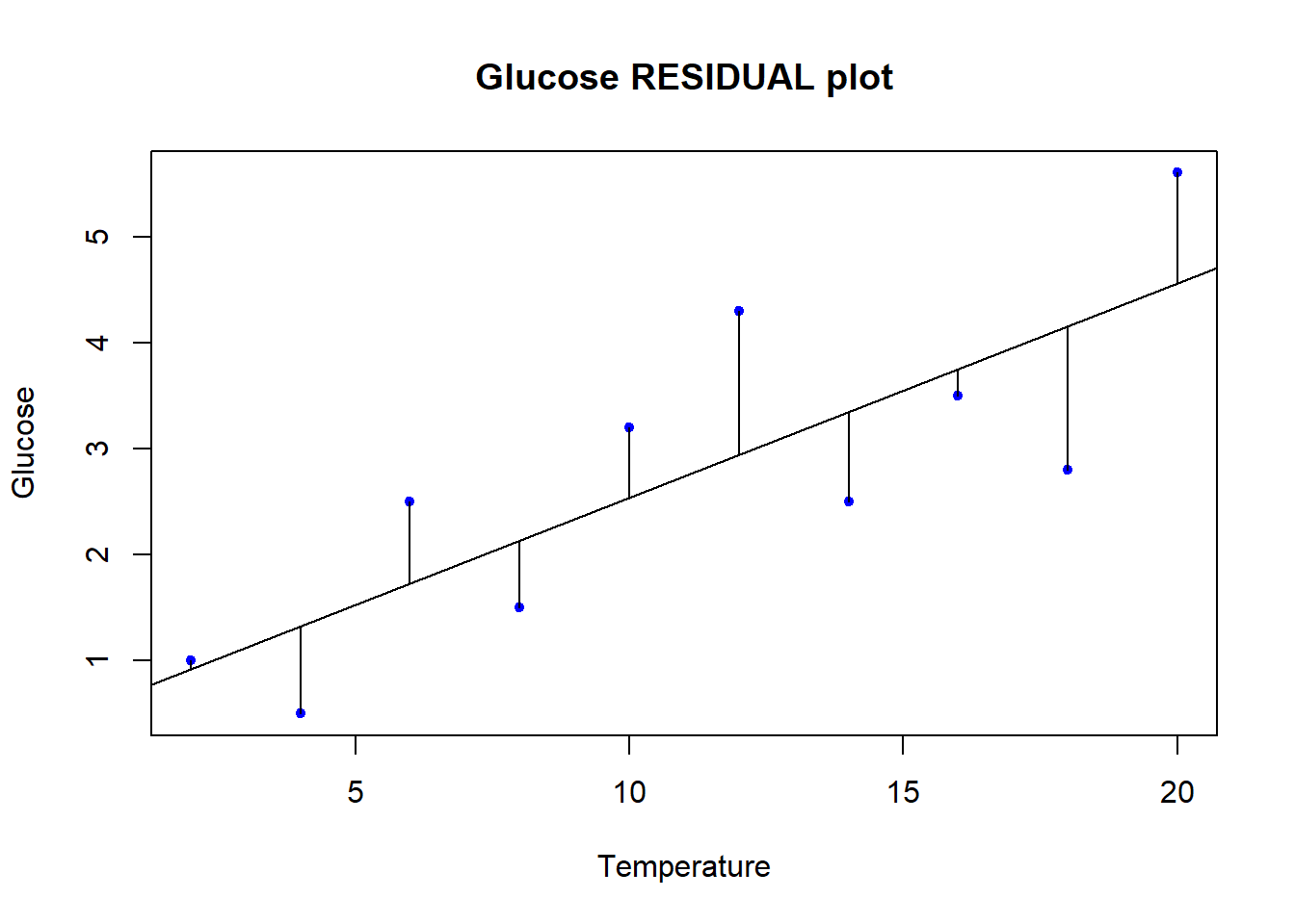
Note the residuals are perpendicular the the x-axis. This is because residuals represent DEVIATION of each OBSERVED y from the PREDICTED y for a GIVEN x. The Gaussian assumption is that relative to the regression line, the residual values should be, well, Gaussian (with mean of 0 and a variance we estimate)! There should be more dots close to the line with small distance from the regression line, and few residuals farther away.
Let’s carry out a statistical test of whether there is evidence our residuals deviate from Gaussian. There are a lot of options for this, but we will only consider one here for illustration - Shapiro-Wilk.
shapiro.test(vicia_model$residuals)
    Shapiro-Wilk normality test

data:  vicia_model$residuals
W = 0.94511, p-value = 0.6111
The null hypothesis is that the residuals are Gaussian. The p-value is 0.611 so we cannot reject the null hypothesis. This is good news, as it means we have no evidence that the residuals are not Gaussian!
We can also test for homoscedasticity. This is the assumption that the variance of the residuals is constant across the range of the predictor variable. We can test this graphically by plotting the residuals against the predictor variable. If the variance of the residuals is constant, the plot should look like a random scatter of points with no pattern. If the variance of the residuals is not constant, the plot will show a pattern, such as a fan shape, or a funnel shape.
plot(y = vicia_model$residuals, x = data$temp,
     ylab = "Residuals", xlab = "Temperature",
     main = "Residuals vs Temperature",
     pch = 20, col = "blue", cex = 1,
     ylim = c(-2,2))

# There is a lot hidden inside our regression object
summary(vicia_model)$sigma # Voila: The residual standard error
[1] 0.9787051(uci <- summary(vicia_model)$sigma*1.96) # upper 95% confidence interval[1] 1.918262(lci <- -summary(vicia_model)$sigma*1.96) # upper 95% confidence interval[1] -1.918262# Add lines for mean and upper and lower 95% CI
abline(h = c(0, uci, lci),
lwd = c(2,2,2),
lty = c(2,3,3),
col = c("blue", "red", "red"))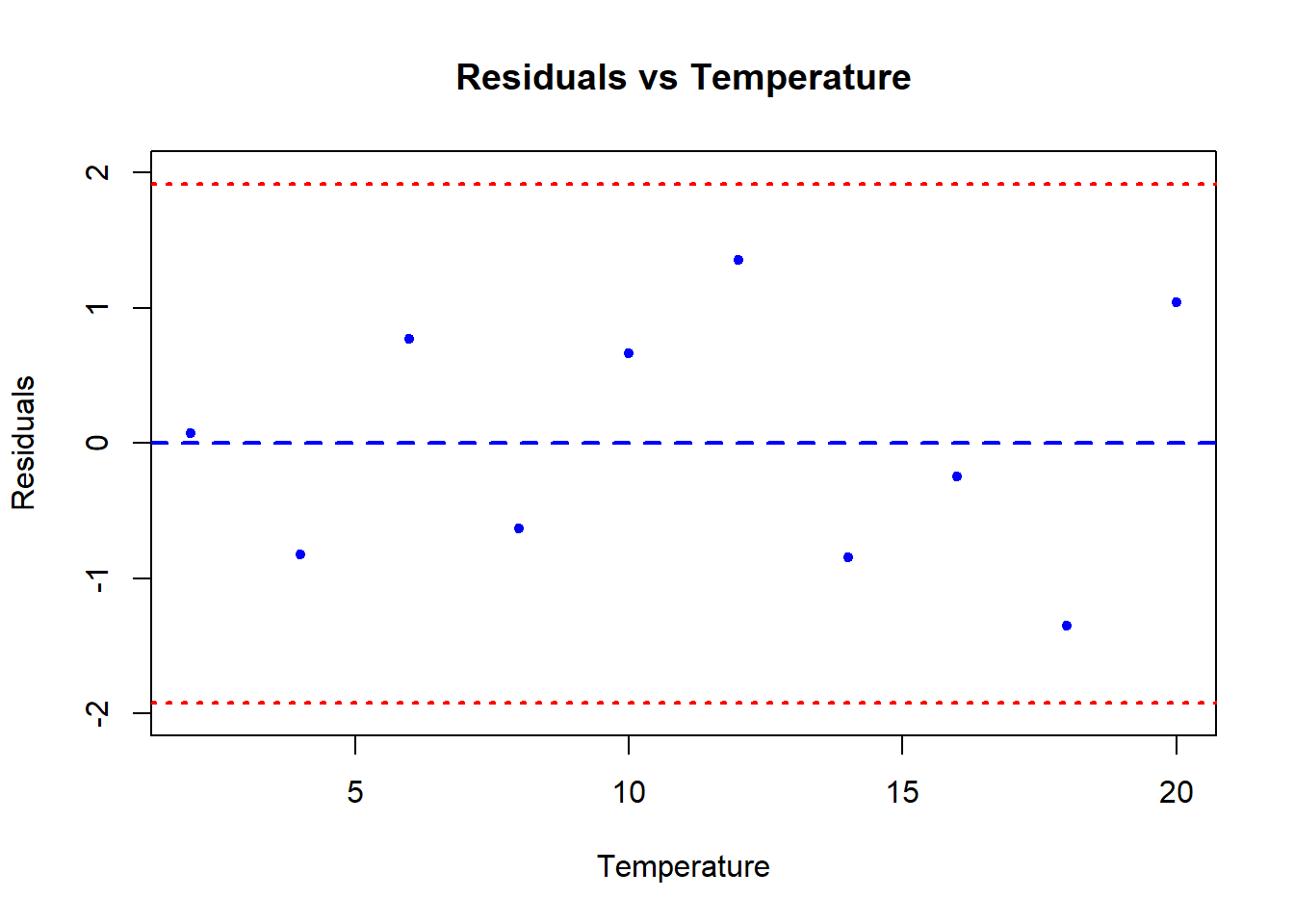
What we are looking for in this graph, ideally, is an even spread of residuals across the x-axis representing our fitted values. The blue reference line is the mean PREDICTED perch Height for each value of Width. The difference between each data point and the horizontal line at zero is the residual difference, or residual error.
There are actually a large number of alternatives to simple linear regression in case our data do not conform to the assumptions. Some of these are quite advanced and beyond the scope of this Bootcamp (like weighted regression, or else specifically modelling the variance in some way). The most reasonable solutions to try first would be data transformation, or possibly if it were adequate to merely demonstrate a relationship between the variables, Spearman Rank correlation. A final alternative of intermediate difficulty, might be to try nonparametric regression.
8 What About Causation?
No discussion of regression would be complete without a little homily on the fact that just because you observe a (significant) relationship between two variables this does not necessarily mean that the two variables are causally linked. If we find a negative relationship between the density of oligochaete worms (the response variable) and the density of trout (the predictor variable) in a sample of different streams, this need not indicate that the trout reduce the numbers of oligochaetes by predation – in fact oligochaete numbers are often very high in slow-flowing, silty streams where they live in the sediments, trout prefer faster flowing, well oxygenated, stony streams – so a negative correlation could occur simply for that reason. There are many situations in biology where a relationship between two variables can occur not because there is a causal link between them but because each is related to a third variable (e.g. habitat).
This difficulty must always be borne in mind when interpreting relationships between variables in data collected from non-experimental situations. However, it is often assumed that because of this problem regression analysis can never be used to infer a causal link. This is incorrect. What is important is how the data are generated, not the statistical model used to analyse them. If a set of ten plants were randomly assigned to be grown under ten different light intensities, with all other conditions held constant, then it would be entirely proper to analyse the resulting data (for, let us say, plant height) by a regression of plant height (\(y\)) against light level (\(x\)) and, if a significant positive straight-line relationship was found, to conclude that increased light level caused increased plant height.
Of course this conclusion still depends on the fact that another factor (e.g. temperature) isn’t varying along with light and causing the effect. But the fact that you are experimentally producing an effect, in plants randomly allocated to each light level (i.e. plants in which it is highly improbable that the heights happened to be positively related to light levels at the start) which gives you the confidence to draw a conclusion about causality. Light might not be the direct causal agent, but it must be indirectly related to plant growth because it was experimentally manipulated.
9 Activities
9.1 Telomere length
he ends of chromosomes are called telomeres. These telomeres are shortened a bit during each cell cycle as DNA is replicated. One of their purposes is to protect more valuable DNA in the chromosome from degradation during replication. As people get older and their cells have replicated more often, their telomeres shorten. There is evidence that these shortened telomeres may play a role in aging. Telomeres can be lengthened in germ cells and stem cells by an enzyme called telomerase, but this enzyme is not active in most healthy somatic cells. Given that the length of telomeres is biologically important, it becomes interesting to know whether telomere length varies between individuals and whether this variation is inherited. A set of data was collected by Nordfjäll et al. (2005) on the telomere length of fathers and their children; these data are in the file telomere_inheritance.csv. Your task is to:
- Create a scatter plot showing the relationship between father and offspring telomere length.
- Determine whether the data require any transformation before analysis using linear regression?
- Estimate an equation that predicts the offspring telomere length from its father’s. Is there evidence that the father’s telomere length predicts his offspring’s value?
💡 Click here to view a solution
# Load libraries
library(tidyverse)
library(broom)

# Load the data
telomere <- read.csv("data/telomere_inheritance.csv")

# Plot the data
# Scatter plot
ggplot(telomere, aes(x = father_telomere_length, y = offspring_telomere_length)) +
  geom_point() +
  labs(title = "Scatter plot of Father vs. Offspring Telomere Length",
       x = "Father Telomere Length",
       y = "Offspring Telomere Length")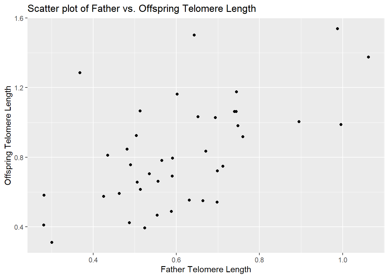
# Linear regression
model <- lm(offspring_telomere_length ~ father_telomere_length, data = telomere)
summary(model)
Call:
lm(formula = offspring_telomere_length ~ father_telomere_length,
    data = telomere)

Residuals:
     Min       1Q   Median       3Q      Max
-0.36768 -0.17438 -0.04824  0.12324  0.69947

Coefficients:
                       Estimate Std. Error t value Pr(>|t|)
(Intercept)              0.2252     0.1396   1.613    0.115
father_telomere_length   0.9792     0.2208   4.436 7.29e-05 ***
---
Signif. codes:  0 '***' 0.001 '**' 0.01 '*' 0.05 '.' 0.1 ' ' 1

Residual standard error: 0.2498 on 39 degrees of freedom
Multiple R-squared:  0.3353,    Adjusted R-squared:  0.3183
F-statistic: 19.68 on 1 and 39 DF,  p-value: 7.287e-05
# Tidy the model output for clear interpretation
tidy_model <- tidy(model)
print(tidy_model)# A tibble: 2 × 5
term estimate std.error statistic p.value
<chr> <dbl> <dbl> <dbl> <dbl>
1 (Intercept) 0.225 0.140 1.61 0.115
2 father_telomere_length 0.979 0.221 4.44 0.00007299.2 Animal brain size
Larger animals tend to have larger brains. But is the increase in brain size proportional to the increase in body size? A set of data on body and brain size of 62 mammal species was collated by Allison and Cicchetti (1976), and these data are in the data set mammals.csv. The file contains columns giving the species name, the average body mass (in kg) and average brain size (in g) for each species. The study of how relatively large body parts (like the brain) in relation to body size (like body weight) is sometimes called allometry. It is traditional to model the body part as the dependent variable on the y axis, and use body size as the predictor variable on the x axis. Your task is to:
- Plot brain size against body size. Is the relationship linear?
- Find a transformation (for either or both variables) that makes the relationship between these two variables linear.
- Is there statistical evidence that brain size is correlated with body size? Assume that the species data are independent.
- What line best predicts (transformed) brain size from (transformed) body size?
- Based on your answer in the previous task, what is the predicted change in log-brain size accompanying an increase of 3 units of log- body size?
- Make a residual plot using the regression fitted to the transformed variables. Do the data look like they match the assumptions of linear regression?
- Which species has the highest brain size relative to that predicted by its body size? Which species has the smallest brain relative to that predicted by its body size? [hint: You could slice out large residuals using base R, or try using filter() from the dplyr package…]
💡 Click here to view a solution
# Load the data
mammals <- read.csv("data/mammals.csv")

# 1. Plot brain size against body size
ggplot(mammals, aes(x = body_mass_kg, y = brain_mass_g)) +
  geom_point() +
  theme_minimal() +
  labs(title = "Brain Size vs Body Size", x = "Body Mass (kg)", y = "Brain Mass (g)")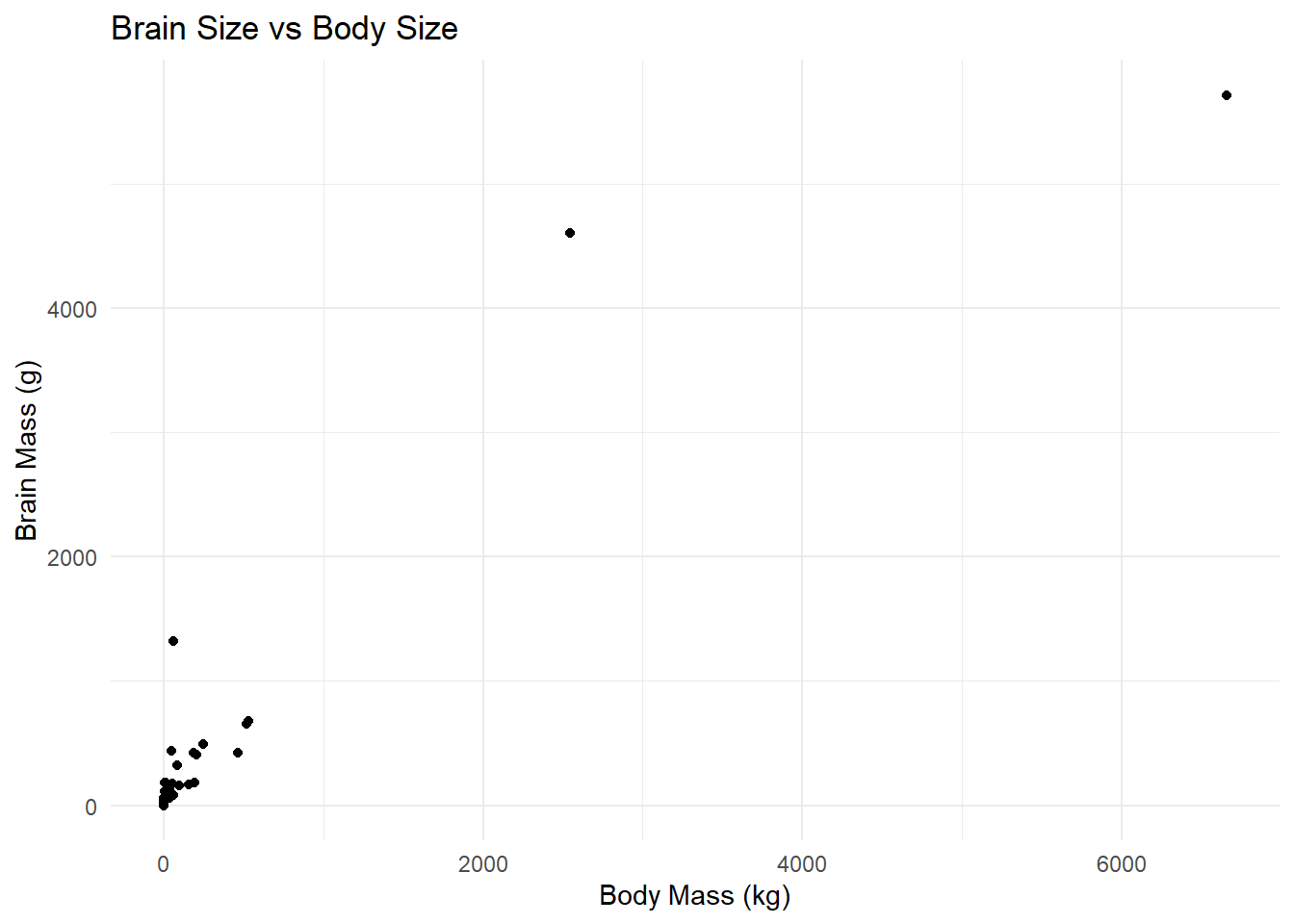
# Assess linearity visually

# 2. Find a transformation
# Try log transformation as a common approach for size-related data
mammals_transformed <- mammals %>%
  mutate(log_body_mass = log(body_mass_kg), log_brain_mass = log(brain_mass_g))

# Plot transformed variables to check linearity
ggplot(mammals_transformed, aes(x = log_body_mass, y = log_brain_mass)) +
  geom_point() +
  theme_minimal() +
  labs(title = "Log-Transformed Brain Size vs Body Size", x = "Log Body Mass", y = "Log Brain Mass")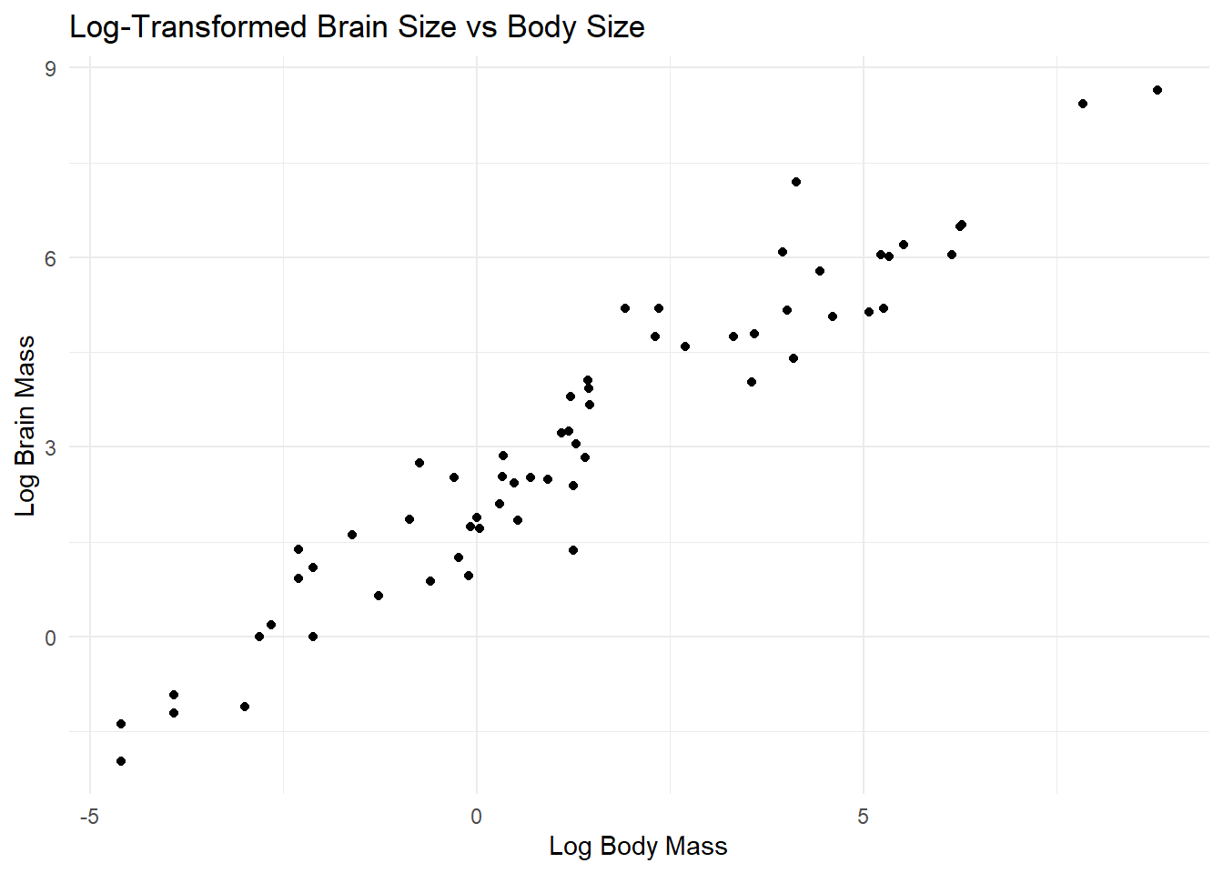
# 3. Test for correlation
cor.test(mammals_transformed$log_body_mass, mammals_transformed$log_brain_mass)
    Pearson's product-moment correlation

data:  mammals_transformed$log_body_mass and mammals_transformed$log_brain_mass
t = 26.216, df = 60, p-value < 2.2e-16
alternative hypothesis: true correlation is not equal to 0
95 percent confidence interval:
 0.9326419 0.9751927
sample estimates:
      cor
0.9590134
# 4. Fit a linear regression model
model <- lm(log_brain_mass ~ log_body_mass, data = mammals_transformed)
summary(model)
Call:
lm(formula = log_brain_mass ~ log_body_mass, data = mammals_transformed)

Residuals:
     Min       1Q   Median       3Q      Max
-1.71143 -0.50667 -0.05606  0.43833  1.94425

Coefficients:
              Estimate Std. Error t value Pr(>|t|)
(Intercept)    2.12719    0.09682   21.97   <2e-16 ***
log_body_mass  0.75451    0.02878   26.22   <2e-16 ***
---
Signif. codes:  0 '***' 0.001 '**' 0.01 '*' 0.05 '.' 0.1 ' ' 1

Residual standard error: 0.699 on 60 degrees of freedom
Multiple R-squared:  0.9197,    Adjusted R-squared:  0.9184
F-statistic: 687.3 on 1 and 60 DF,  p-value: < 2.2e-16
# 5. Predicted change in log-brain size for an increase of 3 units in log-body size
# Coefficient of log_body_mass gives the change in log_brain_mass per unit change in log_body_mass
predicted_change <- coef(model)["log_body_mass"] * 3
# 6. Residual plot
residuals_data <- data.frame(
log_body_mass = mammals_transformed$log_body_mass,
residuals = residuals(model)
)
ggplot(residuals_data, aes(x = log_body_mass, y = residuals)) +
geom_point() +
theme_minimal() +
labs(title = "Residual Plot", x = "Log Body Mass", y = "Residuals")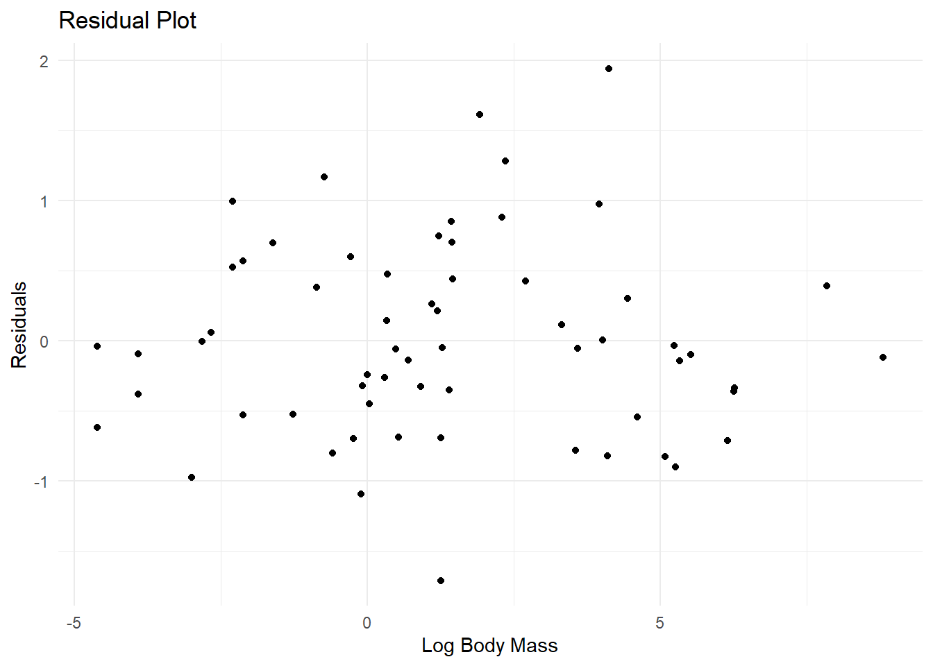
# 7. Identify species with highest and smallest brain size relative to prediction
mammals_transformed <- mammals_transformed %>%
  mutate(predicted_log_brain_mass = predict(model),
         residual = log_brain_mass - predicted_log_brain_mass)

# Highest brain size relative to prediction
highest_brain_size <- mammals_transformed %>%
  filter(residual == max(residual)) %>%
  dplyr::select(name, residual)

# Smallest brain size relative to prediction
smallest_brain_size <- mammals_transformed %>%
  filter(residual == min(residual)) %>%
  dplyr::select(name, residual)

# Print results
print(highest_brain_size)
name residual
1 Human 1.944249print(smallest_brain_size) name residual
1 Water opossum -1.711431Footnotes
The
Adjusted R-squared:value can be ignored in this analysis—it is used when doing a form of regression called multiple regression, in which there is more than one \(x\) variable.↩︎