1 Learning Objectives
- Find scientific graphs from peer-reviewed, published manuscripts;
- Carry out a critique to determine whether they’re examples of ‘bad’ graphs;
- Suggest improvements;
- Prepare a short presentation for one graph outlining your critique and improvements.
2 Introduction
I am sure that you have seen bad graphs previously but have you ever considered what makes these graphs so bad? Being able to critique graphs and other data visualisations is an important part of understanding effective visual communication. Broadly speaking, there are three main categories of bad graphs:
- Ugly - a graph that has aesthetic problems
- Bad - a graph that has problems related to perception
- Wrong - a graph that has problems related to the data it displays
These categories are not mutually exclusive, however, and you will typically find that a lot of bad graphs fall into at least two. This section is designed to give you practice critiquing graphs (both good and bad) from both scientific literature and popular press.
The internet is awash with terrible graphs (e.g., WTF Visualisations and Junk Charts) and it shouldn’t be too difficult to find examples to critique. I also strongly encourage you to delve into the scientific literature via Google Scholar to find examples. Good journals to start with are those with high impact factors such as Nature, Science or Cell as they often compromise on graph quality by trying to cram as much information as possible into few graphs.
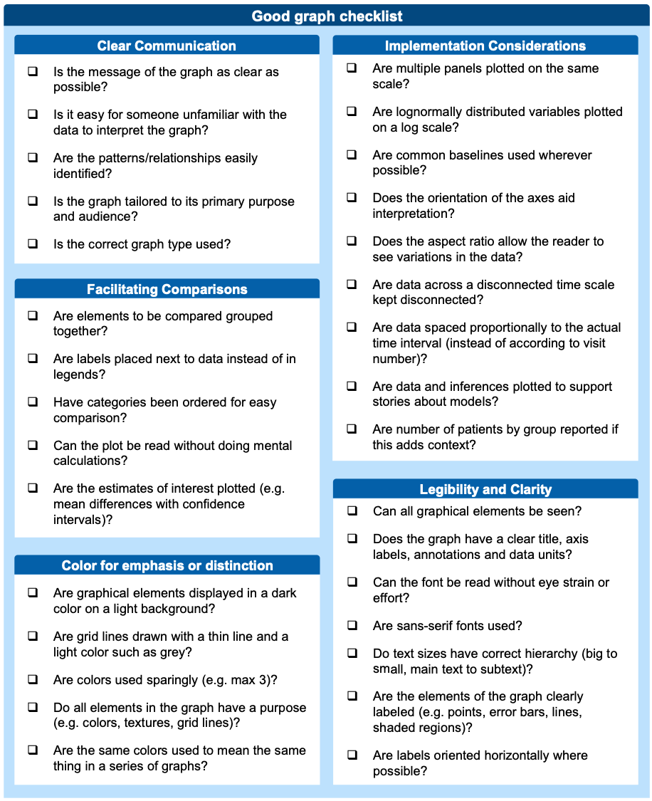
3 Checklist
To help you assess whether a graph is good or bad we have included a basic checklist of considerations. Now, this doesn’t cover every consideration but it is a good starting point and I often use this when assessing a graph for the first time.

4 Activities
Take the opportunity to practice critiquing graphs. You should aim to find at least three graphs to critique and you should try to find examples that fall into each of the three categories of bad graphs. You should also try to find examples from both the scientific literature and popular press.
4.1 Finding graphs to critique
Find three graphs from the peer-reviewed scientific literature - preferably from three different manuscripts.
4.2 Critique
Carry out a critique of your graphs and determine whether they are: ‘good’, ‘bad’ or ‘meh’. Use the checklist to help you determine which category they fall into.
4.3 Improving the graphs
Briefly outline how your graphs could be improved. Even the best graphs in the world are not perfect, so don’t be shy about suggesting changes to graphs you consider ‘good’!
4.4 Presentation
Select one of your graphs and create a one slide PowerPoint presentation outlining your critique and proposed improvements. You should annotate the graph to highlight the issues you have identified and use the notes section to provide a brief explanation of your critique and improvements.