# Install packages
if(!require(tidyverse)){install.packages("tidyverse")}
if(!require(shiny)){install.packages("shiny")}

# Load packages
library(tidyverse)
library(shiny)1 Objectives
- Use
Rto perform analysis of variance (ANOVA) to compare the means of multiple groups; - Perform Tukey-Kramer tests to look at unplanned contrasts between all pairs of groups;
- Use Kruskal-Wallis tests to test for difference between groups without assumptions of Gaussianity;
- Transform data to meet assumptions of ANOVA.
2 Start a Script
For this lab or project, begin by:
- Starting a new
Rscript - Create a good header section and table of contents
- Save the script file with an informative name
- set your working directory
Aim to make the script a future reference for doing things in R!
3 Introduction
Shiny lets you make web applications that do anything you can code in R. For example, you can share your data analysis in a dynamic way with people who don’t use R as well as collecting and visualising data. There are many examples of Shiny apps online, many of which can be found in the Shiny Gallery. Don’t be intimidated by the complexity of some of these apps, they are often built by teams of people and can be very complex. The aim of this lab is to get you started with the basics of Shiny and to give you the tools to build your own apps.
4 Packages
For this lab, you will need to install and load Shiny and tidyverse:
5 Demo Shiny App
To start, let’s walk through the basics of setting up a shiny app, starting with the example built into RStudio. The Shiny package has built-in examples that each demonstrate how Shiny works. Each example is a self-contained Shiny app. We will look at the old faithful example, which is a histogram of the Old Faithful geyser eruption durations. At this stage we are not going to look at how shiny apps are structured, we just want to get something basic up and running to give you some familiarity with the layout of a basic app.
5.1 Open the Shiny App

shiny app- Under the
Filemenu, chooseNew Project.... You will see a popup window like the one above. ChooseNew Directory; - Choose
Shiny Web Applicationas theglossary("project")type; - I like to put all of my apps in the same
glossary("directory"), but it doesn’t matter where you save it.
Your RStudio interface should now look like this:
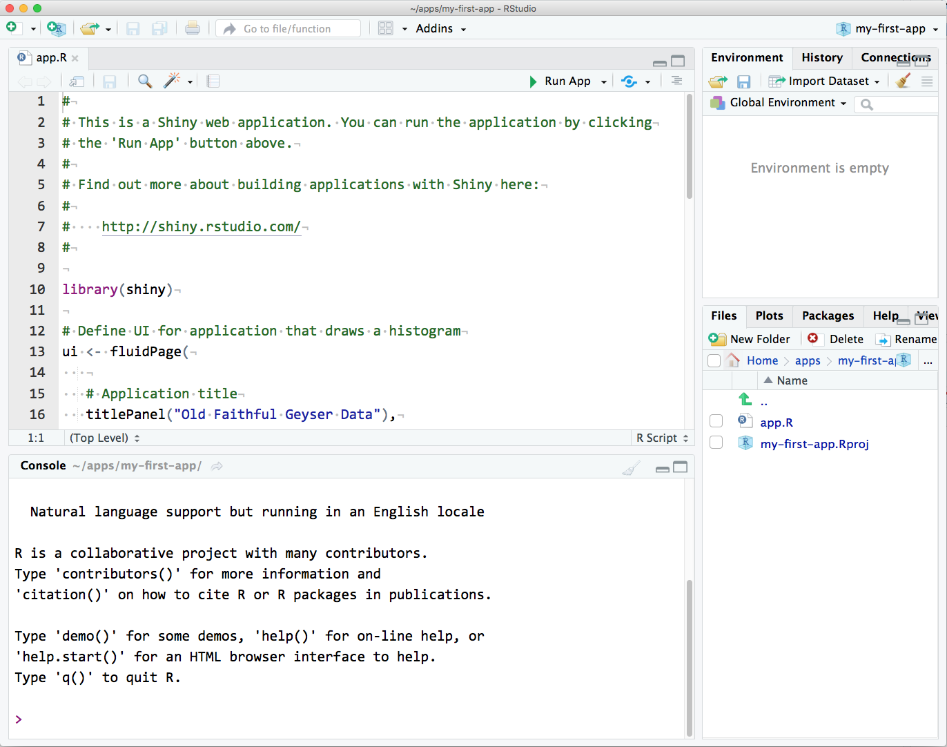
RStudio interface with the built-in demo app loaded.💡 If your source code doesn’t look like this, replace it with the code below:
#
# This is a Shiny web application. You can run the application by clicking
# the 'Run App' button above.
#
# Find out more about building applications with Shiny here:
#
#    http://shiny.rstudio.com/
#

library(shiny)

# Define UI for application that draws a histogram
ui <- fluidPage(

   # Application title
   titlePanel("Old Faithful Geyser Data"),

   # Sidebar with a slider input for number of bins
   sidebarLayout(
      sidebarPanel(
         sliderInput("bins",
                     "Number of bins:",
                     min = 1,
                     max = 50,
                     value = 30)
      ),

      # Show a plot of the generated distribution
      mainPanel(
         plotOutput("distPlot")
      )
   )
)

# Define server logic required to draw a histogram
server <- function(input, output) {

   output$distPlot <- renderPlot({
      # generate bins based on input$bins from ui.R
      x    <- faithful[, 2]
      bins <- seq(min(x), max(x), length.out = input$bins + 1)

      # draw the histogram with the specified number of bins
      hist(x, breaks = bins, col = 'darkgray', border = 'white')
   })
}

# Run the application
shinyApp(ui = ui, server = server)
Click on Run App in the top right corner of the script pane. The app will open up in a new window. Play with the slider and watch the histogram change.
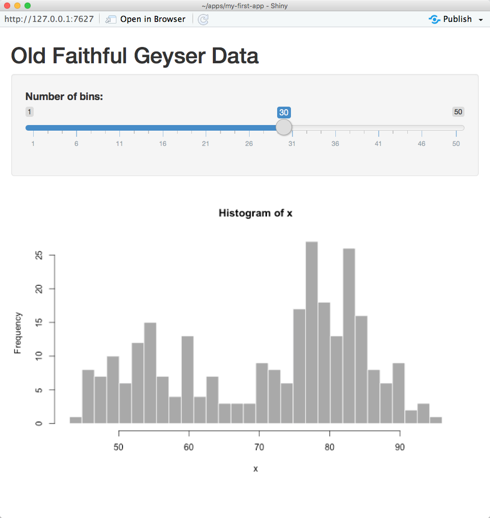
Shiny app interface.Your R session will be busy while the shiny app is active, so you will not be able to run any R commands. R is monitoring the app and executing the app’s reactions. To get your R session back, hit escape or click the stop sign icon (found in the upper right corner of the RStudio console panel).
5.2 Modify the Shiny App
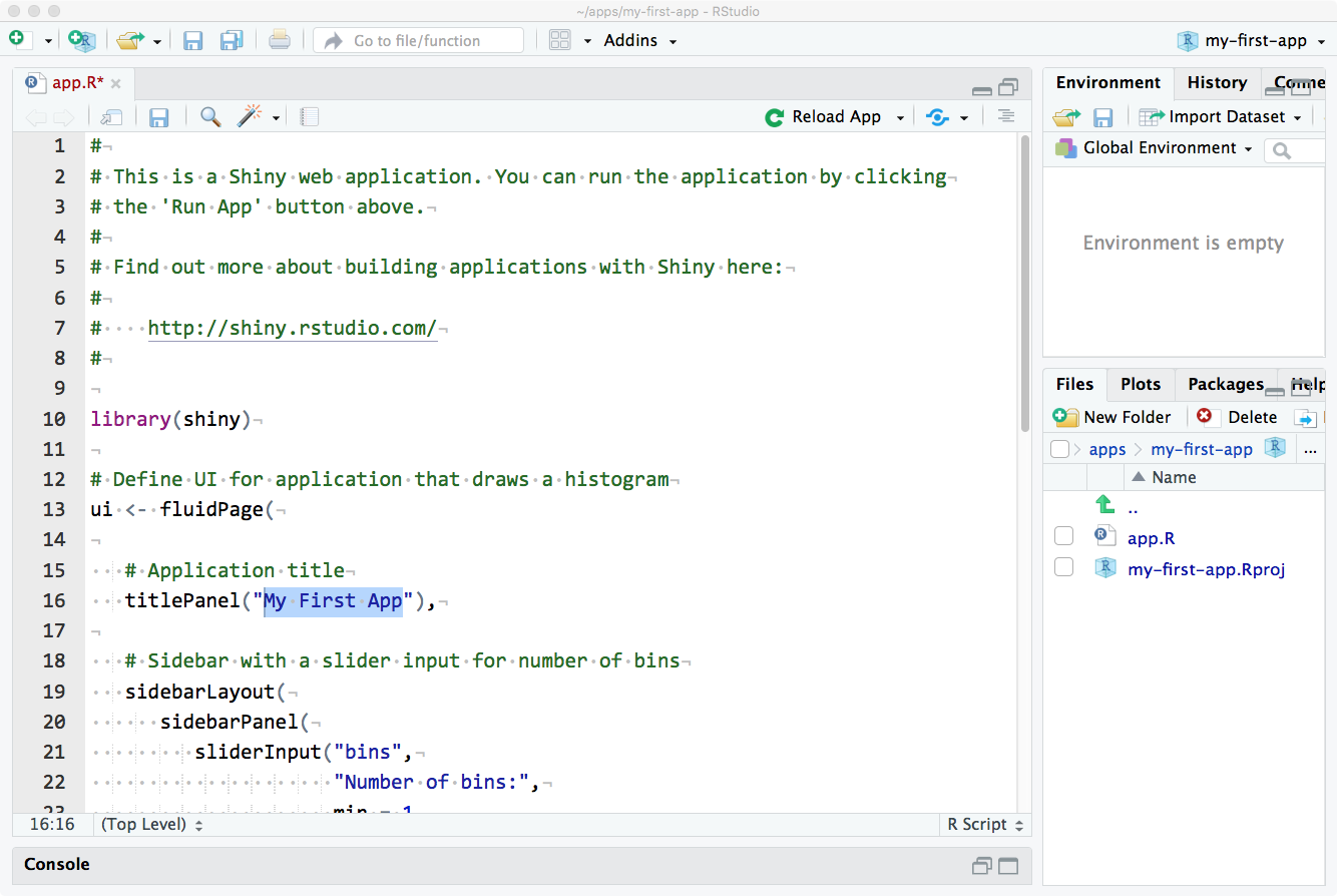
Now that you have seen a basic shiny app, let’s modify it to make it our own. First, start by finding the application title - it is the first argument to the titlePanel() function. Change the title to something more descriptive of your app like “My First Shiny App”. Make sure the title is inside quotes and the whole quoted string is inside the parentheses. Save the file and click Run App again. The title should now be changed.
Shiny app with modified title.Next, let’s change the name of the slider. The slider is defined in the sidebarPanel() function. The first argument to the sliderInput() function is you can use in the code to find the value of this input, so don’t change it just yet. The second argument is the text that displays before the slider (label):
sliderInput("bins",             # Name of the slider
            "Number of bins:",  # Label for the slider
            min = 1,            # Minimum value
            max = 50,           # Maximum value
            value = 30)         # Default value
Change the label of the slider to something more descriptive like “Number of Bins”. Save the file and click Run App again. The slider should now have a new label.
The arguments to the function sidebarPanel() are just a list of things you want to display in the sidebar. To add some explanatory text in a paragraph before sliderInput(), just use the paragraph function p():
sidebarPanel(
   p("I am explaining this perfectly"),       # Paragraph
   sliderInput("bins",                        # Name of the slider
               "Choose the best bin number:", # Label for the slider
               min = 10,                      # Minimum value
               max = 40,                      # Maximum value
               value = 25)                    # Default value
)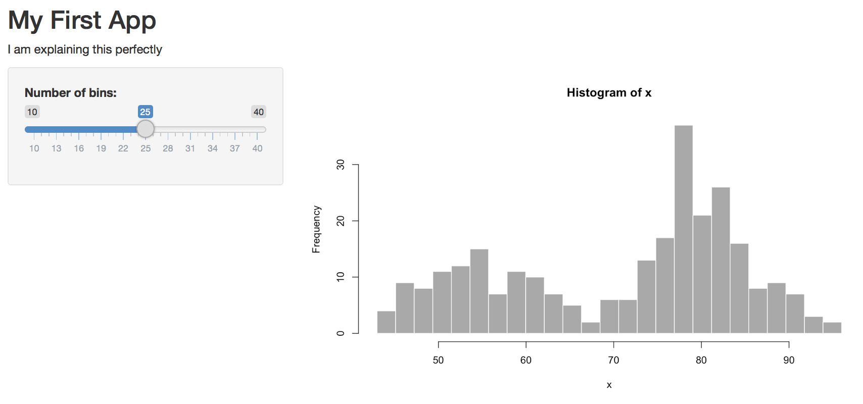
I don’t like it there, so we can move this text out of the sidebar and to the top of the page, just under the title. Try this and re-run the app:
# Application title
titlePanel("My First App"),

p("I am explaining this perfectly"),

# Sidebar with a slider input for number of bins
sidebarLayout(...)
I am also not fond of the grey plot. We can change the plot colour inside hist():
# draw the histogram with the specified number of bins
hist(x, breaks = bins, col = 'steelblue3', border = 'grey30')
As you may have gathered by now, I prefer to use ggplot2 for plotting so let’s make the plot with geom_histogram() instead of hist() (which is a great function for really quick plots, but not very visually appealing). To use ggplot2 plots in shiny we need to use the renderPlot() function. This function takes a ggplot2 object as an argument and returns a shiny plot object. The ggplot2 object is created inside the renderPlot() function using the ggplot() function. The ggplot() function takes two arguments: the data frame and the aesthetics. The data frame is the data you want to plot and the aesthetics are the variables you want to map to the plot. You can replace all of the code in renderPlot() with following code:
# create plot
output$distPlot <- renderPlot({               # renderPlot() function
  ggplot(faithful, aes(x = waiting)) +        # data frame and aesthetics
    geom_histogram(bins = input$bins,         # geom_histogram() function
                   fill = "steelblue3",       # fill colour
                   colour = "grey30") +       # border colour
    xlab("What are we even plotting here?") + # x-axis label
    theme_minimal()                           # minimal theme
})
5.3 Add New Elements
The faithful dataset includes two columns: eruptions and waiting. We’ve been plotting the waiting variable, but what if you wanted to plot the eruptions variable instead? We can add a radio button to the sidebar to choose which variable to plot. The radioButtons() function takes three arguments: the name of the radio button, the label for the radio button, and the choices for the radio button. The choices are a list of values and labels. The values are what R will use to find the choice and the labels are what the user will see. The first choice in the list is the default choice. Add the following code to the sidebarPanel() function:
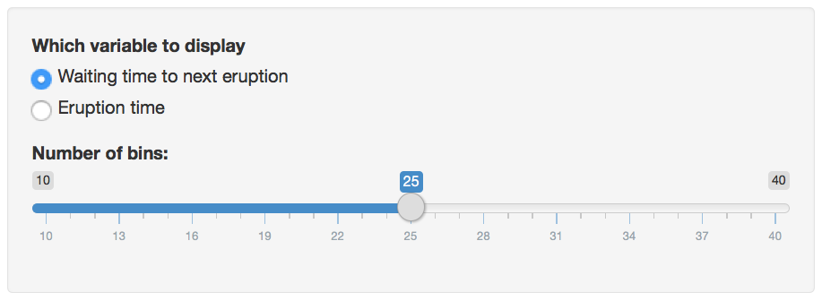
 radioButtons(inputId = "display_var", # Name of the radio button
              label = "Which variable to display", # Label for the radio button
              choices = c("Waiting time to next eruption" = "waiting", # List of choices
                          "Eruption time" = "eruptions"),
              selected = "waiting" # Default choice
 ),
Save this and re-run the app. You should now have a radio button interface now:
radioButton widget above a sliderInput widget.You can click on the options to switch the button, but it won’t do anything to your plot yet. We need to edit the plot-generating code to make that happen. First, we need to change the x-axis label depending on what we’re graphing. We use an if/else statement to set the variable xlabel to one thing if input$display_var is equivalent to “eruptions”, and to something else if it’s equivalent to “waiting”. Put this code at the very beginning of the code block for renderPlot() (after the line output$distPlot <- renderPlot({):
# set x-axis label depending on the value of display_var
if (input$display_var == "eruptions") {  # if input$display_var is "eruptions"
  xlabel <- "Eruption Time (in minutes)" # set xlabel to this
} else if (input$display_var == "waiting") { # else if input$display_var is "waiting"
  xlabel <- "Waiting Time to Next Eruption (in minutes)" # set xlabel to this
}
Next, we need to change the ggplot() function to use the input$display_var variable. The variable input$display_var gives you the user-input value of the widget called “display_var”:
# create plot
ggplot(faithful, aes(.data[[input$display_var]])) + # data frame and aesthetics
  geom_histogram(bins = input$bins,                 # geom_histogram() function
                 fill = "steelblue3",               # fill colour
                 colour = "grey30") +               # border colour
  xlab(xlabel) +                                    # x-axis label
  theme_minimal()                                   # minimal theme
Notice that the code aes(waiting) from before has changed to aes(.data[[input$display_var]]). Because input$display_var is a string, we have to select it from the .data placeholder (which refers to the faithful data table) using double brackets. Save this and re-run the app. You should now be able to switch between the two variables using the radio button.
6 App Structure
Now that we’ve made and modified our first working app, it’s time to learn a bit about how a shiny app is structured. A shiny app is made of two main parts, a UI, which defines what the user interface looks like, and a server function, which defines how the interface behaves. The function shinyApp() puts the two together to run the application in a web browser.
Shiny apps are contained in a single script called app.R. The script app.R lives in a directory (for example, newdir/) and the app can be run with runApp("newdir").
app.R has three components:
- a user interface object (
ui) - a
serverfunction - a call to the
shinyAppfunction
The user interface (ui) object controls the layout and appearance of your app. The server function contains the instructions that your computer needs to build your app. Finally the shinyApp function creates Shiny app objects from an explicit ui/server pair.
6.1 ui
Here is the ui object for the Hello Shiny example:
# This is the 1st(/3) part of the Old Faithful app.R script for "01_hello"!
# Define the UI

# Load package
library(shiny)

# Define UI for app that draws a histogram ----
ui <- fluidPage(

  # App title ----
  titlePanel("Hello Shiny!"),

  # Sidebar layout with input and output definitions ----
  sidebarLayout(

    # Sidebar panel for inputs ----
    sidebarPanel(

      # Input: Slider for the number of bins ----
      sliderInput(inputId = "bins",
                  label = "Number of bins:",
                  min = 1,
                  max = 50,
                  value = 30)
    ),

    # Main panel for displaying outputs ----
    mainPanel(

      # Output: Histogram ----
      plotOutput(outputId = "distPlot")
    )
  )
)
6.2 Server
Here is the server function for the Hello Shiny example:
# This is the 2nd(/3) part of the Old Faithful app.R script!
# Define the server

server <- function(input, output) {

  # Histogram of the Old Faithful Geyser Data
  # with requested number of bins
  # This expression that generates a histogram is wrapped in a call
  # to renderPlot to indicate that:
  #
  # 1. It is "reactive" and therefore should be automatically
  # re-executed when inputs (input$bins) change
  # 2. Its output type is a plot
  output$distPlot <- renderPlot({

    x <- faithful$waiting
    bins <- seq(min(x), max(x), length.out = input$bins + 1)

    hist(x, breaks = bins, col = "goldenrod", border = "white",
         xlab = "Waiting time to next eruption (in mins)",
         main = "Histogram of waiting times")
  })
}
6.3 shinyApp
# This is the 3rd(/3) part of the Old Faithful app.R script!
# Call ShinyApp()

shinyApp(ui = ui, server = server)
The Hello Shiny server function can be very simple like here. The script does some calculations and then plots a histogram with the requested number of bins. Notice that most of the script is wrapped in a call to renderPlot. The comment above the function explains a bit about this, but if you find it confusing, don’t worry.
The basic structure of how parts of a Shiny app fit together in a app.R file are like this:
library(shiny)

# See above for the definitions of ui and server - this will not run!
# ui <- ...

# server <- ...

# shinyApp(ui = ui, server = server)6.5 Layouts
The layout of a Shiny app is the part that controls where the widgets go. There are several different types of layouts, but the most common is the fluidPage() layout. This layout is made up of rows and columns, and you can put widgets into each row and column. The fluidPage() layout is responsive, which means that it will automatically resize to fit the screen that it is displayed on.
7 Dynamic Elements
So far, we’ve just put static elements into our UI. What makes Shiny apps work is dynamic elements like inputs, outputs, and action buttons. These elements are defined in the UI and then used in the server function.
7.1 Inputs
Inputs are the way that users interact with your app. They can be text boxes, sliders, radio buttons, or any other type of widget. Inputs are defined in the UI using the inputId argument. The inputId is a string that is used to refer to the input in the server function. Here is an example of a slider input:
sliderInput(inputId = "bins",          # inputId is "bins"
            label = "Number of bins:", # label is "Number of bins:"
            min = 1,                   # min is 1
            max = 50,                  # max is 50
            value = 30)                # value is 30
Most inputs are structured like this, with an inputId, which needs to be a unique string not used as the ID for any other input or output in your app, a label that contains the question, and a list of choices or other parameters that determine what type of values the input will record. There are many different types of inputs:
textInput()- a single line text box;textareaInput()- a multi-line text box;selectInput()- a drop-down list of choices;checkboxInput()- a single checkbox;checkboxGroupInput()- a group of checkboxes;radioButtons()- a set of radio buttons;dateInput()- a calendar date selector;dateRangeInput()- a pair of calendar date selectors;fileInput()- a file upload control;- …
7.2 Outputs
Outputs are the way that your app displays information to the user. They can be plots, tables, text, or any other type of widget. Outputs are defined in the UI using the outputId argument. The outputId is a string that is used to refer to the output in the server function. Here is an example of a plot output:
plotOutput(outputId = "distPlot") # outputId is "distPlot"Most outputs are structured like this, with just a unique outputId (the argument name is also usually omitted). There are many different types of outputs:
textOutput()- a paragraph of text;renderText()- a paragraph of text generated by a reactive expression;verbatimTextOutput()- code, pre-formatted;plotOutput()- a plot, image, or other graphics output;renderPlot()- a plot, image, or other graphics output generated by a reactive expression;imageOutput()- an image file;renderImage()- an image file generated by a reactive expression;tableOutput()- a table;renderTable()- a table generated by a reactive expression;dataTableOutput()- an interactive table;renderDataTable()- an interactive table generated by a reactive expression;- …
7.4 Reactive Expressions
Reactive expressions are used to calculate values that are used in your app. They are defined in the server function using the reactive() function. The reactive() function takes one argument, which is a function that returns a value. The value returned by the function is the value that the reactive expression will return. Here is an example of a reactive expression:
reactive({
  # Do some calculations here
  # Return a value
})
7.5 Reactive Values
Reactive values are used to store values that are used in your app. They are defined in the server function using the reactiveValues() function. The reactiveValues() function takes one or more arguments, which are the names of the values that you want to store. The values are stored in a list, and you can access them using the $ operator. Here is an example of a reactive value:
reactiveValues(
  # Store some values here
  # Return a list of values
)
8 Deploying Shiny Apps
8.1 Shinyapps.io
The easiest way to deploy a Shiny app is to use shinyapps.io. This is a free service that allows you to host your Shiny apps on the web. You can sign up for a free account at https://www.shinyapps.io/. Once you have an account, you can deploy your app by clicking the “Publish” button in the RStudio IDE. You can also deploy your app from the command line using the rsconnect package.
8.2 RStudio Connect
If you want to host your Shiny app on your own server, you can use RStudio Connect. This is a paid service that allows you to host your Shiny apps on your own server. You can sign up for a free trial at https://www.rstudio.com/products/connect/. Once you have an account, you can deploy your app by clicking the “Publish” button in the RStudio IDE. You can also deploy your app from the command line using the rsconnect package.
8.3 Shiny Server
If you want to host your Shiny app on your own server, you can use Shiny Server. This is a free service that allows you to host your Shiny apps on your own server. You can download it from https://www.rstudio.com/products/shiny/shiny-server/. Once you have it installed, you can deploy your app by clicking the “Publish” button in the RStudio IDE. You can also deploy your app from the command line using the rsconnect package.
9 Activities
9.1 Activity 1 - Setup
Create a new app called “basic_demo” and replace all the text in app.R with the code below. You should be able to run the app and see just a blank page.
💡 Click here to view a solution
# Setup ----
library(shiny)

# Define UI ----
ui <- fluidPage()

# Define server logic ----
server <- function(input, output, session) {}

# Run the application ----
shinyApp(ui = ui, server = server)
9.2 Activity 2 - Title
Add a title to the app using the titlePanel() function. The title should be “Basic Demo App - Diamonds”.
💡 Click here to view a solution
# Setup ----
library(shiny)

# Define UI ----
ui <- fluidPage(
  titlePanel("Basic Demo App")
)

# Define server logic ----
server <- function(input, output, session) {}

# Run the application ----
shinyApp(ui = ui, server = server)
9.3 Activity 3 - Inputs
You are going to use the diamonds dataset from the ggplot2 package. This dataset contains information about diamonds, including their carat, cut, color, clarity, depth, table, price, and x, y, and z dimensions. Add a selectInput() widget to the app that allows the user to select a cut of diamond. The choices should be “Fair”, “Good”, “Very Good”, “Premium”, and “Ideal”. The default value should be “Ideal”.
💡 Click here to view a solution
# Setup ----
library(shiny)
library(tidyverse)

# Define UI ----
ui <- fluidPage(
  titlePanel("Basic Demo App"),
  selectInput(inputId = "cut",
              label = "Cut",
              choices = c("Fair", "Good", "Very Good", "Premium", "Ideal"),
              selected = "Ideal")
)

# Define server logic ----
server <- function(input, output, session) {}

# Run the application ----
shinyApp(ui = ui, server = server)
Now add a sliderInput() widget to the app that allows the user to select a price range. The minimum value should be 0 and the maximum value should be 20,000. The default value should be 0 and the step size should be 100.
💡 Click here to view a solution
# Setup ----
library(shiny)
library(tidyverse)

# Define UI ----
ui <- fluidPage(
  titlePanel("Basic Demo App"),
  selectInput(inputId = "cut",
              label = "Cut",
              choices = c("Fair", "Good", "Very Good", "Premium", "Ideal"),
              selected = "Ideal"),
  sliderInput(inputId = "price",
              label = "Price",
              min = 0,
              max = 20000,
              value = 0,
              step = 100)
)

# Define server logic ----
server <- function(input, output, session) {}

# Run the application ----
shinyApp(ui = ui, server = server)
9.4 Activity 4 - Output
Add a plotOutput() widget to the app that will display a histogram of the price of diamonds. The histogram should be filtered by the cut of diamond selected by the user. The histogram should also be filtered by the price range selected by the user. The histogram should be colored by the cut of diamon - you will have to add an option to display all diamond cuts!
💡 Click here to view a solution
# Setup ----
library(shiny)
library(tidyverse)

# Define UI ----
ui <- fluidPage(
  titlePanel("Basic Demo App"),
  selectInput(inputId = "cut",
              label = "Cut",
              choices = c("All", "Fair", "Good", "Very Good", "Premium", "Ideal"),
              selected = "All"),  # Updated this line
  sliderInput(inputId = "price",
              label = "Price",
              min = 0,
              max = 20000,
              value = c(0, 20000),
              step = 100),
  plotOutput(outputId = "hist")
)

# Define server logic ----
server <- function(input, output, session) {
  output$hist <- renderPlot({
    # Data filtering
    data <- diamonds %>%
      filter(
        (input$cut == "All" | cut == input$cut),
        price >= input$price[1],
        price <= input$price[2]
      )

    # Plot
    ggplot(data, aes(x = price, fill = cut)) +
      geom_histogram(bins = 30)
  })
}

# Run the application ----
shinyApp(ui = ui, server = server)
9.5 Activity 5 - Layout
Add a sidebarLayout() to the app. Move the selectInput() and sliderInput() widgets to the sidebar. Move the plotOutput() widget to the main panel. Add a h3() widget to the main panel that says “Diamond Price Histogram”. Add a h3() widget to the sidebar that says “Diamond Filters”.
💡 Click here to view a solution
# Setup ----
library(shiny)
library(tidyverse)

# Define UI ----
ui <- fluidPage(
  titlePanel("Basic Demo App"),

  # Use sidebarLayout
  sidebarLayout(
    sidebarPanel(
      h3("Diamond Filters"),  # Header for the sidebar
      selectInput(inputId = "cut",
                  label = "Cut",
                  choices = c("All", "Fair", "Good", "Very Good", "Premium", "Ideal"),
                  selected = "All"),
      sliderInput(inputId = "price",
                  label = "Price",
                  min = 0,
                  max = 20000,
                  value = c(0, 20000),
                  step = 100)
    ),
    mainPanel(
      h3("Diamond Price Histogram"),  # Header for the main panel
      plotOutput(outputId = "hist")
    )
  )
)

# Define server logic ----
server <- function(input, output, session) {
  output$hist <- renderPlot({
    # Data filtering
    data <- diamonds %>%
      filter(
        (input$cut == "All" | cut == input$cut),
        price >= input$price[1],
        price <= input$price[2]
      )

    # Plot
    ggplot(data, aes(x = price, fill = cut)) +
      geom_histogram(bins = 30)
  })
}

# Run the application ----
shinyApp(ui = ui, server = server)
9.6 Activity 6 - Styling
Add a theme() to the plot that removes the legend and adds a title - you can also change the aestheics to whatever you like using the skills learned earlier in this module. Add a theme() to the sidebar that changes the background color to light blue. Add a theme() to the main panel that changes the background color to light green.
💡 Click here to view a solution
# Setup ----
library(shiny)
library(tidyverse)

# Define UI ----
ui <- fluidPage(
  titlePanel("Basic Demo App"),

  # Custom CSS for sidebar and main panel
  tags$head(
    tags$style(HTML("
      .sidebar { background-color: lightblue; }
      .main { background-color: lightgreen; }
    "))
  ),

  # Use sidebarLayout
  sidebarLayout(
    sidebarPanel(
      h3("Diamond Filters"),  # Header for the sidebar
      selectInput(inputId = "cut",
                  label = "Cut",
                  choices = c("All", "Fair", "Good", "Very Good", "Premium", "Ideal"),
                  selected = "All"),
      sliderInput(inputId = "price",
                  label = "Price",
                  min = 0,
                  max = 20000,
                  value = c(0, 20000),
                  step = 100)
    ),
    mainPanel(
      h3("Diamond Price Histogram"),  # Header for the main panel
      plotOutput(outputId = "hist")
    )
  )
)

# Define server logic ----
server <- function(input, output, session) {
  output$hist <- renderPlot({
    # Data filtering
    data <- diamonds %>%
      filter(
        (input$cut == "All" | cut == input$cut),
        price >= input$price[1],
        price <= input$price[2]
      )

    # Plot with theme modifications
    ggplot(data, aes(x = price, fill = cut)) +
      geom_histogram(bins = 30) +
      ggtitle("Diamond Price Distribution") +
      theme(legend.position = "none",
            plot.title = element_text(hjust = 0.5))  # Center the title
  })
}

# Run the application ----
shinyApp(ui = ui, server = server)
9.7 Activity 7 - Reactive Values
Add a reactiveValues() object to the server that will store the filtered data. Add a observeEvent() to the server that will update the reactiveValues() object when the user changes the cut or price range. Update the renderPlot() to use the reactiveValues() object instead of filtering the data directly.
💡 Click here to view a solution
# Setup ----
library(shiny)
library(tidyverse)

# Define UI ----
ui <- fluidPage(
  titlePanel("Basic Demo App"),

  # Custom CSS for sidebar and main panel
  tags$head(
    tags$style(HTML("
      .sidebar { background-color: lightblue; }
      .main { background-color: lightgreen; }
    "))
  ),

  # Use sidebarLayout
  sidebarLayout(
    sidebarPanel(
      h3("Diamond Filters"),  # Header for the sidebar
      selectInput(inputId = "cut",
                  label = "Cut",
                  choices = c("All", "Fair", "Good", "Very Good", "Premium", "Ideal"),
                  selected = "All"),
      sliderInput(inputId = "price",
                  label = "Price",
                  min = 0,
                  max = 20000,
                  value = c(0, 20000),
                  step = 100)
    ),
    mainPanel(
      h3("Diamond Price Histogram"),  # Header for the main panel
      plotOutput(outputId = "hist")
    )
  )
)

# Define server logic ----
server <- function(input, output, session) {
  # Create a reactiveValues object
  filteredData <- reactiveValues(data = NULL)

  # Observe changes in input$cut and input$price
  observeEvent(c(input$cut, input$price), {
    # Update the reactiveValues object when input changes
    filteredData$data <- diamonds %>%
      filter(
        (input$cut == "All" | cut == input$cut),
        price >= input$price[1],
        price <= input$price[2]
      )
  }, ignoreNULL = FALSE)

  # Update renderPlot to use the reactiveValues object
  output$hist <- renderPlot({
    # Check if data is not NULL before plotting
    if (!is.null(filteredData$data)) {
      ggplot(filteredData$data, aes(x = price, fill = cut)) +
        geom_histogram(bins = 30) +
        ggtitle("Diamond Price Distribution") +
        theme(legend.position = "none",
              plot.title = element_text(hjust = 0.5))
    }
  })
}

# Run the application ----
shinyApp(ui = ui, server = server)
9.8 Activity 8 - Adding More Plots
Add a second plot to the main panel using a tabsetpanel. This plot should show the relationship between carat and price. Add a theme() to the plot that removes the legend and adds a title - you can also change the aestheics to whatever you like using the skills learned earlier in this module. Add a theme() to the sidebar that changes the background color to light blue. Add a theme() to the main panel that changes the background color to light green.
💡 Click here to view a solution
# Setup ----
library(shiny)
library(tidyverse)

# Define UI ----
ui <- fluidPage(
  titlePanel("Basic Demo App"),

  # Custom CSS for sidebar and main panel
  tags$head(
    tags$style(HTML("
      .sidebar { background-color: lightblue; }
      .main { background-color: lightgreen; }
    "))
  ),

  # Use sidebarLayout
  sidebarLayout(
    sidebarPanel(
      h3("Diamond Filters"),
      selectInput(inputId = "cut",
                  label = "Cut",
                  choices = c("All", "Fair", "Good", "Very Good", "Premium", "Ideal"),
                  selected = "All"),
      sliderInput(inputId = "price",
                  label = "Price",
                  min = 0,
                  max = 20000,
                  value = c(0, 20000),
                  step = 100)
    ),
    mainPanel(
      tabsetPanel(
        tabPanel("Price Histogram",
                 plotOutput("hist")),
        tabPanel("Carat vs Price",
                 plotOutput("scatterPlot"))
      )
    )
  )
)

# Define server logic ----
server <- function(input, output, session) {
  # Create a reactiveValues object
  filteredData <- reactiveValues(data = NULL)

  # Observe changes in input$cut and input$price
  observeEvent(c(input$cut, input$price), {
    filtered <- diamonds %>%
      filter(
        (input$cut == "All" | cut == input$cut),
        price >= input$price[1],
        price <= input$price[2]
      )

    # Sample 1000 values if the filtered data has more than 1000 rows
    if (nrow(filtered) > 1000) {
      filteredData$data <- sample_n(filtered, 1000)
    } else {
      filteredData$data <- filtered
    }
  }, ignoreNULL = FALSE)

  # Histogram Plot
  output$hist <- renderPlot({
    if (!is.null(filteredData$data)) {
      ggplot(filteredData$data, aes(x = price, fill = cut)) +
        geom_histogram(bins = 30) +
        ggtitle("Diamond Price Distribution") +
        theme(legend.position = "none",
              plot.title = element_text(hjust = 0.5))
    }
  })

  # Scatter Plot
  output$scatterPlot <- renderPlot({
    if (!is.null(filteredData$data)) {
      ggplot(filteredData$data, aes(x = carat, y = price, color = cut)) +
        geom_point() +
        ggtitle("Carat vs Price") +
        theme(legend.position = "none",
              plot.title = element_text(hjust = 0.5))
    }
  })
}

# Run the application ----
shinyApp(ui = ui, server = server)10 Resources
It is impossible to cover all the topics in Shiny in a single workshop. Here are some resources to help you continue your learning journey with shiny:
- Mastering
Shinyby Hadley Wickham; RstudioShinytutorials.
11 Recap
Shinyis a web application framework for R;Shinyapps are built using two components: a user interface (UI) script and a server script;- The UI script controls the layout and appearance of the app;
- The server script controls the logic of the app;
Shinyapps are reactive: changes in the UI are automatically reflected in the server and vice versa;Shinyapps can be deployed locally or on the web.