# Load tidyverse
library(tidyverse)

# Import data
tv_shows <- read_csv("data/tv_shows.csv", # file path
show_col_types = FALSE) # don't show column types1 Objectives
- Use the
tv_showsdataset to tell a story; - Learn how to de-clutter your plots;
- Learn how to annotate your plots;
- Learn how to use highlighting in your plots.
2 Start a Script
For this lab or project, begin by:
- Starting a new
Rscript - Create a good header section and table of contents
- Save the script file with an informative name
- set your working directory
Aim to make the script a future reference for doing things in R!
3 Introduction
There are, in essence, two key motivations behind data visualisation:
- Exploratory analysis - exploring and understanding the data, conducting the analysis
- Explanatory analysis - explaining your findings from your analysis in a coherent narrative
Much of the module so far has focused on creating basic plots for exploratory analysis, so let’s shift gear and learn how to improve your plots for explanatory analysis (i.e., promote effective visual communication through storytelling). To do this we are going to take a basic plot and dress it up through de-cluttering, annotating and highlighting. By changing plot appearance we can make our point clearer and more immediate.
4 Packages and Data
We’re going to look at a dataset about TV shows that was collected from IMDb (The Internet Movie Database). You will need to download this dataset from here and save it with your other lab datasets. We will also need the tidyverse package, so let’s go ahead and load this then import our data:
As always, let’s go ahead and inspect the data to see what we are working with:
# Inspect data
glimpse(tv_shows)
Rows: 48
Columns: 6
$ title <chr> "BoJack Horseman", "BoJack Horseman", "BoJack Horseman", …
$ seasonNumber <dbl> 1, 2, 3, 4, 5, 1, 2, 3, 4, 5, 1, 2, 3, 4, 5, 6, 7, 8, 9, …
$ av_rating <dbl> 7.7871, 8.0440, 8.3554, 8.6384, 9.4738, 8.7110, 8.7655, 8…
$ share <dbl> 0.88, 0.73, 0.62, 0.78, 0.45, 11.55, 15.42, 12.34, 10.79,…
$ genres <chr> "Animation,Comedy,Drama", "Animation,Comedy,Drama", "Anim…
$ status <chr> "riser", "riser", "riser", "riser", "riser", "riser", "ri…It’s a relatively basic dataset. It contains 48 observations of 6 variables. The variables are:
title- the title of the TV show;seasonNumber- the number of seasons the show has had;av_rating- the average rating of the show;share- percentage share of all TV sets in use that were tuned to the show;genres- the genre(s) of the show;statuts- whether the show is considered to be a riser (better) or faller (worse).
5 A Basic Plot
Let’s start by creating a basic line plot of the average rating of the TV shows over seasons:
# Basic plot
ggplot(data = tv_shows, aes(x = seasonNumber, # x-axis
                            y = av_rating,    # y-axis
                            group = title,    # group by title
                            colour = title)) + # colour by title
  geom_line() # add line
While this visualisation might be good for exploratory purposes, for explanatory purposes, it is a little too complicated to communicate our findings about the data. Before you move on, have a think about what this plot is communicating, how it could be improved and are there any stand out shows?
The question we need to ask ourselves is: what do we want to show? It is clear that the plot is showing how the average rating of a TV show temporally changes with season number. There is no obvious message in our plot, but it looks like BoJack Horseman and Breaking Bad are interesting as they show a sharp increase in rating but have comparatively few seasons. So, we’re going to highlight TV shows that are risers in the data and make the point that shows that increase in ratings overall tend to stop early.
Let’s save our plot into an R object called a ggplot. We’ll use the <- (left arrow) to assign it to the variable called my_plot:
# Assign plot
my_plot <- ggplot(data = tv_shows, aes(x = seasonNumber,  # x-axis
                                       y = av_rating,     # y-axis
                                       group = title,     # group by title
                                       colour = title)) + # colour by title
  geom_line() # add line
Now, when we want to modify our plot, we can use my_plot like so:
# View plot
my_plot
6 De-Cluttering
Our plot is full of ‘chart junk’, so we need to de-clutter and get rid of elements that distract from the message (e.g., shadows, 3D effect, etc.) Why? Well, it helps to reduce cognitive load for your audience and enables them to focus on what really matters. Humans have terrible short-term memory and we can only remember 5 things at once, so make it easy for your audience to get the point you’re trying to convey. Perhaps the best example of this is the London tube map as it emphasises the questions of which lines do I take to get from A to B?
6.1 Themes
The nice thing about ggplot2 is that you can modify the plot code by adding modifiers with the + (plus) sign. The defaults for the plot are okay-ish, but have some distracting elements. We can de-clutter our plot by removing some of these distracting elements. Which parts do you think are distracting? I personally find the grey background distracting as well as the legend!
A lot of the simplification can come from built in themes. Themes are like a full wardrobe for our plots, specifying lots of different details. Adding theme_minimal() will remove a lot of the background elements:
# apply theme
my_plot + theme_minimal()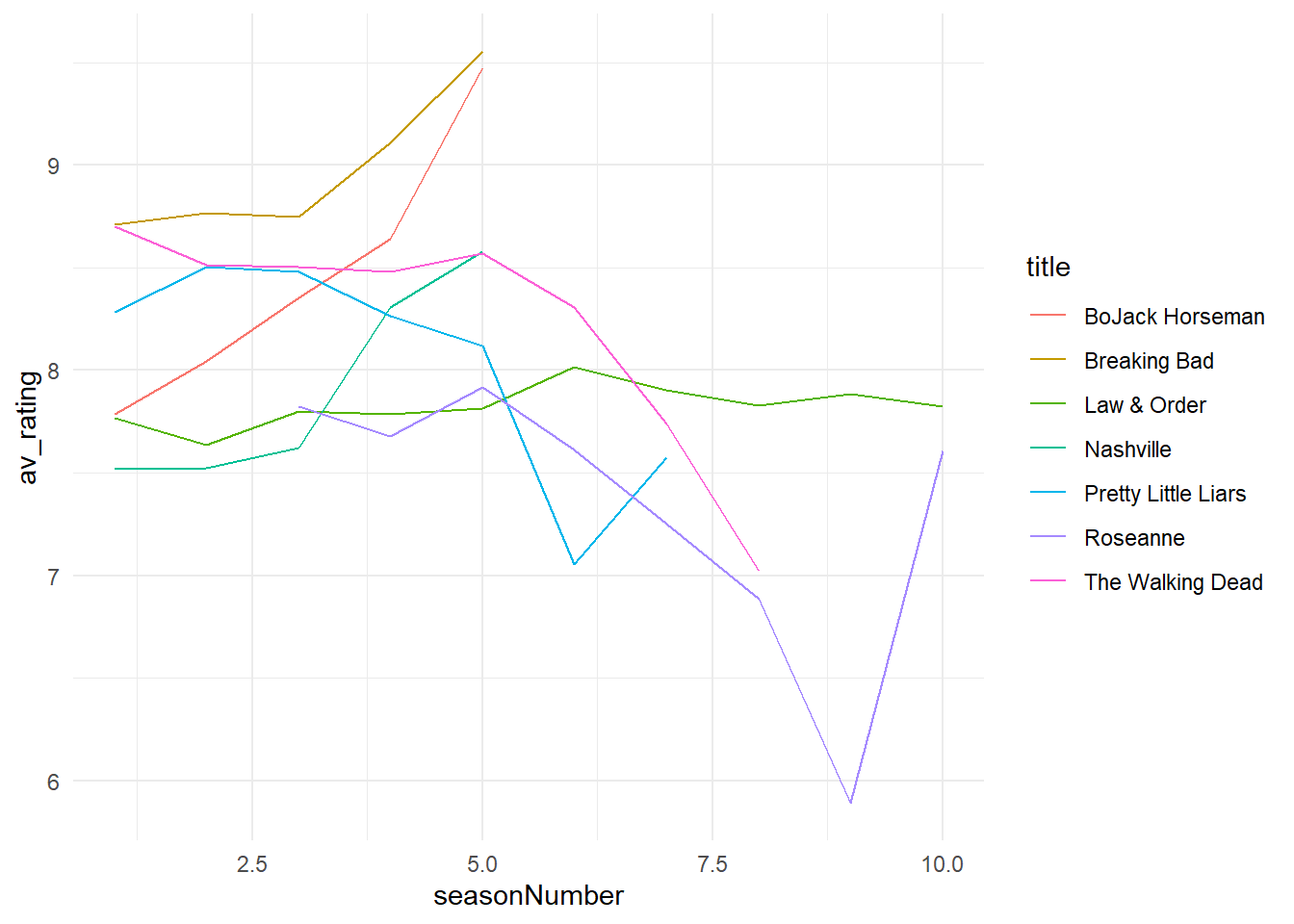
Built in themes let you be more efficient in paring elements down, but you will often find that you need to customise them.
6.2 Removing elements using theme()
We can customise our plot even further by adding a theme() function to the end of our plot. We’ll use this to remove individual elements from the plot.
Note: If we change any theme attributes after calling theme_minimal(), it will basically overwrite the previous built-in theme. This means that order is important, so keep that in mind!
theme() looks very intimidating, because it has lots of different arguments. We’ll only look at a few of these:
axis.title,axis.title.xandaxis.title.y(The labels for the axes)panel.grid(grid lines)legend.position(Placing the legend, including removing it)
How will we remove these elements? For most of them, we will specify an element called element_blank() to these arguments. What is this? Think of it as a special placeholder that says we don’t want to see this element.
Let’s try simplifying our plot by removing the x-axis text. By context, the label seasonNumber isn’t that helpful.
# Remove x-axis title
my_plot + # plot
  theme(axis.title.x = element_blank()) # remove x-axis title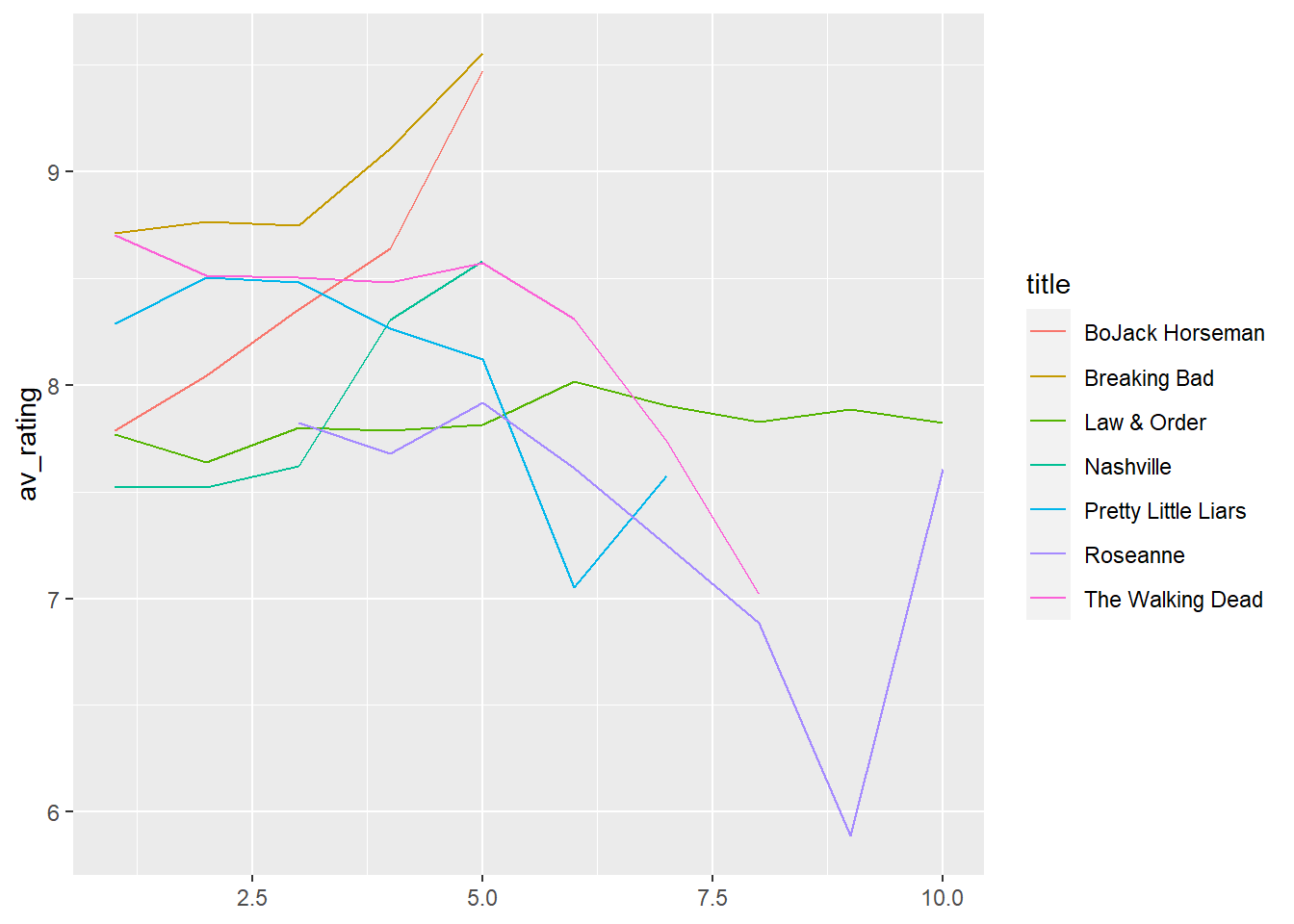
Try removing the gridlines. Is that helpful or not?
# Remove gridlines
my_plot + # plot
  theme(panel.grid = element_blank()) # remove gridlines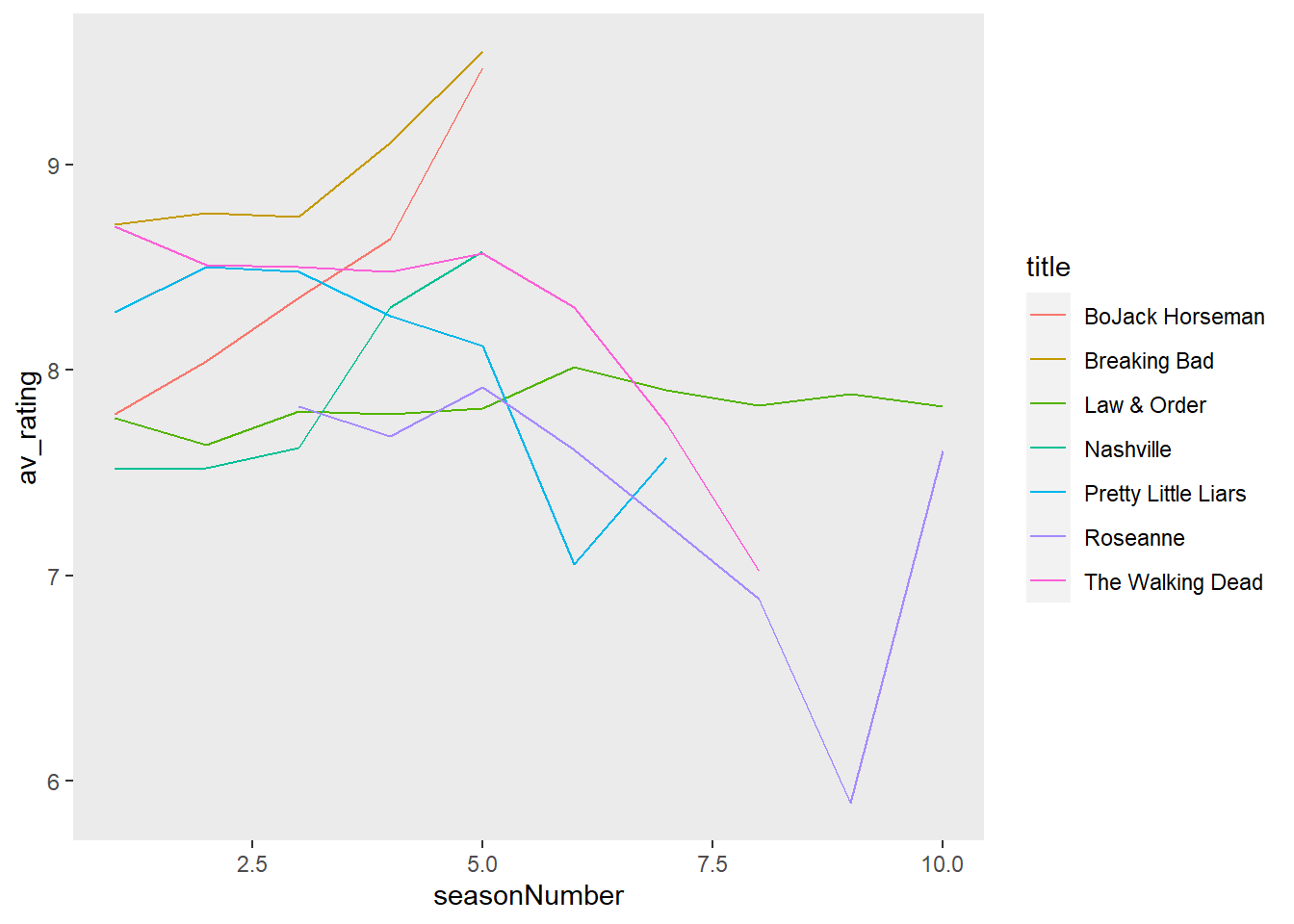
Sometimes, to remove some items, like the legend, you have to specify it not as element_blank, but as “none”. Let’s try removing the legend.
Hmm, it is more simplified, but we have lost all the information about the categories! We can add that information back with the use of colour.
# Add colour
my_plot + # plot
  theme(legend.position = "none") # remove legend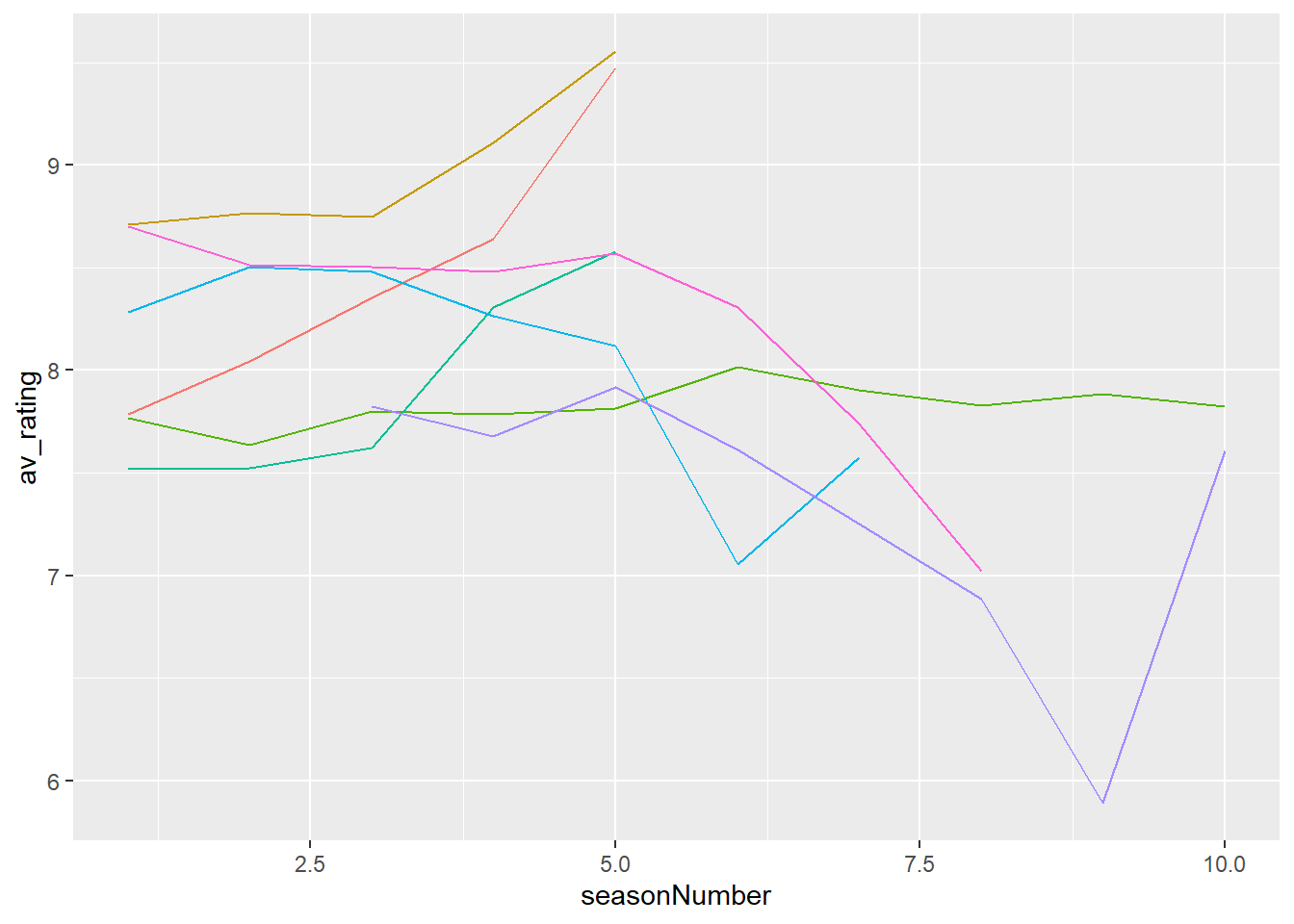
7 Annotations
Another way we can guide people through our visualisation is by using annotations. I am a firm believer in using titles and captions as they can guide people to the point of your plot and also prime your audience to know what they’re looking for. Obviously, you can go too far and label too much. Think about only labelling the data that matters.
7.1 Titles
Let’s add a title to our plot. We can do this by adding labs() to our plot. We’ll add the title “Average TV Show Ratings by Season” to our plot:
# add title
my_plot <- my_plot + # plot
  labs(title = "Average TV Show Ratings by Season", # add title
       x = "Season Number", # add x-axis label
       y = "Average Rating") # add y-axis label
Why is labs() not part of theme()? This is one confusing thing about ggplot2. theme() is about the appearance (position, angle, font size) of an element, whereas the labs() function actually provides the content.
7.2 Reference Line
Using geom_hline() to show the average value across a time period can provide a useful reference for viewers:
# Calculate mean
grand_mean_rating <- mean(tv_shows$av_rating) # calculate mean

# mean = 8.04

# add horizontal line
my_plot + # plot
  geom_hline(yintercept = 8.04, # add horizontal line
             lty = 3) # dashed line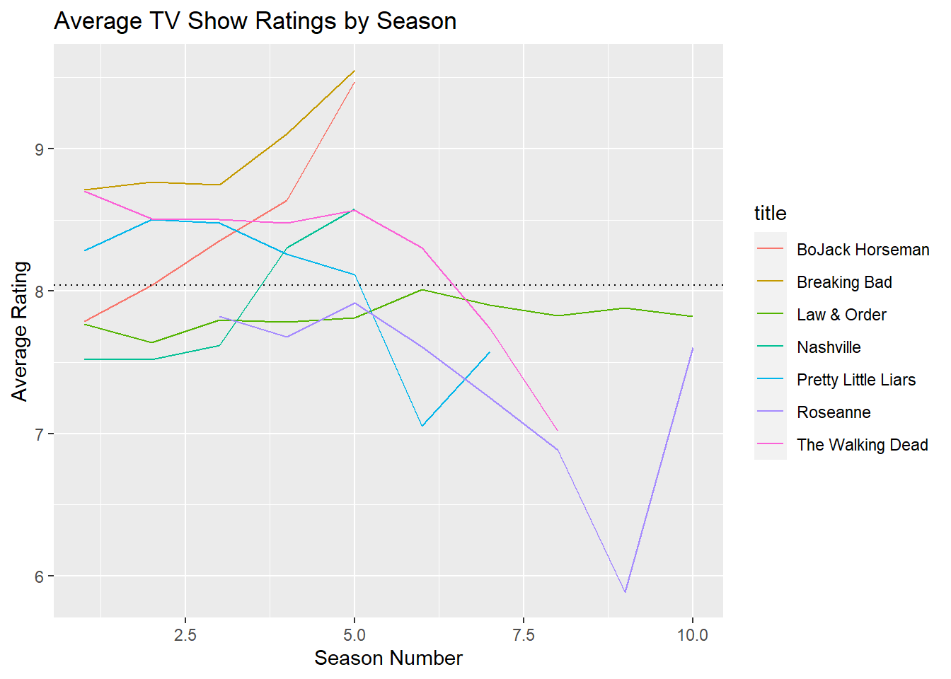
7.3 Text
Adding text annotations directly to the plot can be extremely helpful, especially if there are points of interest you want users to look at. (For adding text information per data point, look at geom_text() and geom_repel() from the ggrepel package).
The first argument to annotate() is “text”.
It takes x and y arguments to determine the position of our annotation. These values are dependent on the scale - since we have a numeric scale for both the x and y axes, we’ll use numbers to specify the position. Our actual text goes in the label argument.
# Add text annotation
my_plot + # plot
  geom_hline(yintercept = 8.04, lty = 3) + # add horizontal line
  annotate(geom = "text", # add text annotation
           x = 9, # x position
           y = 8.2 , # y position
           label = "Mean Rating") # text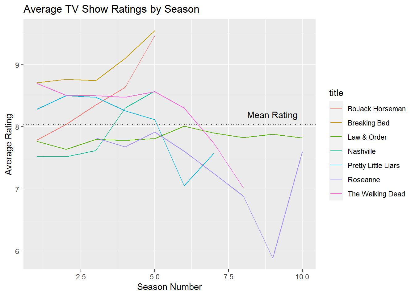
7.4 Axes
One last thing that’s been bugging me - the values of the ticks in the Season Number axis. We can specify these numbers using the breaks argument. Note that c(1:10) is a shortcut for specifying c(1, 2, 3, 4, 5, 6, 7, 8, 9, 10).
# Change x-axis tick numbers
my_plot + # plot
  scale_x_continuous(breaks = c(1:10)) # change x-axis tick numbers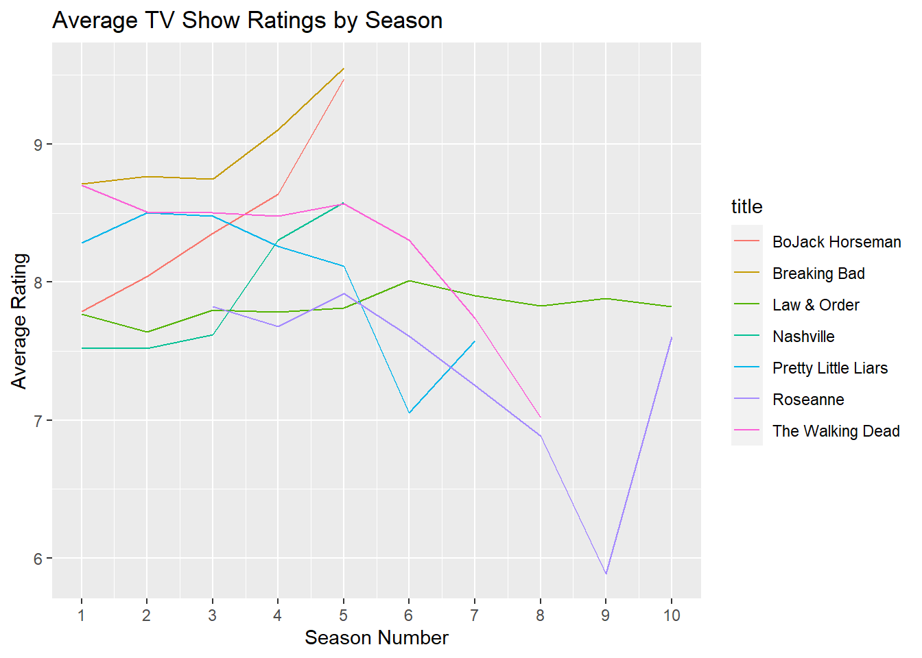
8 Highlighting Data
colour and contrast are known as preattentive attributes. Our unconscious brain is aware of these kinds of attributes even before we consciously process the content of a plot. You can use colour and contrast to highlight aspects of the data. There are some ‘best practices’ for using colour:
- Use colour only when needed to serve a particular communication goal;
- Use different colours only when they correspond to differences of meaning in the data;
- Use soft, natural colours to display most information and bright and/or dark colours to highlight information that requires greater attention.
8.1 Updated Plot
Remember our original plot mapped colour to title. There’s also a variable called status in our data. status has two different values: a TV show can be a riser (positive trend in ratings), or be a faller (negative trend in ratings).
Let’s modify the plot to use this variable to colour our lines. We’ll save it as a different object, this time called my_new_plot.
# Create new plot
my_new_plot <- # plot
  ggplot(tv_shows) + # data
    aes(x = seasonNumber, # x-axis
        y = av_rating, # y-axis
        group = title, # group by title
        colour = status) +   #changing `colour` to map to `status` here
    geom_line() # line plot

# View new plot
my_new_plot 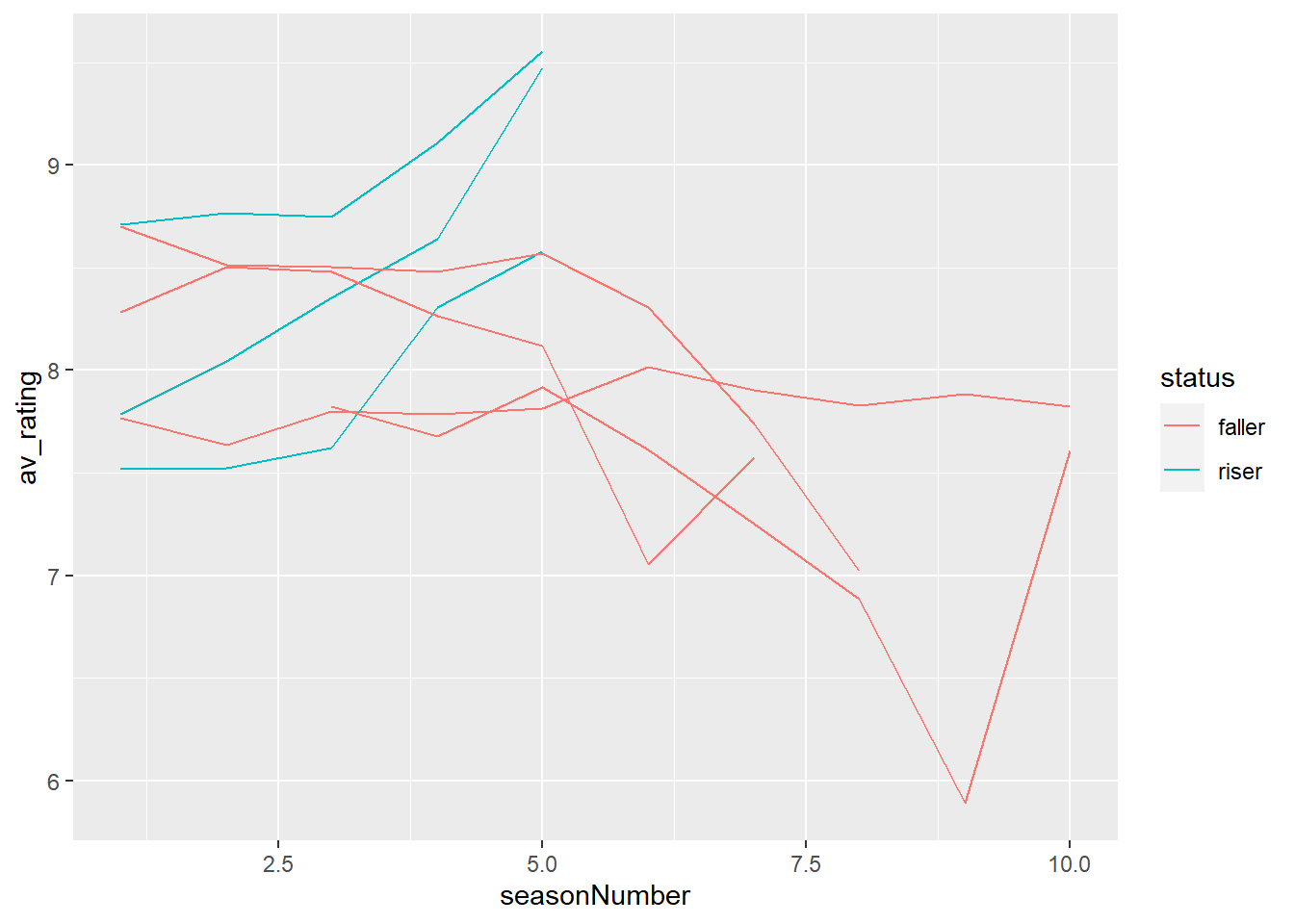
8.2 Highlighting Parts
What if we only want to highlight one group in the data? In this case, maybe we want to highlight the risers in our dataset. If we colour them blue, and leave the others as grey we can immediately highlight them as important and worth noticing in the context of the other data.
We can actually manually colour our traces by using scale_colour_manual(). This lets us manually map our values in our variable (riser and faller) to colours: (blue and grey).
# Highlight risers
my_new_plot + # plot
  scale_colour_manual(values = c ("riser" = "blue", "faller" = "grey")) + # manually map colours
  theme_minimal() # change theme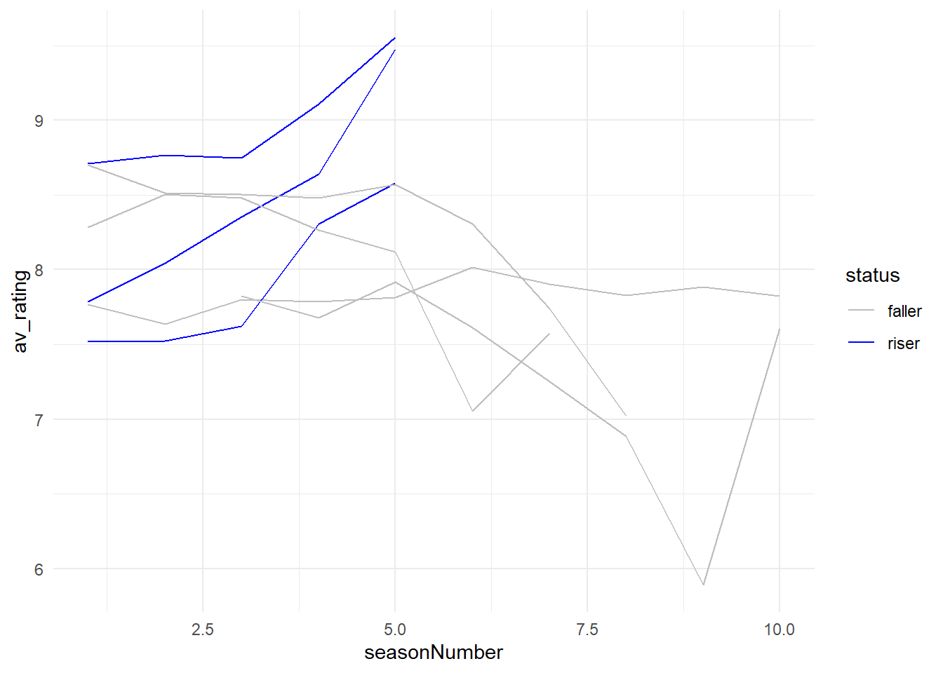
If you’ve mapped a variable to fill, you’ll have to use scale_fill_manual() to map values to colours.
8.3 Putting it Together
Let’s put together all the things we’ve learned so far to make a plot that is more visually appealing and easier to understand.
# Create final plot
my_new_plot + # plot
  scale_colour_manual(values = c ("riser" = "blue", "faller" = "grey")) + # manually map colours
  theme_bw() + # change theme
  theme(legend.position = "none", # remove legend
        panel.grid.minor.y =element_blank(), # remove minor gridlines
        panel.grid.minor.x=element_blank()) + # remove minor gridlines
  labs(title = "Quitting while you're ahead - which TV shows ended at their peak?",  # add title
       x = "Season Number",  # add x-axis label
       y = "Average Rating") +  # add y-axis label
  annotate(geom = "text", x = 3.6, y = 9.5 , label = "Breaking Bad") + # add text annotations
  annotate(geom = "text", x = 6, y = 9.2 , label = "Bojack Horseman") + # add text annotations
  annotate(geom = "text", x = 5.6, y = 8.7 , label = "Nashville") + # add text annotations
  scale_x_continuous(breaks = c(1:10)) + # change x-axis tick numbers
  expand_limits(y = c(5,10)) # expand y-axis limits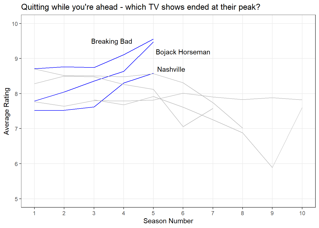
9 Activities
9.1 Download Data
Download the tv_shows_larger_set from the here. Import this data and recreate the first basic plot we made in this lab but including the extra data then modify your basic plot to map the status variable to colour.
💡 Click here to view a solution
# Import data
tv_shows_larger_set <- read_csv("data/tv_shows_larger_set.csv")
Rows: 162 Columns: 6
── Column specification ────────────────────────────────────────────────────────
Delimiter: ","
chr (3): title, genres, status
dbl (3): seasonNumber, av_rating, share
ℹ Use `spec()` to retrieve the full column specification for this data.
ℹ Specify the column types or set `show_col_types = FALSE` to quiet this message.# Basic plot
ggplot(data = tv_shows_larger_set, aes(x = seasonNumber, # x-axis
y = av_rating, # y-axis
group = title, # group by title
colour = title)) + # colour by title
geom_line() # add line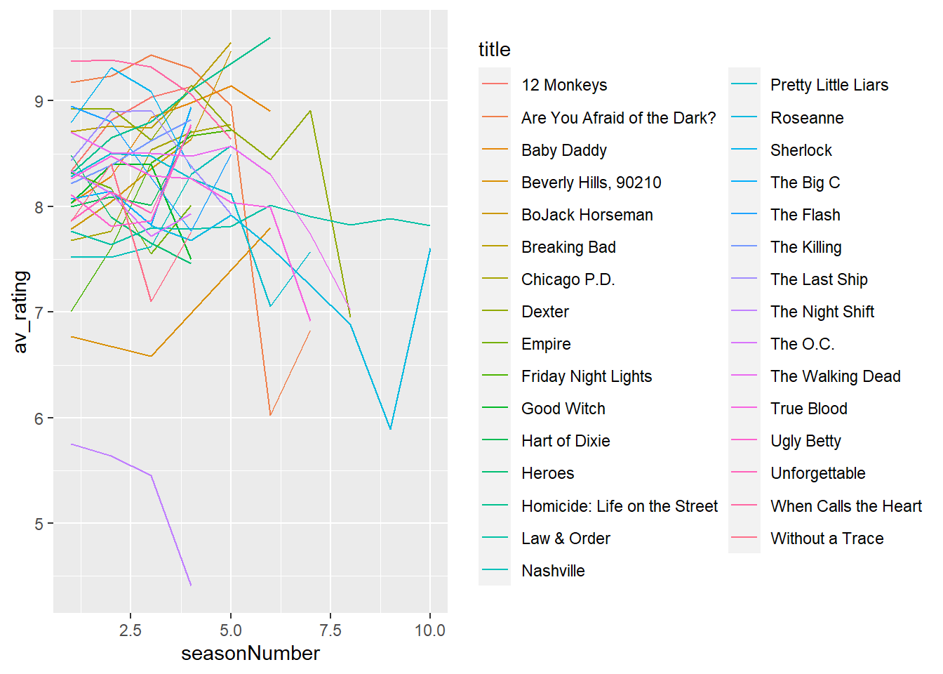
# Modified plot to map status to colour
ggplot(tv_shows_larger_set) + # data
  aes(x = seasonNumber, y = av_rating, group = title, colour = status) + # mapping colour to status
  geom_line() # add line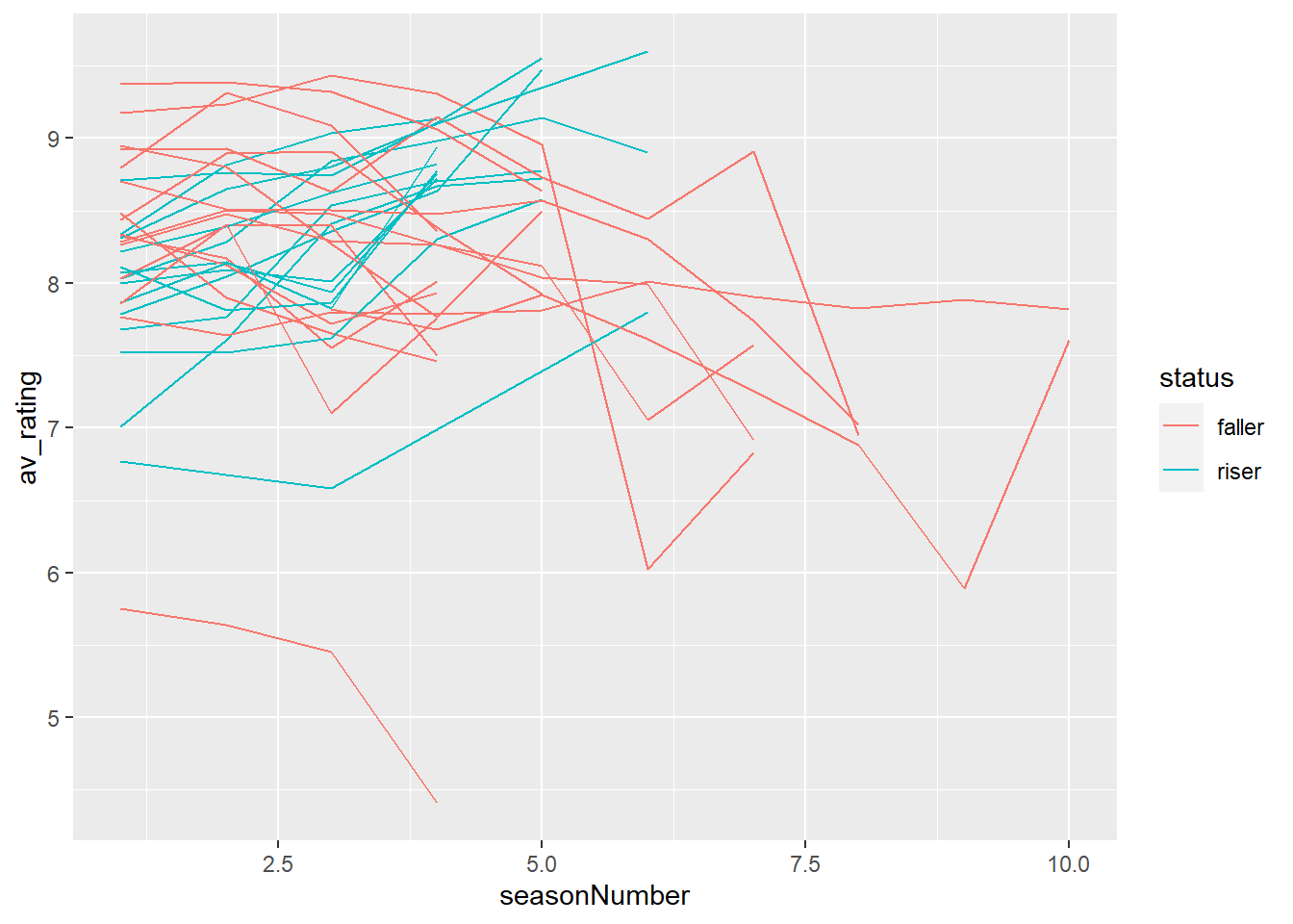
9.2 Upgrading your plot
Produce a de-cluttered, annotated and highlighted plot that shows the faller TV shows. Add a mean rating for the faller TV shows only and use the annotation tools to highlight the following shows within that group:
- Largest ‘drop-off’ in rating
- Lowest rating
💡 Click here to view a solution
# Calculate mean for faller TV shows
faller_mean <- tv_shows_larger_set %>%
  filter(status == "faller") %>%
  summarise(mean_rating = mean(av_rating))

# Print mean
faller_mean
# A tibble: 1 × 1
mean_rating
<dbl>
1 8.06# Modified plot to map status to colour
ggplot(tv_shows_larger_set) + # data
aes(x = seasonNumber, y = av_rating, group = title, colour = status) + # mapping colour to status
geom_line() + # add line
scale_colour_manual(values = c ("riser" = "grey", "faller" = "red")) + # manually map colours
theme_bw() + # change theme
theme(legend.position = "none", # remove legend
panel.grid.minor.y =element_blank(), # remove minor gridlines
panel.grid.minor.x=element_blank()) + # remove minor gridlines
labs(title = "Quitting while you're ahead - which TV shows ended at their peak?", # add title
x = "Season Number", # add x-axis label
y = "Average Rating") + # add y-axis label
scale_x_continuous(breaks = c(1:10)) + # change x-axis tick numbers
expand_limits(y = c(5,10)) + # expand y-axis limits
geom_hline(yintercept = 8.06, lty = 3) + # add horizontal line
annotate(geom = "text", x = 9, y = 8.2 , label = "Faller Mean Rating") + # add text annotation
annotate(geom = "text", x = 6, y = 5.9 , label = "Largest Drop-off") + # add text annotation
annotate(geom = "text", x = 1.5, y = 6 , label = "Lowest Rating") # add text annotation
10 Bonus
We can manually colour a single group in our data through a two step process. For example, if we want to highlight “Breaking Bad” but not the other shows we can:
- Make a “dummy” variable called
breaking_badby recoding thegenrevariable to haveYwhen this variable has “Drama” in it, andNfor the other categories. - Manually colour the lines using
scale_colour_manual()by specifying avalues()argument.
In order to make our new variable, we will use a command called mutate() to search for “Breaking Bad” in the title variable.
10.1 Dummy variables
What if we wanted to highlight a single TV show in the data, such as Breaking Bad?
We can create a dummy variable in our dataset, much like status. In this one, we want to create a variable called breaking_bad where the value is Y (yes) where the title is Breaking Bad and N (no) otherwise:
We can add a new variable using what is called a mutate() function. It lets us calculate a new variable, based on the other values of the variable. If you’ve used Excel’s IF() function, it’s very similar in terms of the syntax. We first provide a condition:
if(!require("tidyverse")) install.packages("tidyverse")

tv_shows_breaking <- tv_shows %>%
  mutate(breaking_bad =
           case_when(
             title == "Breaking Bad" ~ "Y",
             TRUE ~ "N"
  ))
10.2 Highlighting multiple lines
tv_shows_comedy <- tv_shows %>%
  mutate(
   #check whether a cell has the word "Comedy" in it
      #If it does, output a "Y",
    comedy = case_when(
        str_detect(genres, "Comedy") ~ "Y",
      #otherwise, output a "N"
                  TRUE ~ "N"))
Now we can use scale_colour_manual() to remap the TRUE and FALSE values.
ggplot(tv_shows_comedy) +
  aes(x = seasonNumber, y = av_rating, group = title, colour = comedy) +
  geom_line() +
  scale_colour_manual(values=c("Y" = "blue", "N" = "grey")) +
  scale_x_continuous(breaks=c(1:10))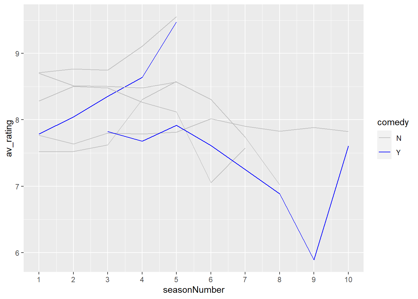
10.3 Highlighting a subset
This is an optional section, but it shows you a specific trick in highlighting your data.
What if we wanted to highlight a specific time period in our dataset? We can actually subset the data, and plot over the original data with a different colour to highlight it.
We want to specify this criteria in our filter() statement:
tv_subset <- tv_shows %>%
  filter(seasonNumber > 2) %>%
  filter(seasonNumber < 6)
Now we can use this dataset to highlight this portion of the data:
ggplot(tv_shows) +
    aes(x = seasonNumber, y= av_rating, group=title) +
  #colour all the data - notice we pass a colour argument directly in
    geom_line(colour = "grey") +
  #colour the subset - notice that pass a colour argument in directly
  #also notice that we specify `data` to be our `tv_subset`
  geom_line(data = tv_subset, colour = "blue") +
  geom_vline(xintercept = 3, lty = 3) + # add vertical line
  geom_vline(xintercept = 5, lty = 3) + # add vertical line
  annotate("text", x = 4, y = 7, label="This is a critical\ntime period") + # add text annotation
  labs(title = "Seasons 3 to 5 are Critical") + # add title
  theme_minimal() + # change theme
  scale_x_continuous(breaks = c(1:10)) # change x-axis tick numbers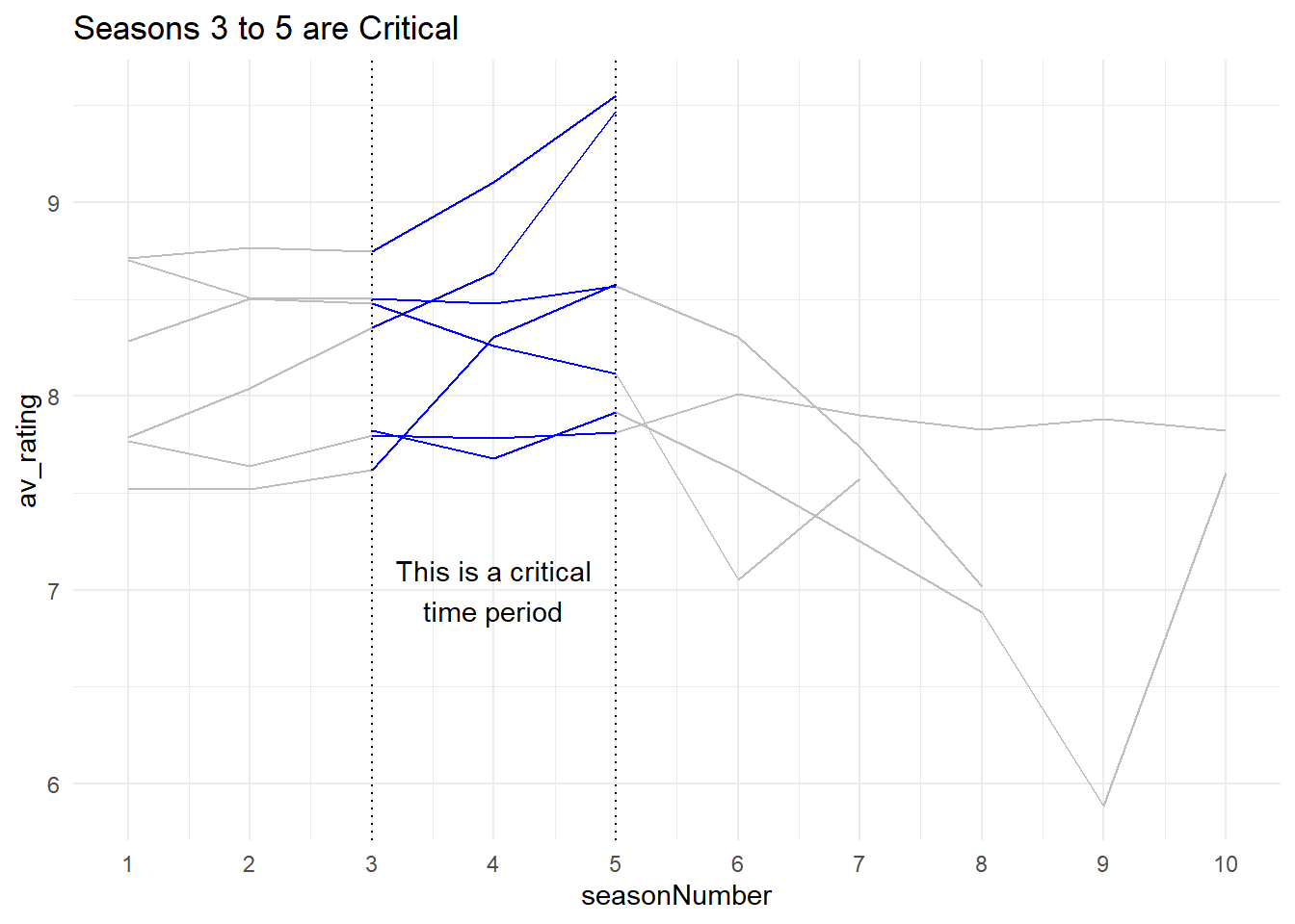
11 Recap
- There are two key motivations for data visualisation: exploration and communication;
- We can use
ggplot2to create a wide range of visualisations; - We can modify these plots to be more informative through de-cluttering, annotating and highlighting.