# Check whether a package is installed and install if not.
# This will also load the package if already installed!
if(!require("sf")) install.packages("sf")
if(!require("tmap")) install.packages("tmap")
if(!require("dplyr")) install.packages("dplyr")
if(!require("COVID19")) install.packages("COVID19")1 Objectives
- Import and review simple features data;
- Manipulate simple features data;
- Draw a static map;
- Draw an animated map.
2 Start a Script
For this lab or project, begin by:
- Starting a new
Rscript - Create a good header section and table of contents
- Save the script file with an informative name
- set your working directory
Aim to make the script a future reference for doing things in R!
3 Introduction
Many geographic information system (GIS) programmes make it extraordinarily easy for users to create maps by loading a file with a geographic identifier and data to plot. They are designed to be ‘point and click’, meaning that they do a lot of the hard work behind the scenes. We have to do this work ourselves in R as it has no innate knowledge of what we want to graph, so we have to provide every detail. But this provides superior flexibility compared to ‘point and click’ programmes! Let’s take a look at making some basic maps using a dataset you’ve probably heard of before…
4 Packages and Data
For this lab we are going to use the official COVID-19 statistics from the dedicated package (COVID19). Let’s first install and load the packages we need. We will be using sf to handle simple features, tmap for drawing maps, and dplyr for manipulating data.
4.1 COVID-19 Data
We can get up-to-date global data for COVID-19:
# Download data - this may take a while!
covid_data = COVID19::covid19()
We have invested a lot of time and effort in creating COVID-19 Data
Hub, please cite the following when using it:
Guidotti, E., Ardia, D., (2020), "COVID-19 Data Hub", Journal of Open
Source Software 5(51):2376, doi: 10.21105/joss.02376
The implementation details and the latest version of the data are
described in:
Guidotti, E., (2022), "A worldwide epidemiological database for
COVID-19 at fine-grained spatial resolution", Sci Data 9(1):112, doi:
10.1038/s41597-022-01245-1
To print citations in BibTeX format use:
> print(citation('COVID19'), bibtex=TRUE)
To hide this message use 'verbose = FALSE'.# Print number of columns
ncol(covid_data)[1] 47# Print number of rows
nrow(covid_data)[1] 281643# Print variable names
names(covid_data) [1] "id" "date"
[3] "confirmed" "deaths"
[5] "recovered" "tests"
[7] "vaccines" "people_vaccinated"
[9] "people_fully_vaccinated" "hosp"
[11] "icu" "vent"
[13] "school_closing" "workplace_closing"
[15] "cancel_events" "gatherings_restrictions"
[17] "transport_closing" "stay_home_restrictions"
[19] "internal_movement_restrictions" "international_movement_restrictions"
[21] "information_campaigns" "testing_policy"
[23] "contact_tracing" "facial_coverings"
[25] "vaccination_policy" "elderly_people_protection"
[27] "government_response_index" "stringency_index"
[29] "containment_health_index" "economic_support_index"
[31] "administrative_area_level" "administrative_area_level_1"
[33] "administrative_area_level_2" "administrative_area_level_3"
[35] "latitude" "longitude"
[37] "population" "iso_alpha_3"
[39] "iso_alpha_2" "iso_numeric"
[41] "iso_currency" "key_local"
[43] "key_google_mobility" "key_apple_mobility"
[45] "key_jhu_csse" "key_nuts"
[47] "key_gadm" Looks like we have a lot of data here (281,639 observations of 47 variables!), so we will need to think carefully about what we want to display on a map!
4.2 Geographic Data
We will need geographic data alongside our COVID-19 data, otherwise we won’t be able to plot it! Luckily we can use rnaturalearth for this:
if(!require("magrittr")) install.packages("magrittr") # for the pipe operator %>%
if(!require("devtools")) install.packages("devtools") # for installing packages from GitHub

# Due to some issues with the CRAN version of this package, it must be installed from GitHub using the following command
if(!require("rnaturalearth")) devtools::install_github("ropensci/rnaturalearth")

# Download geographic data as a shapefile
world_rnatural = rnaturalearth::ne_download(returnclass = "sf")
Reading layer `ne_110m_admin_0_countries' from data source
`C:\Users\00708040\AppData\Local\Temp\RtmpE7ga5L\ne_110m_admin_0_countries.shp'
using driver `ESRI Shapefile'
Simple feature collection with 177 features and 168 fields
Geometry type: MULTIPOLYGON
Dimension: XY
Bounding box: xmin: -180 ymin: -90 xmax: 180 ymax: 83.64513
Geodetic CRS: WGS 84# Select key variables and assign them to a new object
world_iso = world_rnatural %>% # Pipe operator
select(NAME_LONG, ISO_A3_EH, POP_EST, GDP_MD, CONTINENT) # Select variablesTo see what’s in the world_iso object we can plot it, with the default setting in sf showing the geographic distribution of each variable:
# Plot a subset of our data
plot(world_iso)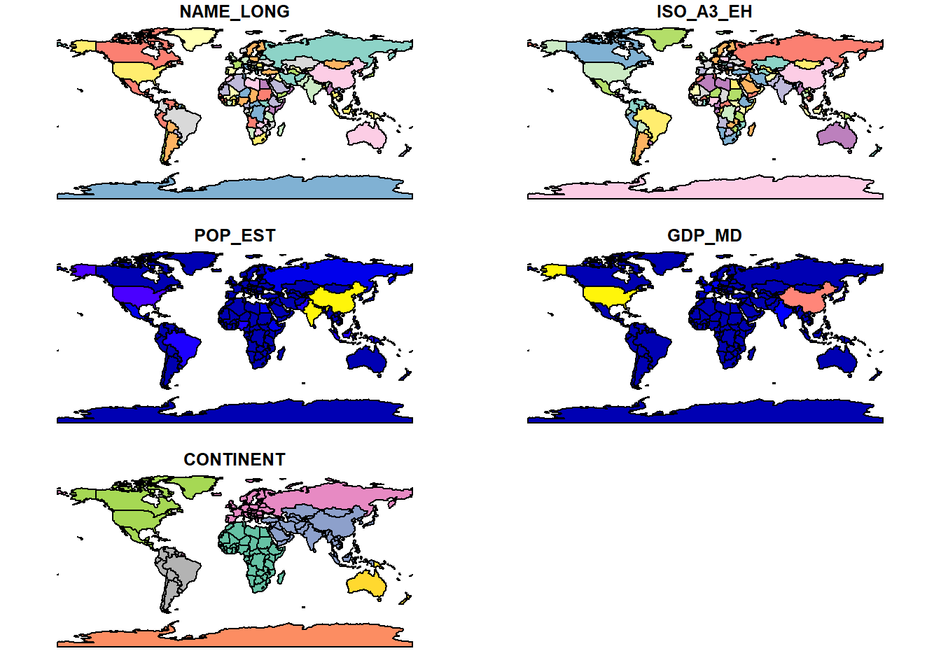
Our first maps! These variables are pretty self-explanatory, but a point to note is that ISO_A3_EH is the 3 letter country code.
5 Simple Features
5.1 What are Simple Features?
Simple features are a way of representing geographic data in R. They are a type of vector data, which means that they are made up of points, lines, or polygons. Points are used to represent single locations, lines are used to represent linear features such as roads, and polygons are used to represent areas such as countries. Simple features are stored in a data frame (shapefiles), with each row representing a single feature. The data frame has a special column called geometry which contains the coordinates of the feature.
5.2 Simple Features in R
The sf package is used to handle simple features in R. It is a very powerful package, and we will only be using a small part of its functionality in this lab. The sf package is designed to work with the dplyr package, which is used for data manipulation. This means that we can use dplyr functions to manipulate simple features data. Let’s take a look at the world_iso object we created earlier:
# Print the first 6 rows of the data
head(world_iso)
Simple feature collection with 6 features and 5 fields
Geometry type: MULTIPOLYGON
Dimension: XY
Bounding box: xmin: -180 ymin: -18.28799 xmax: 180 ymax: 83.23324
Geodetic CRS: WGS 84
NAME_LONG ISO_A3_EH POP_EST GDP_MD CONTINENT
1 Fiji FJI 889953 5496 Oceania
2 Tanzania TZA 58005463 63177 Africa
3 Western Sahara ESH 603253 907 Africa
4 Canada CAN 37589262 1736425 North America
5 United States USA 328239523 21433226 North America
6 Kazakhstan KAZ 18513930 181665 Asia
geometry
1 MULTIPOLYGON (((180 -16.067...
2 MULTIPOLYGON (((33.90371 -0...
3 MULTIPOLYGON (((-8.66559 27...
4 MULTIPOLYGON (((-122.84 49,...
5 MULTIPOLYGON (((-122.84 49,...
6 MULTIPOLYGON (((87.35997 49...We can see that the geometry column contains the coordinates of each country. It is important to note that the geometry column is a special type of column called a sfc_GEOMETRY column. This is a special type of column that contains the coordinates of the feature. The key features of sfc_GEOMETRY columns are:
- Each row is a feature that we could plot; since we called
head()we have only see the first 6 even though the full dataset has more; - We have 5 fields. Each column is a field with (potentially) useful information about the feature.The geometry column is not considered a field;
- We are told this is a collection of multipolygons;
- We are told the bounding box for our data (the most western/eastern longitudes and northern/southern latitudes);
- We are told the Coordinate Reference System (CRS), which in this case is “WGS 84.” CRSs are cartographers’ ways of telling each other what system they used for describing points on the earth. Cartographers need to pick an equation for an ellipsoid to approximate earth’s shape since it’s slightly pear-shaped. Cartographers also need to determine a set of reference markers–known as a datum–to use to set coordinates, as earth’s tectonic plates shift ever so slightly over time. Together, the ellipsoid and datum become a CRS. WGS 84 is one of the most common CRSs and is the standard used for GPS applications;
- Finally, we are provided a column called “geometry.” This column contains everything that
Rwill need to draw each of the countries.
5.3 Simple Features Manipulation
We can use dplyr to manipulate simple features data. Let’s say we want to select only the countries in Europe. We can do this using the filter() function:
# Filter the data to only include countries in Europe
world_europe <- world_iso %>%
  filter(CONTINENT == "Europe") # Filter the data
5.4 Transforming Simple Features
n issue with the result from a data visualisation perspective is that this unprojected visualisation distorts the world: countries such as Greenland at high latitudes appear bigger than the actually are. Let’s plot this to see what we mean:
# Plot world
plot(st_geometry(world_iso))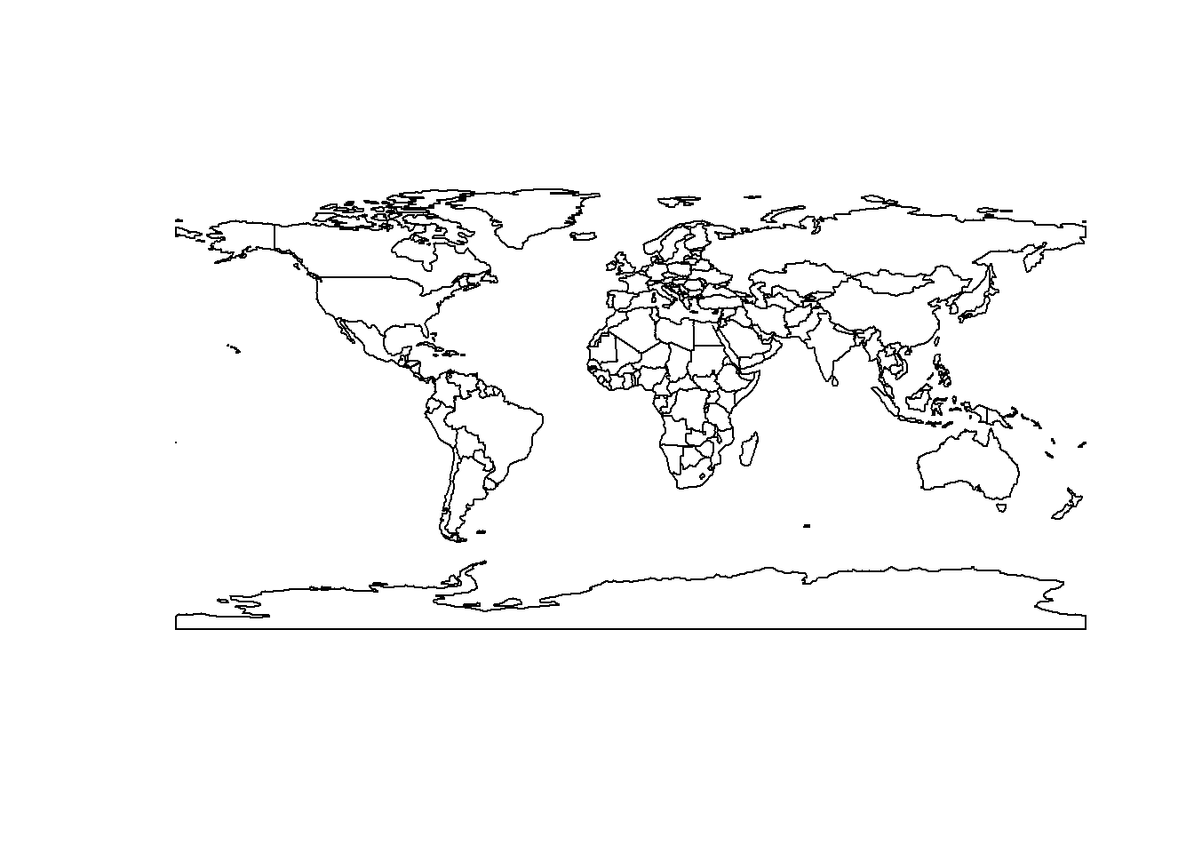
To overcome this issue we will project the our geographic data:
# Transform the map
world_projected = world_iso %>%
  st_transform("+proj=moll") # Transform the map

# Plot transformed map
plot(st_geometry(world_projected)) # Plot the map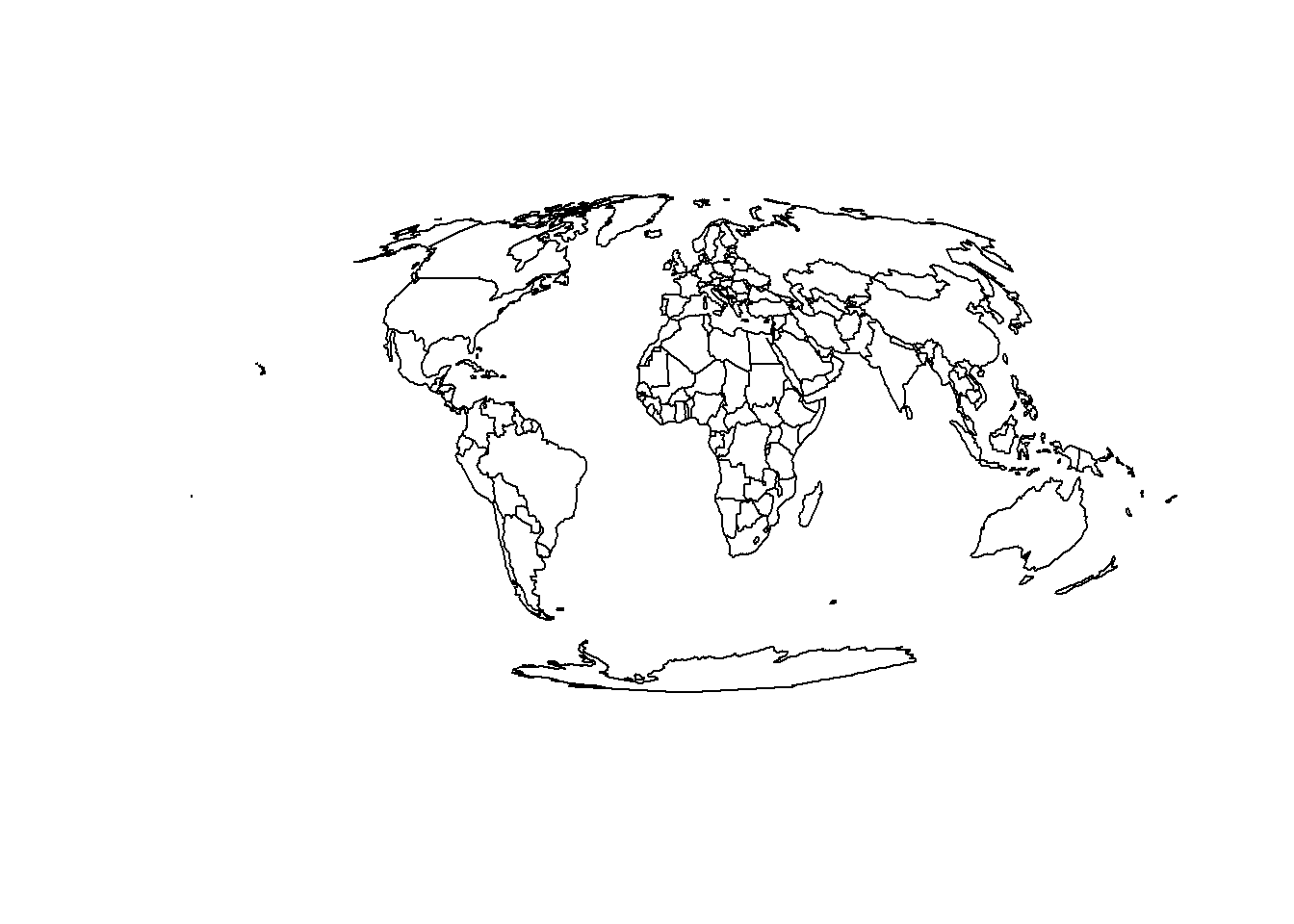
We can see that the map is now projected, and Greenland is no longer distorted. We can also see that the geometry column is now a sfc_GEOMETRY column, which means that we can plot it directly using plot().
6 Combining Data
Now we have our county geospatial data and our COVID-19 data - how in the world do we plot this? For this lab there are three simple steps to prepare your data for graphing.
- Import all data (already completed above);
- Clean the geospatial data (already completed above);
- Merge the data together.
# Merge the data using dplyr
combined_df = dplyr::left_join(world_projected,  # Dataset 1
                               covid_data,  # Dataset 2
                               by = c("ISO_A3_EH" = "iso_alpha_3"))  # Variables
6.1 Calculating Area
The sf package provides a wide range of functions for calculating geographic variables such as object centroid, bounding boxes, lengths and area. We can use this to calculate the population density of each country:
# Calculate country area (km)
combined_df$Area_km = as.numeric(st_area(combined_df)) / 1e6 # Divide by 1e6 to convert to km

# Calculate population density
combined_df$`Pop/km2` = as.numeric(combined_df$POP_EST) / combined_df$Area_km
7 Plotting Data
7.1 sf Plots
We can very easily graph our COVID-19 data for a single day using the sf package’s plot() function:
# Filter data for 24th May 2020
data_yesterday = combined_df %>%
  filter(date == "2020-05-24") # Filter data

# Plot data
plot(data_yesterday, max.plot = 53) 
Let’s just a look at a single variable, deaths, as there are too many above:
# Plot data for a single variable
plot(data_yesterday["deaths"])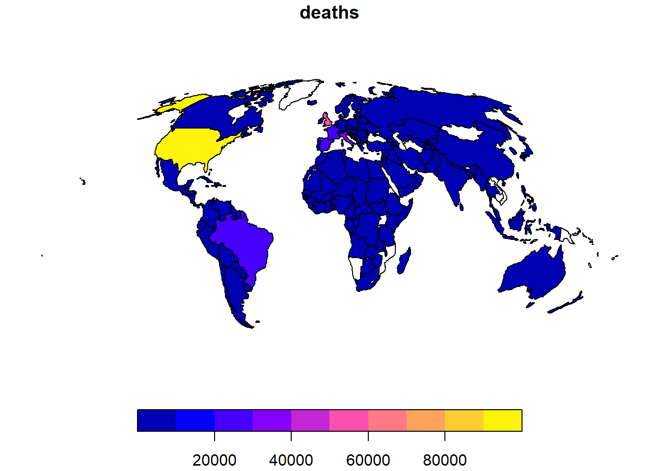
# Improve the plot
plot(data_yesterday["deaths"], # Data
     axes = TRUE, # Add axes
     graticule = TRUE, # Add graticule
     main = "COVID-19 Deaths on 24th May 2020") # Add title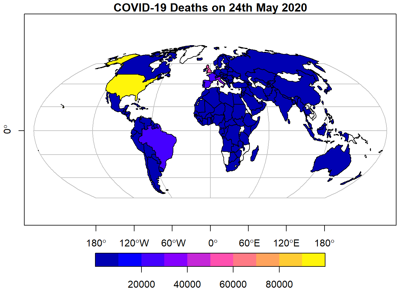
We can also plot multiple variables on the same plot:
# Plot multiple variables
plot(data_yesterday[c("deaths", "tests")], # Data
     axes = TRUE, # Add axes
     graticule = TRUE) # Add graticule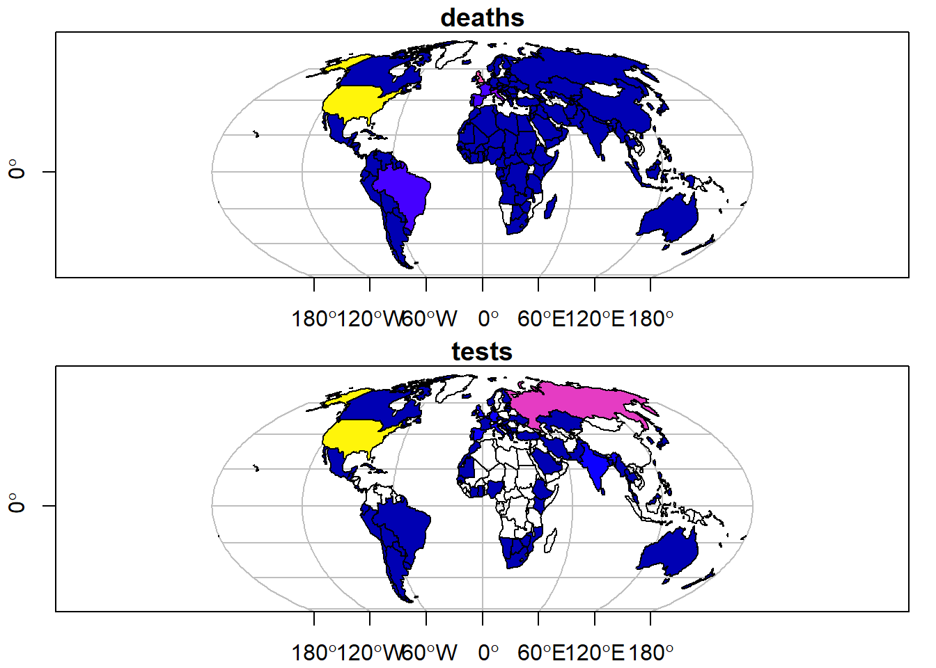
7.2 tmap Plots
The tmap package is a very powerful package for plotting geographic data. It is designed to work with sf objects, and provides a wide range of functions for plotting data. Let’s plot the COVID-19 data for a single day:
# Plot data
tm_shape(data_yesterday) + # Data
  tm_polygons("deaths", # Variable
              title = "Deaths", # Title
              palette = "Reds", # Colour palette
              border.col = "black") + # Border colour
  tm_layout(legend.outside = TRUE, # Move legend outside of plot
            legend.outside.position = "bottom", # Position legend at bottom
            legend.frame = TRUE) # Add legend frame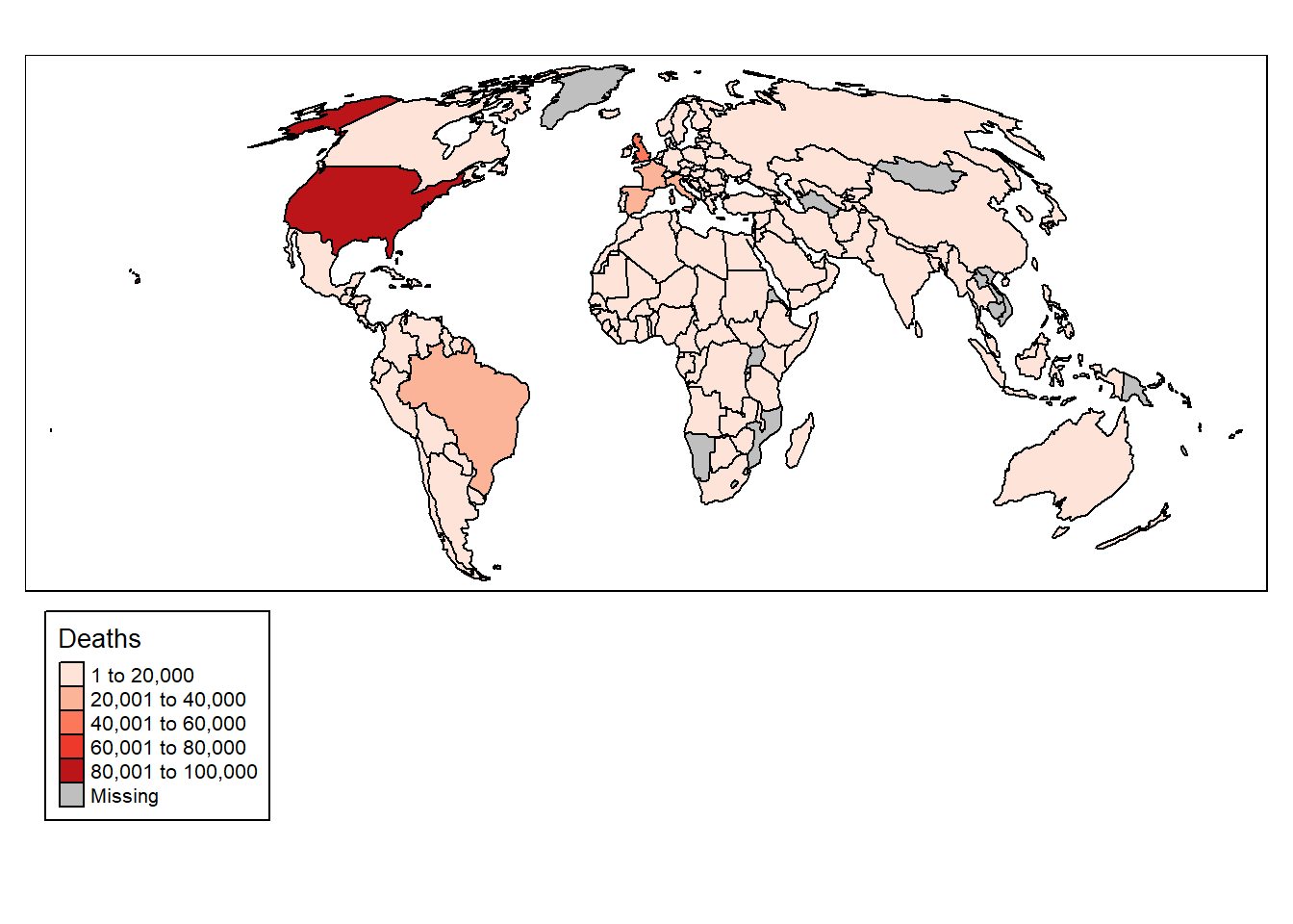
You will notice that tmap uses + to add elements like ggplot2. These maps are pretty ugly though, so let’s change the colour palette:
# Plot data
tm_shape(data_yesterday) + # Data
  tm_polygons("deaths", # Variable
              title = "Deaths", # Title
              palette = "viridis", # Colour palette
              border.col = "black") + # Border colour
  tm_layout(legend.outside = TRUE, # Move legend outside of plot
            legend.outside.position = "bottom", # Position legend at bottom
            legend.frame = TRUE) # Add legend frame
The map can be further improved by adding graticules representing the curvature of the Earth, created as follows:
# Add graticules
data_yesterday.g = st_graticule(data_yesterday)
We can then plot the graticules and the data together while removing the plot border:
# Plot data
tm_shape(data_yesterday.g) + # Data
  tm_lines(col = "grey") + # Add graticules
  tm_shape(data_yesterday) + # Data
  tm_polygons("deaths", # Variable
              title = "Deaths", # Title
              palette = "viridis", # Colour palette
              border.col = "black") + # Border colour
  tm_layout(legend.outside = TRUE, # Move legend outside of plot
            legend.outside.position = "bottom", # Position legend at bottom
            legend.frame = TRUE, frame = FALSE) # Add legend frame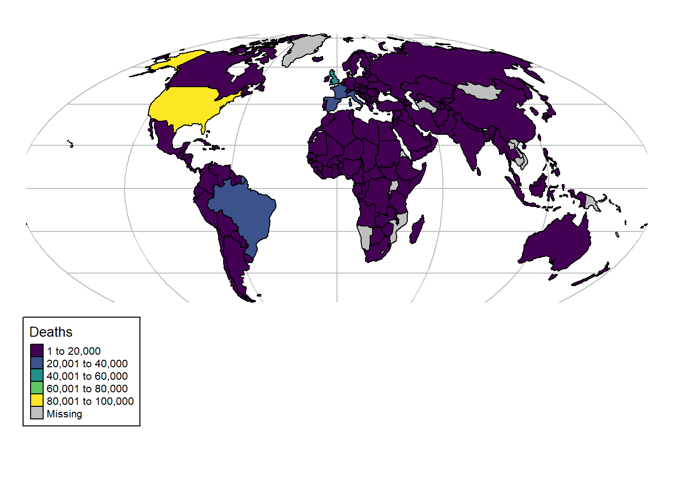
7.3 ggplot2 Plots
The ggplot2 package is a very powerful package for plotting data. It can be used with sf objects, and provides a wide range of functions for plotting data. Let’s plot the COVID-19 data for a single day:
# Load ggplot2
if (!require("ggplot2")) install.packages("ggplot2")
Loading required package: ggplot2# Plot data
ggplot(data_yesterday) + # Data
geom_sf(aes(fill = deaths)) + # Variable
scale_fill_viridis_c(option = "C") + # Colour palette
theme_void() # Remove background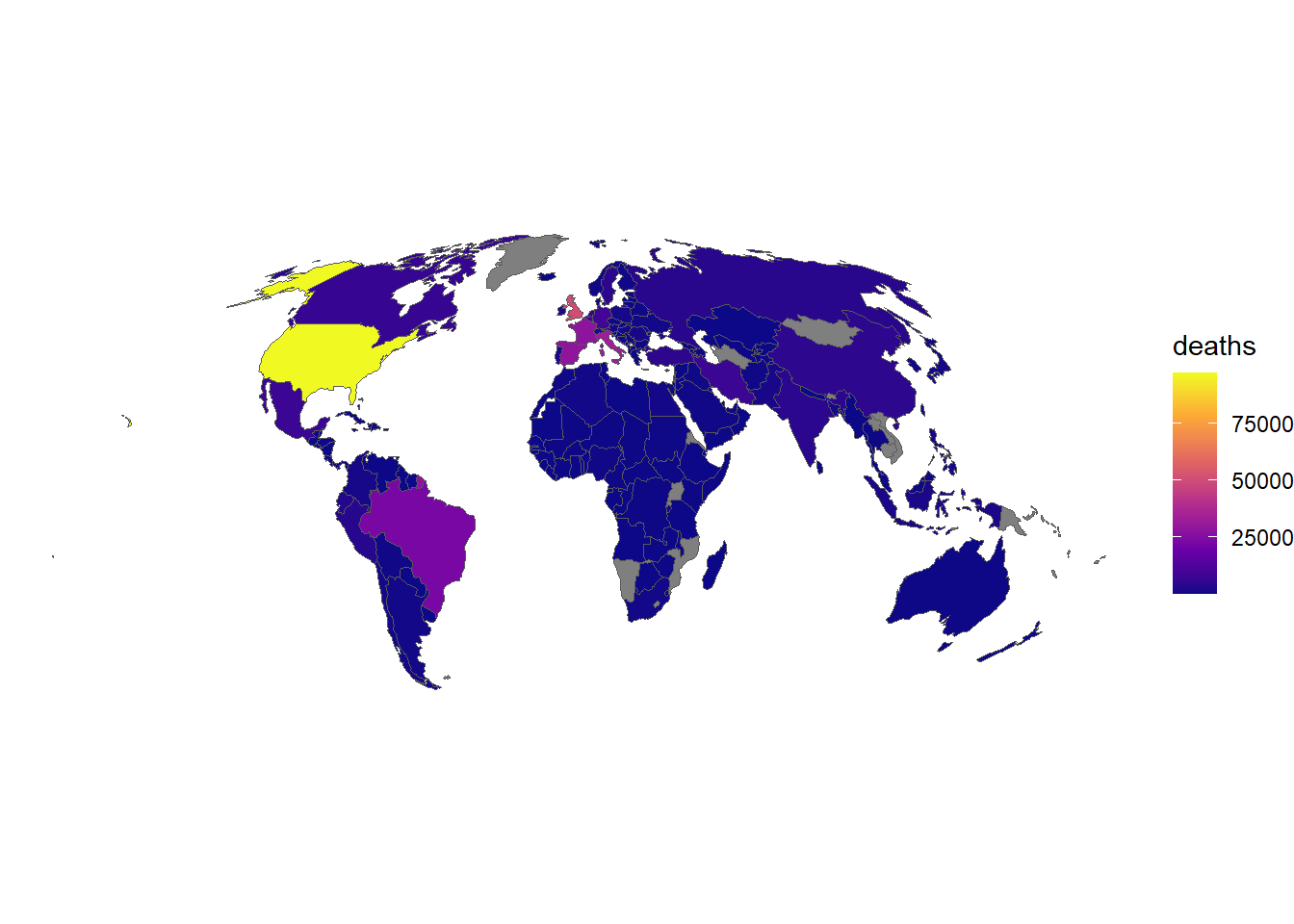
We can customise the plot by adding a title and changing the colour palette:
# Plot data
ggplot(data_yesterday) + # Data
  geom_sf(aes(fill = deaths)) + # Variable
  scale_fill_viridis_c(option = "A") + # Colour palette
  theme_void() + # Remove background
  labs(title = "COVID-19 Deaths on 24th May 2020") # Add title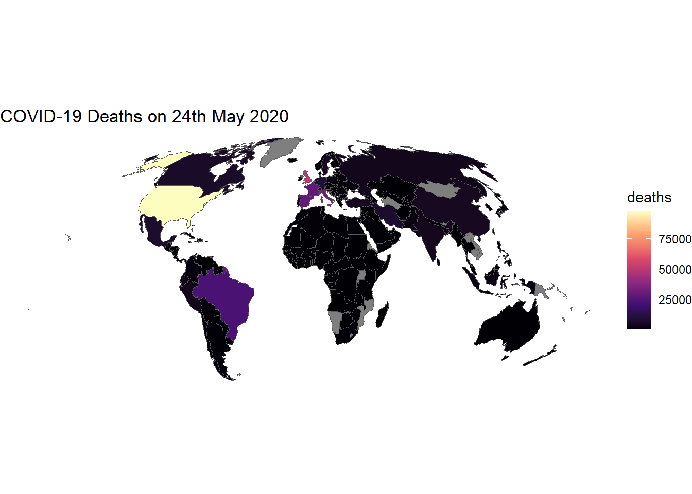
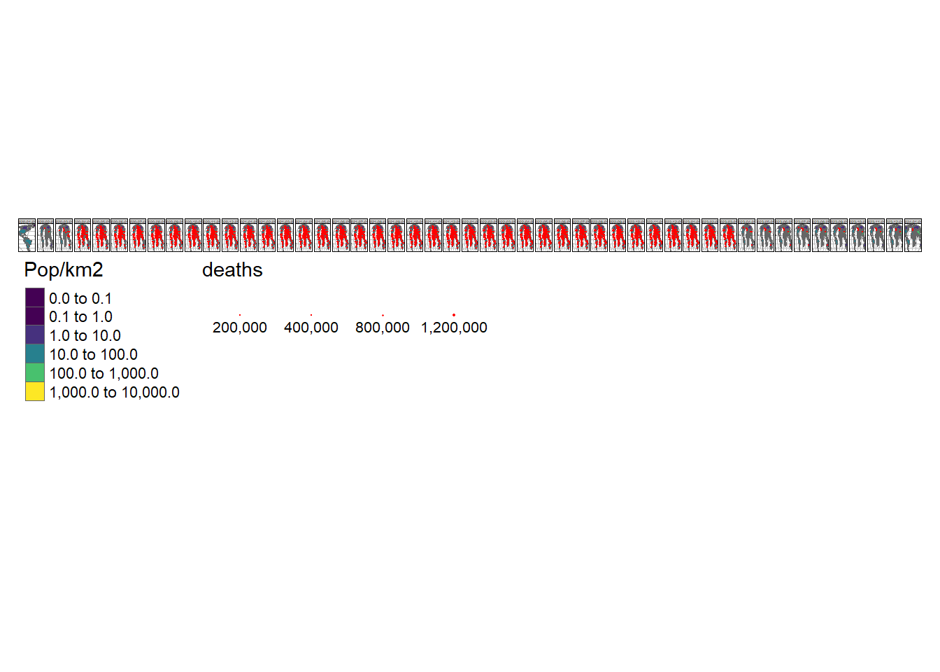
7.4 Animated Maps
Animated graphics can communicate change effectively, and animated maps are useful for showing evolving geographic phenomena, such as the spread of COVID-19 worldwide. Animated maps can be created with tmap by extending the tm_facet(). Let’s start by creating a facetted map showing the total number of deaths on the first day of each month in our data:
# Create a new variable - date as a text string
combined_df$Date = as.character(combined_df$date)

tm_shape(data_yesterday.g) +
  # Graticule colour
  tm_lines(col = "grey") +
  # Specify object shape
  tm_shape(data_yesterday) +
  # Draw polygons
  tm_polygons(
    "Pop/km2",
    palette = "viridis",
    style = "log10_pretty",
    n = 3
    ) +
  # Select data from 1st every month
  tm_shape(combined_df %>% filter(grepl(pattern = "01$", date))) +
  # Draw dots
  tm_dots(size = "deaths", col = "red") +
  # Create a facet (i.e. plot for each month)
  tm_facets("Date", nrow = 1, free.scales.fill = FALSE) +
  # ALter legend
  tm_layout(
    legend.outside.position = "bottom",
    legend.stack = "horizontal"
    )
To turn this into an animated map we need to make some small changes to the code above:
# Install gifski
if(!require("gifski")) install.packages("gifski")

m = tm_shape(data_yesterday.g) + # Graticule colour
  tm_lines(col = "grey") + # Specify object shape
  tm_shape(data_yesterday) + # Draw polygons
  tm_polygons(
    "Pop/km2",
    palette = "viridis",
    style = "log10_pretty",
    n = 3
    ) +
  tm_shape(combined_df %>% filter(grepl(pattern = "01$", date))) + # Select data from 1st every month
  tm_dots(size = "deaths", col = "red") + # Draw dots
  tm_facets(along = "Date", free.coords = FALSE) + # Create a facet (i.e. plot for each month)
  tm_layout(legend.outside = TRUE) # Alter legend

tmap_animation(m, "covid-19-animated-map-test.gif", width = 800) # Create animation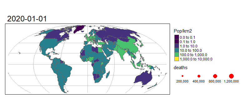
8 Activities
8.1 Download Data
Download the county-level data for the UK with this command:
uk_city = COVID19::covid19(country = "GBR", # Country code
                           level = 2) # Level of administrative division
8.2 Plot UK Data
Explore the geographic distribution of the outbreak using the lab code as a guide. Produce a static map of the UK infection on 2021-01-01.
💡 Click here to view a solution
# Download geographic data as a shapefile
world_rnatural = rnaturalearth::ne_download(returnclass = "sf")

# Select key variables and assign them to a new object
uk_iso = world_rnatural %>% # Data
  select(NAME_LONG, ISO_A3_EH, POP_EST, GDP_MD, CONTINENT) %>% # Variables
  filter(ISO_A3_EH == "GBR") # Filter for UK

# Merge the geographic data with the COVID-19 data
combined_df = left_join(uk_iso, uk_city, # Data
                        by = c("ISO_A3_EH" = "iso_alpha_3")) # Variables

# Filter data for 1st Jan 2021
data_jan = combined_df %>% # Data
  filter(date == "2021-01-01") # Date

# Plot data
ggplot(data_jan) + # Data
  geom_sf(aes(fill = deaths)) + # Variable
  scale_fill_viridis_c(option = "C") + # Colour palette
  theme_void() # Remove background
8.3 Plot Europe Data
Explore the geographic distribution of the outbreak using the lab code as a guide. Produce a static map of the European infection on 2021-01-01.
💡 Click here to view a solution
# Download covid-19 data
europe = COVID19::covid19(continent = "Europe", # Country code
                           level = 2) # Level of administrative division

# Download geographic data as a shapefile
world_rnatural = rnaturalearth::ne_download(returnclass = "sf")

# Select key variables and assign them to a new object
europe_iso = world_rnatural %>%
  select(NAME_LONG, ISO_A3_EH, POP_EST, GDP_MD, CONTINENT) %>%
  filter(CONTINENT == "Europe")

# Merge the geographic data with the COVID-19 data
combined_df = left_join(europe_iso, europe, by = c("ISO_A3_EH" = "iso_alpha_3"))

# Filter data for 1st Jan 2021
data_jan = combined_df %>%
  filter(date == "2021-01-01")

# Plot data
ggplot(data_jan) +
  geom_sf(aes(fill = deaths)) +
  scale_fill_viridis_c(option = "C") +
  theme_void()
8.4 Animated Map
Produce an animated map of the UK infection from the start of the pandemic to the present day.
💡 Click here to view a solution
# Download geographic data as a shapefile
world_rnatural = rnaturalearth::ne_download(returnclass = "sf")

# Select key variables and assign them to a new object
uk_iso = world_rnatural %>%
  select(NAME_LONG, ISO_A3_EH, POP_EST, GDP_MD, CONTINENT) %>%
  filter(ISO_A3_EH == "GBR")

# Merge the geographic data with the COVID-19 data
combined_df = left_join(uk_iso, uk_city, by = c("ISO_A3_EH" = "iso_alpha_3"))

# Plot data
m = tm_shape(combined_df) +
  tm_polygons(
    "deaths",
    palette = "viridis",
    style = "log10_pretty",
    n = 3
    ) +
  tm_facets(along = "date", free.coords = FALSE) +
  tm_layout(legend.outside = TRUE)

tmap_animation(m, "covid-19-animated-map-uk.gif", width = 800)
9 Recap
- Geographic data can be downloaded from the internet using the
rnaturalearthpackage; - Geographic data can be merged with COVID-19 data using the
left_join()function; - Geographic data can be plotted using the
ggplot2package; - Geographic data can be plotted using the
tmappackage; - Animated maps can be created using the
tmappackage.