# Import packages
import pandas as pd # For data manipulation
import numpy as np # For data manipulation
import matplotlib.pyplot as plt # For plotting
import seaborn as sns # For plotting
import matplotlib.gridspec as gridspec # For plotting1 Learning Objectives
- Review some basic graphical formats and when they are useful;
- Learn key tools for creating graphs in
R; - Make some basic graphs in
R.
2 Introduction
Data visualisation is an essential component of data analysis. The primary objective of any data visualisation (or data viz if you’re one of the cool kids) is either to allow us to understand complex data sets (exploratory data analysis) and help others understand them (presentations). R users have what is widely considered one of the best data visualisation package, ggplot2, however Python also has some pretty good options. In this lab we will explore some of the basic plotting tools in Python.
3 Plotting in Python
There is a large choice of plotting libraries in Python, all with different strengths and weaknesses. In the frame of this computer lab, we present two of them: Matplotlib and seaborn. We use these two packages because 1) they are very popular and you will necessarily encounter them, 2) they are examples of low- (Matplotlib) and hihgh-level (seaborn) libraries, 3) they represent two different plotting “philosophies” and finally 4) seaborn builds on top of Matplotlib which facilitates the learning.
4 Packages and Data
First we need to load the packages we will use in this lab. We will use the pandas package to read in the data and the seaborn and matplotlib packages to make the plots.
We also need some data to plot. Let’s use our trusty friend palmerpenguins again:
# Read in data
penguins = pd.read_csv("https://raw.githubusercontent.com/allisonhorst/palmerpenguins/master/inst/extdata/penguins.csv")

# Check data
penguins.head(5) # Show first 5 rows| species | island | bill_length_mm | bill_depth_mm | flipper_length_mm | body_mass_g | sex | year | |
|---|---|---|---|---|---|---|---|---|
| 0 | Adelie | Torgersen | 39.1 | 18.7 | 181.0 | 3750.0 | male | 2007 |
| 1 | Adelie | Torgersen | 39.5 | 17.4 | 186.0 | 3800.0 | female | 2007 |
| 2 | Adelie | Torgersen | 40.3 | 18.0 | 195.0 | 3250.0 | female | 2007 |
| 3 | Adelie | Torgersen | NaN | NaN | NaN | NaN | NaN | 2007 |
| 4 | Adelie | Torgersen | 36.7 | 19.3 | 193.0 | 3450.0 | female | 2007 |
5 Matplotlib
Matplotlib is a low-level library, which means that it is very flexible but also that it requires a lot of code to make a plot, a little bit like base R. The first step of any plotting is to create 1) a figure that will contain all the plot parts and 2) one or more axis objects that will contains specific parts of the figure e.g., if we want to create a grid of plots. There are multiple ways of creating these objects, but here we just use the subplots (don’t forget the final s) function:
# Create figure and axis objects
fig, ax = plt.subplots()

# Create a grid of plots
fig, ax = plt.subplots(2, 2)

# Create a grid of plots with different sizes
fig, ax = plt.subplots(2, 2, gridspec_kw={'width_ratios': [1, 2], 'height_ratios': [4, 1]})
5.1 Histograms
Let’s start with a simple histogram. We want to plot the body mass of the penguins. We can do this with the hist function:
# Create figure and axis objects
fig, ax = plt.subplots()

# Histogram
ax.hist(penguins["body_mass_g"]) # x

# Show plot
plt.show()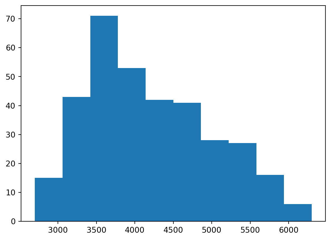
Like in R, there are manu options to customise the plot. For example, we can change the number of bins, the colour, the transparency, titles etc.:
# Create figure and axis objects
fig, ax = plt.subplots()

# Histogram
ax.hist(penguins["body_mass_g"], # x
bins = 20, # Number of bins
color = "purple", # Colour
alpha = 0.5) # Transparency

# Add title and axis labels
ax.set_title("Body mass of penguins") # Title
ax.set_xlabel("Body mass (g)") # x-axis label
ax.set_ylabel("Frequency") # y-axis label

# Show plot
plt.show()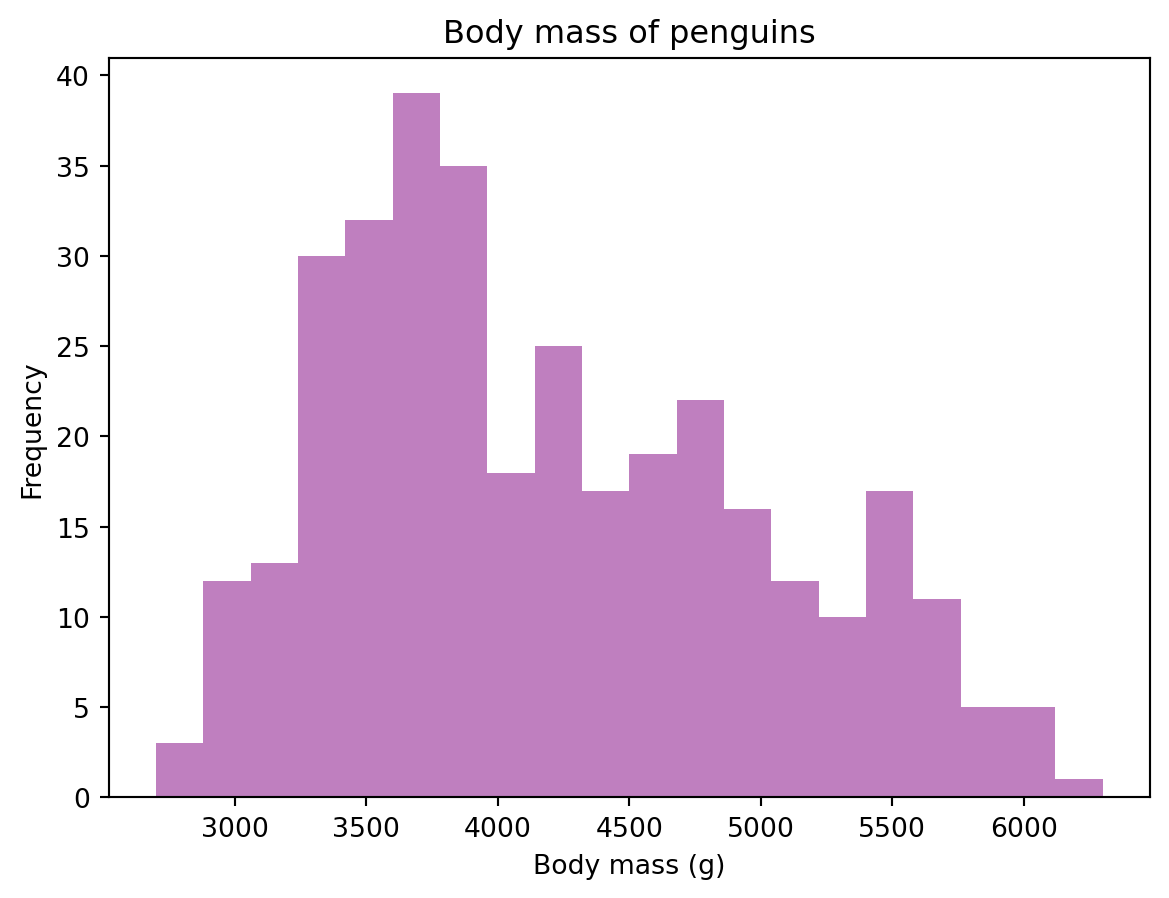
5.2 Boxplots
Let’s start by creating a boxplot of the flipper length of the penguins. We can do this with the boxplot function:
# Create figure and axis
fig, ax = plt.subplots()

# Create a boxplot
ax.boxplot(penguins["flipper_length_mm"].dropna())  # Drop NaN values

# Add title and labels
ax.set_title("Boxplot of Penguin Flipper Lengths")
ax.set_ylabel("Flipper Length (mm)")

# Show the plot
plt.show()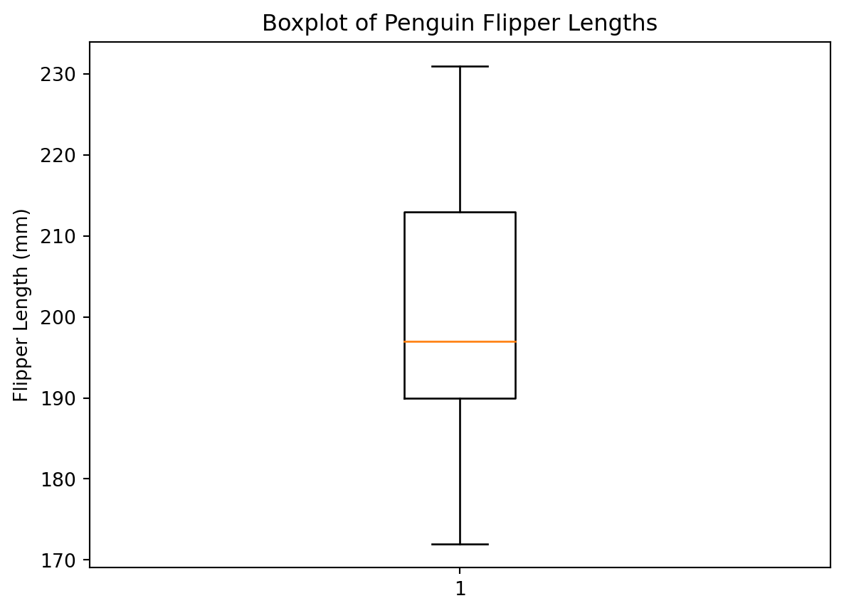
This is good, but it would be better to see each penguin species:
# Create figure and axis
fig, ax = plt.subplots()

# Create a boxplot
ax.boxplot([penguins.loc[penguins["species"] == "Adelie", "flipper_length_mm"].dropna(), # Adelie
            penguins.loc[penguins["species"] == "Chinstrap", "flipper_length_mm"].dropna(), # Chinstrap
            penguins.loc[penguins["species"] == "Gentoo", "flipper_length_mm"].dropna()], # Gentoo
           labels = ["Adelie", "Chinstrap", "Gentoo"]) # Labels

# Add title and labels
ax.set_title("Boxplot of Penguin Flipper Lengths")
ax.set_ylabel("Flipper Length (mm)")
ax.set_xlabel("Species")

# Show the plot
plt.show()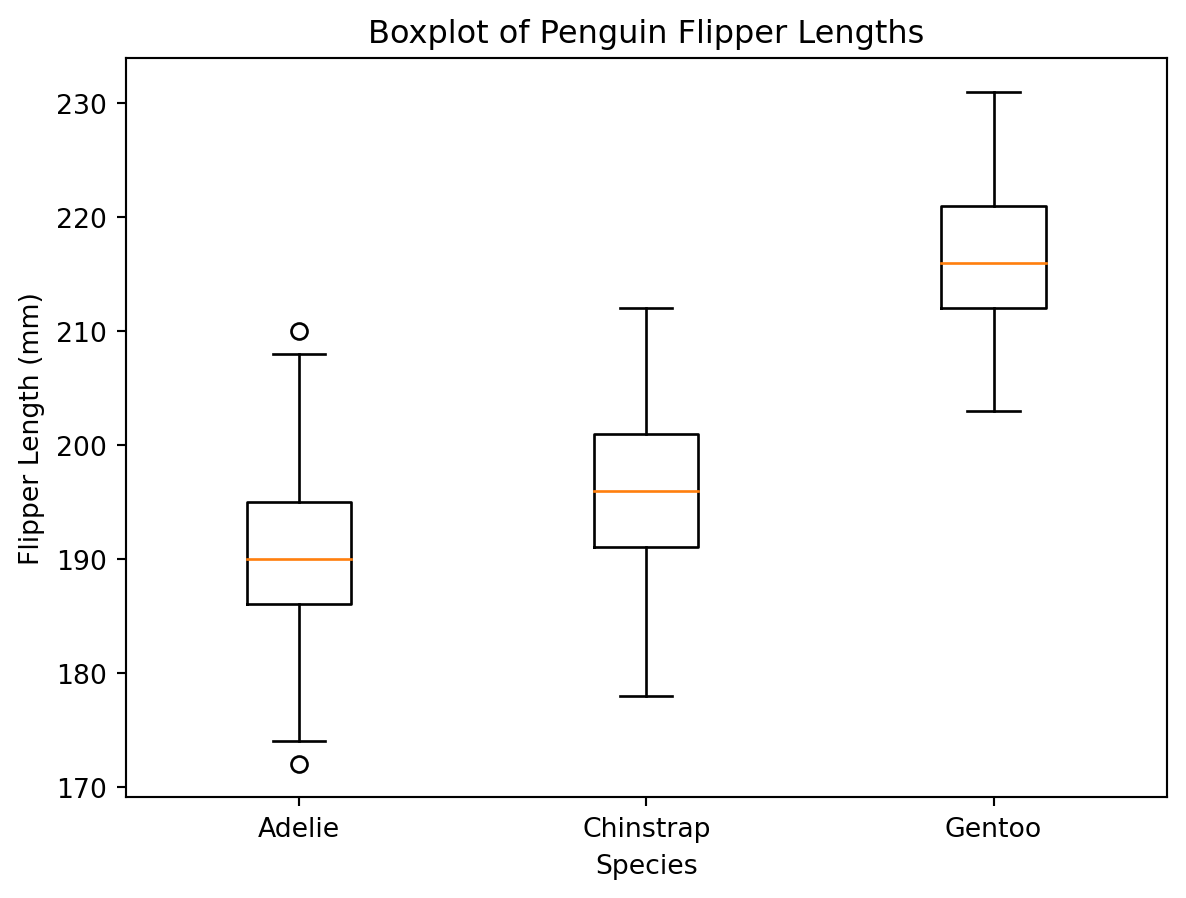
We can also overlay the data points on top of the boxplot:
# Create figure and axis
fig, ax = plt.subplots();

# Create a boxplot
ax.boxplot([penguins.loc[penguins["species"] == "Adelie", "flipper_length_mm"].dropna(), # Adelie
            penguins.loc[penguins["species"] == "Chinstrap", "flipper_length_mm"].dropna(), # Chinstrap
            penguins.loc[penguins["species"] == "Gentoo", "flipper_length_mm"].dropna()], # Gentoo
           labels = ["Adelie", "Chinstrap", "Gentoo"]); # Labels

# Add data points with jitter
ax.plot(np.random.normal(1, 0.05, len(penguins.loc[penguins["species"] == "Adelie", "flipper_length_mm"].dropna())), # x
        penguins.loc[penguins["species"] == "Adelie", "flipper_length_mm"].dropna(), # y
        marker = "o", # Marker
        linestyle = "none", # No line
        alpha = 0.2, # Transparency
        color = "blue"); # Colour

ax.plot(np.random.normal(2, 0.05, len(penguins.loc[penguins["species"] == "Chinstrap", "flipper_length_mm"].dropna())), # x
        penguins.loc[penguins["species"] == "Chinstrap", "flipper_length_mm"].dropna(), # y
        marker = "o", # Marker
        linestyle = "none", # No line
        alpha = 0.2, # Transparency
        color = "blue"); # Colour

ax.plot(np.random.normal(3, 0.05, len(penguins.loc[penguins["species"] == "Gentoo", "flipper_length_mm"].dropna())), # x
        penguins.loc[penguins["species"] == "Gentoo", "flipper_length_mm"].dropna(), # y
        marker = "o", # Marker
        linestyle = "none", # No line
        alpha = 0.2, # Transparency
        color = "blue"); # Colour

# Add title and labels
ax.set_title("Boxplot of Penguin Flipper Lengths");
ax.set_ylabel("Flipper Length (mm)");
ax.set_xlabel("Species");

# Show plot
plt.show();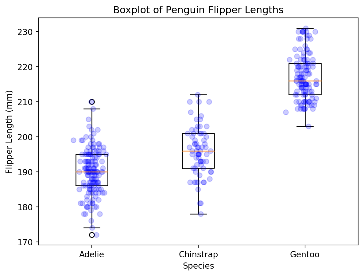
5.3 Bar Plots
Let’s start by creating a barplot of the species of penguins in the dataset. We can do this with the bar function:
# Create figure and axis objects
fig, ax = plt.subplots()

# Bar plot
ax.bar(["Adelie", "Chinstrap", "Gentoo"], # x
       [penguins.loc[penguins["species"] == "Adelie", "species"].count(), # Adelie
        penguins.loc[penguins["species"] == "Chinstrap", "species"].count(), # Chinstrap
        penguins.loc[penguins["species"] == "Gentoo", "species"].count()]) # Gentoo

# Add title and axis labels
ax.set_title("Number of penguins in dataset") # Title
ax.set_xlabel("Species") # x-axis label
ax.set_ylabel("Number of penguins") # y-axis label

# Show plot
plt.show()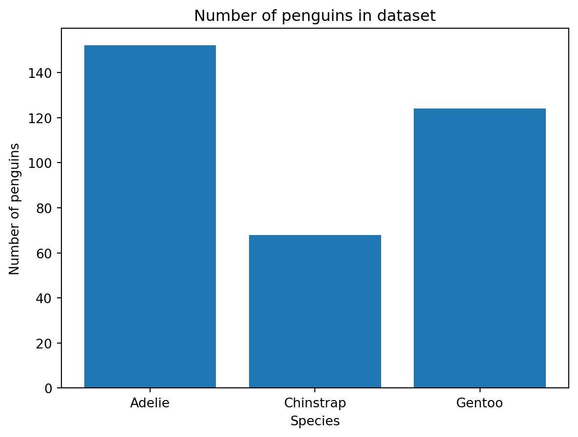
5.4 Scatter Plots
Let’s start with a simple scatter plot. We want to plot the flipper length against the body mass of the penguins. We can do this with the scatter function:
# Create figure and axis objects
fig, ax = plt.subplots()

# Scatter plot
ax.scatter(penguins["flipper_length_mm"], penguins["body_mass_g"]) # x, y
<matplotlib.collections.PathCollection at 0x2f2c33cd550>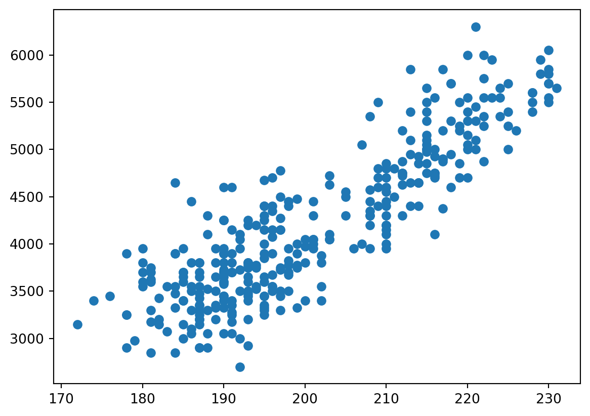
Now this is a very basic plot. We can add a title and axis labels with the set functions:
# Create figure and axis objects
fig, ax = plt.subplots()

# Scatter plot
ax.scatter(penguins["flipper_length_mm"], penguins["body_mass_g"]) # x, y

# Add title and axis labels
ax.set_title("Flipper length vs. body mass") # Title
ax.set_xlabel("Flipper length (mm)") # x-axis label
ax.set_ylabel("Body mass (g)") # y-axis label
Text(0, 0.5, 'Body mass (g)')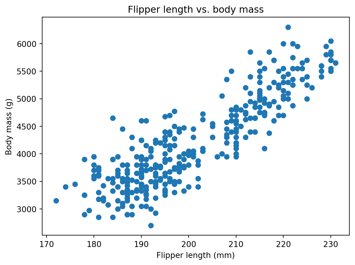
We can also colour the points by species. To do this, we need to create a list of colours, one for each species. We can do this with the map function:
# Create figure and axis objects
fig, ax = plt.subplots()

# Scatter plot
ax.scatter(penguins["flipper_length_mm"], penguins["body_mass_g"],  # x, y,
           c = penguins["species"].map({"Adelie": "blue", "Chinstrap": "red", "Gentoo": "green"})) # colour

# Add title and axis labels
ax.set_title("Flipper length vs. body mass") # Title
ax.set_xlabel("Flipper length (mm)") # x-axis label
ax.set_ylabel("Body mass (g)") # y-axis label

# Show plot
plt.show()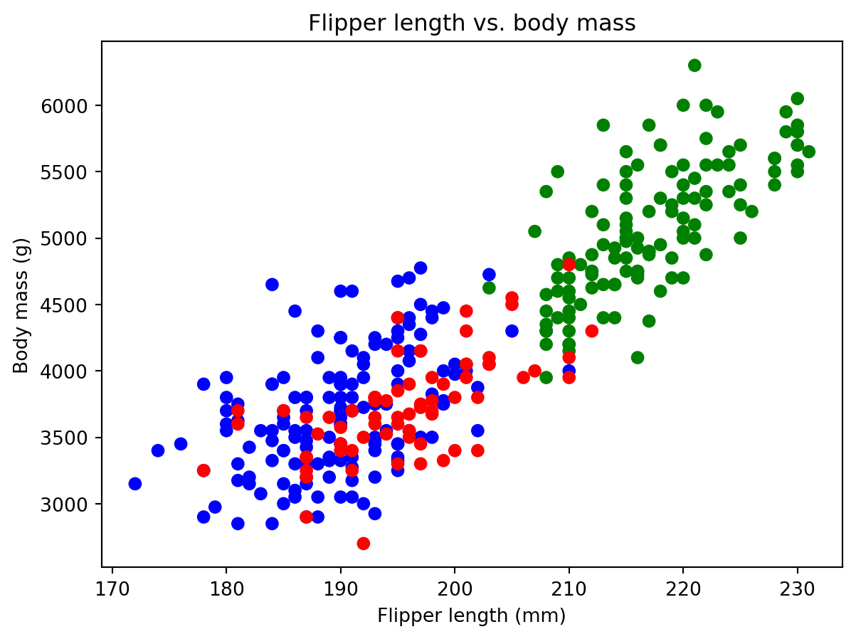
A legend is also useful to know which colour corresponds to which species:
# Create figure and axis objects
fig, ax = plt.subplots()

# Colors mapped to species
species_colors = {"Adelie": "blue", "Chinstrap": "red", "Gentoo": "green"} # Create dictionary

# Scatter plot with labels for legend
for species, color in species_colors.items(): # Loop over species and colors
    species_data = penguins[penguins["species"] == species] # Subset data for each species
    ax.scatter(species_data["flipper_length_mm"], species_data["body_mass_g"], # x, y
               color=color, label=species) # colour and label

# Add title and axis labels
ax.set_title("Flipper length vs. body mass") # Title
ax.set_xlabel("Flipper length (mm)") # x-axis label
ax.set_ylabel("Body mass (g)") # y-axis label

# Add legend to the top left corner
ax.legend(loc='upper left') # Location of legend

# Show plot
plt.show()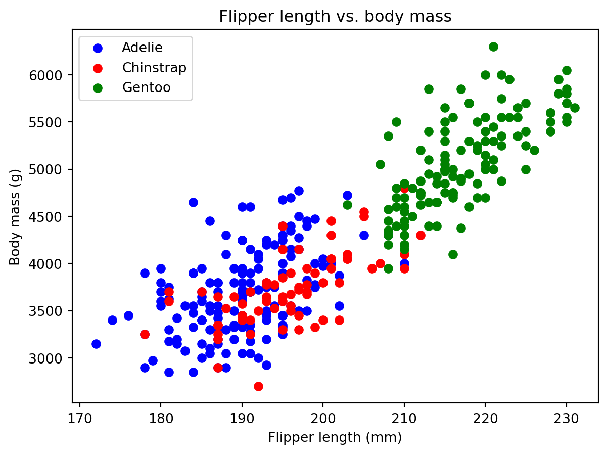
6 seaborn
seaborn is a Python library for statistical data visualisation. It is built on top of matplotlib and provides a high-level interface for drawing attractive and informative statistical graphics. It is particularly useful for exploring and understanding data. It also provides a range of functions for plotting univariate and bivariate distributions, regression models, and statistical tests. It is, in my opinion, much easier to work with than matplotlib.
6.1 Histograms
Let’s start by re-creating a histogram of the flipper lengths of the penguins. We can do this with the histplot function:
# Create figure and axis objects
fig, ax = plt.subplots()

# Histogram
sns.histplot(penguins["flipper_length_mm"], # x
             ax=ax) # axis

# Add title and axis labels
ax.set_title("Histogram of flipper lengths") # Title
ax.set_xlabel("Flipper length (mm)") # x-axis label
ax.set_ylabel("Count") # y-axis label

# Show plot
plt.show()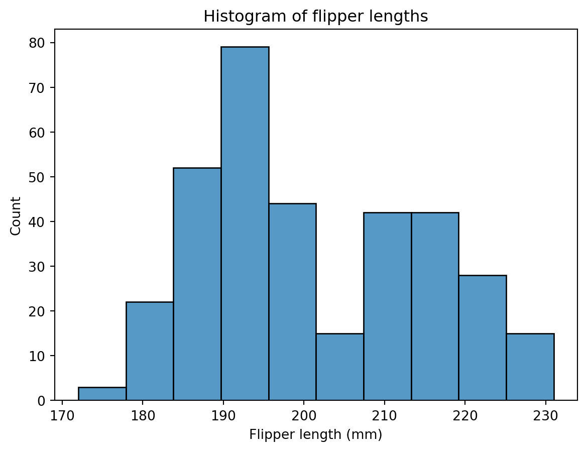
Because seaborn is more powerful than matplotlib, we can also add a kernel density estimate (KDE) to the histogram. This gives us a hybrid between a histogram and a density plot. We can do this by setting the kde argument to True:
# Create figure and axis objects
fig, ax = plt.subplots()

# Histogram with KDE
sns.histplot(penguins["flipper_length_mm"], # x
             kde=True, # KDE
             ax=ax) # axis

# Add title and axis labels
ax.set_title("Histogram of flipper lengths") # Title
ax.set_xlabel("Flipper length (mm)") # x-axis label
ax.set_ylabel("Count") # y-axis label

# Show plot
plt.show()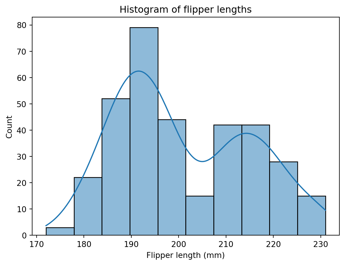
We could also add multiple distributions onto a single plot. So we could visualise the distribution of flipper lengths for each species of penguin:
# Create figure and axis objects
fig, ax = plt.subplots()

# Histogram with KDE for each species
sns.histplot(data=penguins, # Data
             x="flipper_length_mm", # x
             hue="species", # Colour by species
             kde=True, # KDE
             ax=ax, # axis
             multiple='layer') # Multiple distributions

# Add title and axis labels
ax.set_title("Histogram of Flipper Lengths by Species") # Title
ax.set_xlabel("Flipper length (mm)") # x-axis label
ax.set_ylabel("Count") # y-axis label

# Show plot
plt.show()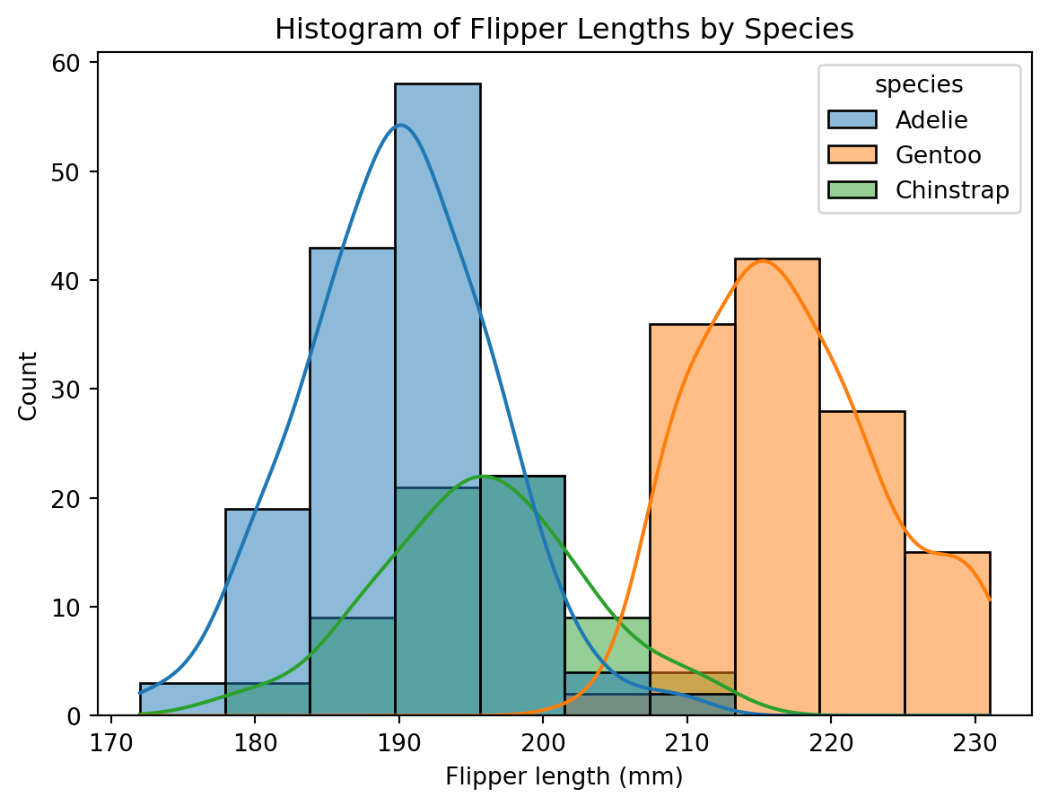
6.2 Box Plots
We can also create box plots with seaborn. Let’s start by creating a simple box plot of the flipper lengths of the penguins:
# Create figure and axis objects
fig, ax = plt.subplots()

# Box plot
sns.boxplot(penguins["flipper_length_mm"], # x
            ax=ax) # axis

# Add title and axis labels
ax.set_title("Box plot of flipper lengths") # Title
ax.set_ylabel("Flipper length (mm)") # y-axis label

# Show plot
plt.show()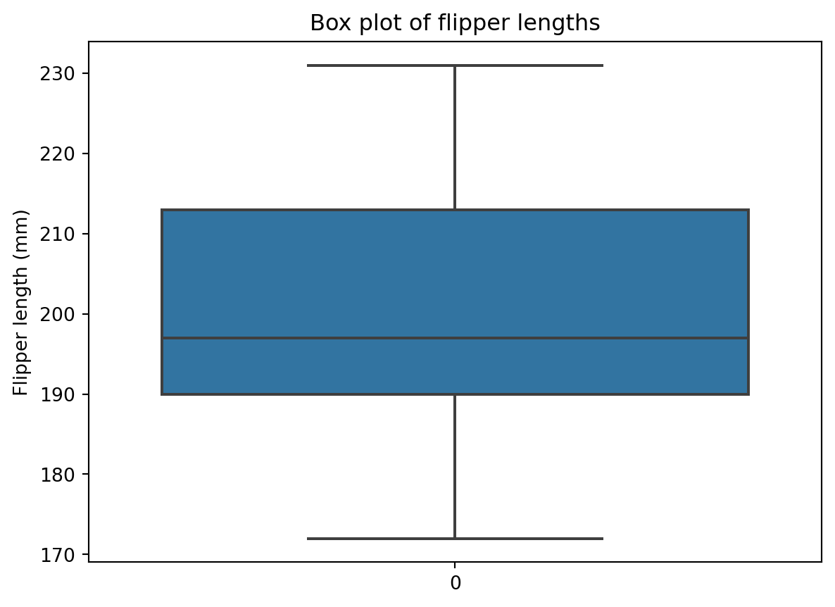
Once again, this would be better if we could colour the box plots by species. We can do this by setting the hue argument to "species":
# Create figure and axis objects
fig, ax = plt.subplots()

# Box plot with hue
sns.boxplot(data=penguins, # Data
            x="flipper_length_mm", # x
            y="species", # Colour by species
            ax=ax) # axis

# Add title and axis labels
ax.set_title("Box plot of flipper lengths") # Title
ax.set_ylabel("Flipper length (mm)") # y-axis label
ax.set_xlabel("Species") # x-axis label

# Show plot
plt.show()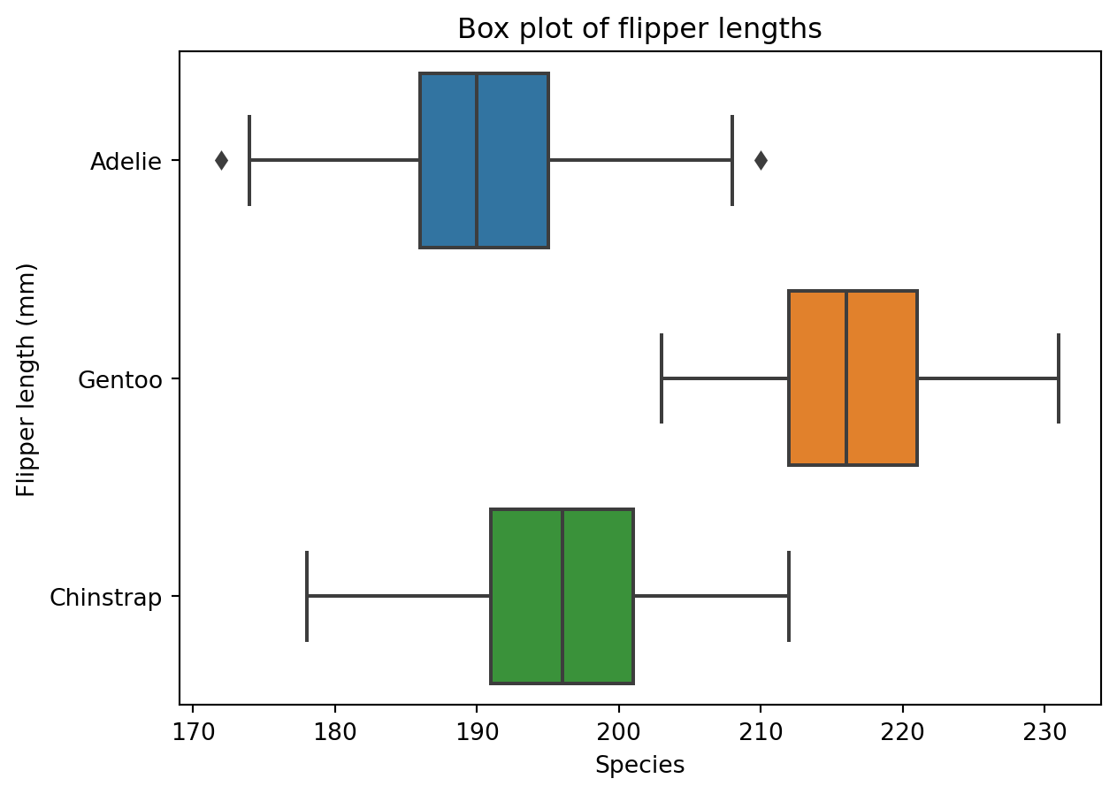
Let’s add the points to the box plot as well. We can do this with the swarmplot function:
# Create figure and axis objects
fig, ax = plt.subplots()

# Box plot with hue
sns.boxplot(data=penguins, # Data
            x="flipper_length_mm", # x
            y="species", # Colour by species
            ax=ax) # axis

# Add points
sns.swarmplot(data=penguins, # Data
              x="flipper_length_mm", # x
              y="species", # Colour by species
              ax=ax, # axis
              color="black", # Colour of points
              alpha=0.5) # Transparency of points

# Add title and axis labels
ax.set_title("Box plot of flipper lengths") # Title
ax.set_xlabel("Flipper length (mm)") # x-axis label
ax.set_ylabel("Species") # y-axis label

# Show plot
plt.show()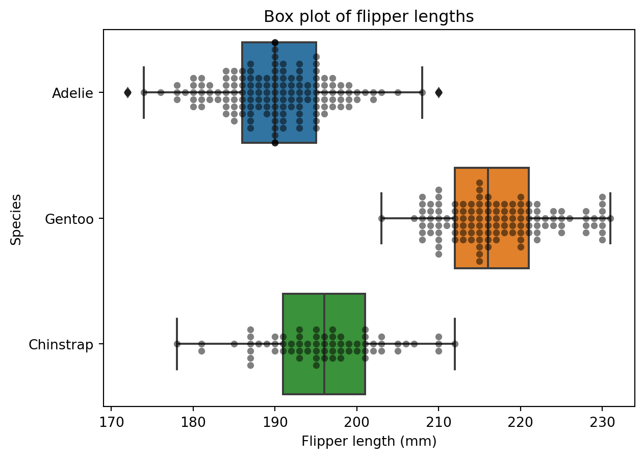
A violin plot is another way of visualising the distribution of data. It is similar to a box plot, but it also shows the probability density of the data at different values. We can create a violin plot with the violinplot function:
# Create figure and axis objects
fig, ax = plt.subplots()

# Violin plot with hue
sns.violinplot(data=penguins, # Data
               x="flipper_length_mm", # x
               y="species", # Colour by species
               ax=ax) # axis

# Add title and axis labels
ax.set_title("Violin plot of flipper lengths") # Title
ax.set_xlabel("Flipper length (mm)") # y-axis label
ax.set_ylabel("Species") # x-axis label

# Show plot
plt.show()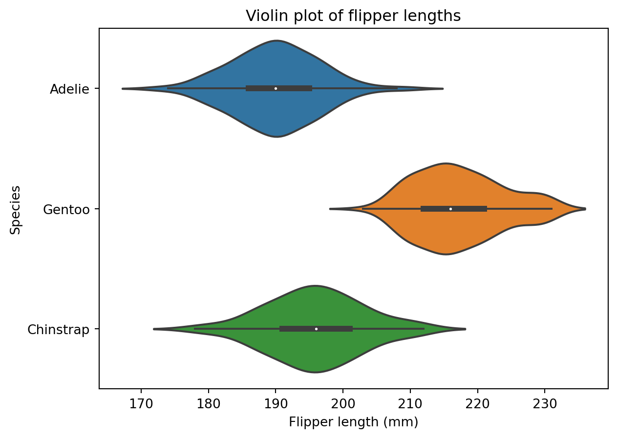
6.3 Bar Plots
Let’s start by creating a barplot of the species of penguins in the dataset. We can do this with the countplot function:
# Create figure and axis objects
fig, ax = plt.subplots()

# Bar plot
sns.countplot(data=penguins, # Data
              x="species", # x
              ax=ax) # axis

# Add title and axis labels
ax.set_title("Bar plot of species") # Title
ax.set_xlabel("Species") # x-axis label
ax.set_ylabel("Count") # y-axis label

# Show plot
plt.show()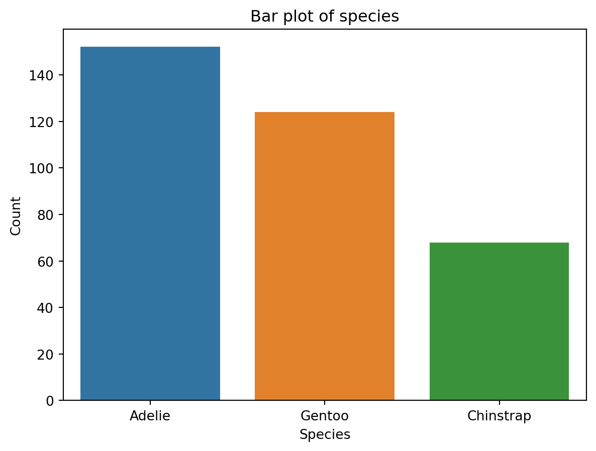
We can customise this plot by changing the colour of the bars and re-ordering them from smallest to largest:
# Create figure and axis objects
fig, ax = plt.subplots()

# Bar plot
sns.countplot(data=penguins, # Data
              x="species", # x
              ax=ax, # axis
              color="steelblue", # Colour of bars
              order=["Chinstrap", "Gentoo", "Adelie"]) # Order of bars

# Add title and axis labels
ax.set_title("Bar plot of species") # Title
ax.set_xlabel("Species") # x-axis label
ax.set_ylabel("Count") # y-axis label

# Show plot
plt.show()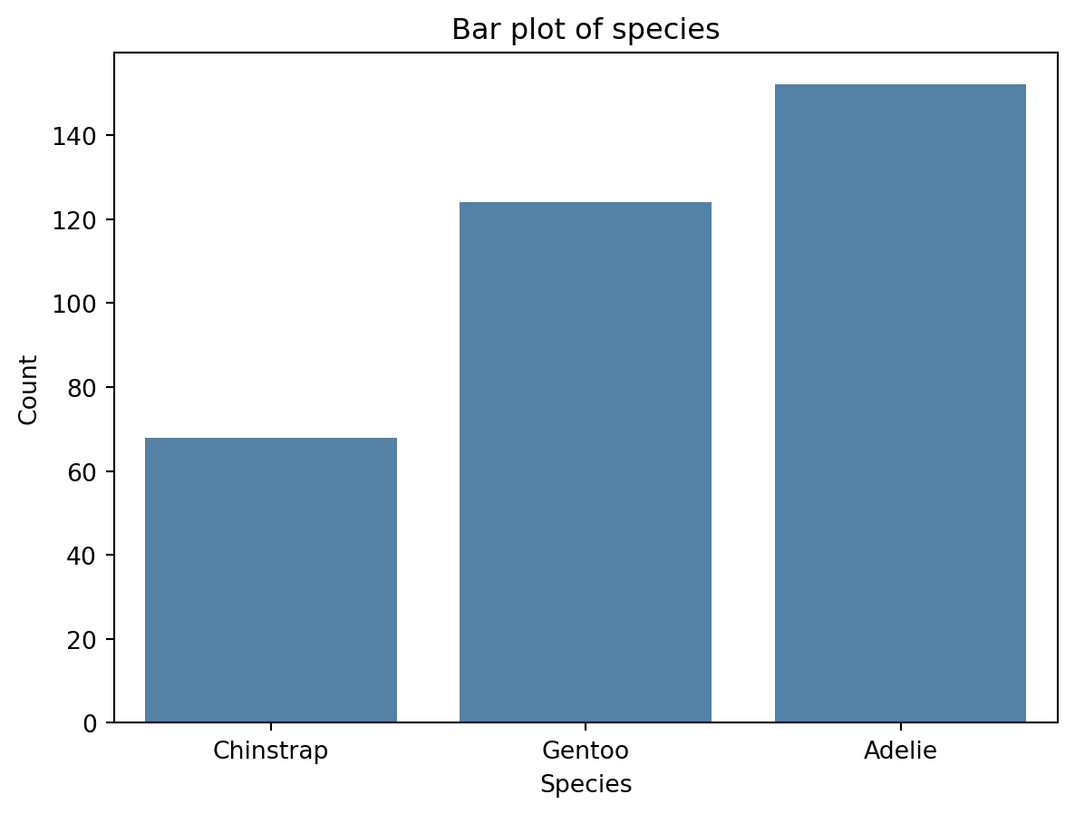
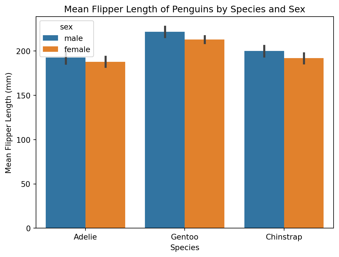
As scientists it is not often that we want to create such simple barplots - we might want to compare two or more groups along with some measure of variation. For this we need to use a grouped barplot. Let’s say we are interested in visualising the mean flipper length of penguins, grouped by species and sex, along with the standard error of the mean for each group. We can do this with the barplot function:
# Create figure and axis objects
fig, ax = plt.subplots()

# Create a barplot
sns.barplot(data=penguins, x="species", y="flipper_length_mm", hue="sex", ci="sd")

# Add title and labels
plt.title("Mean Flipper Length of Penguins by Species and Sex")
plt.xlabel("Species")
plt.ylabel("Mean Flipper Length (mm)")

# Show plot
plt.show()
C:\Users\00708040\AppData\Local\Temp\ipykernel_8864\4056240637.py:5: FutureWarning:
The `ci` parameter is deprecated. Use `errorbar='sd'` for the same effect.
6.4 Scatter Plots
Let’s start by creating a scatterplot of flipper length against body mass for the penguins dataset. We can do this with the scatterplot function:
# Create figure and axis objects
fig, ax = plt.subplots()

# Scatter plot
sns.scatterplot(data=penguins, # Data
                x="body_mass_g", # x
                y="flipper_length_mm", # y
                ax=ax) # axis

# Add title and axis labels
ax.set_title("Scatter plot of flipper length against body mass") # Title
ax.set_xlabel("Body mass (g)") # x-axis label
ax.set_ylabel("Flipper length (mm)") # y-axis label

# Show plot
plt.show()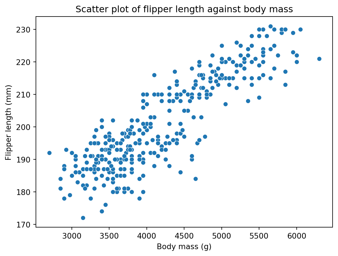
We can colour the points by species with the hue argument:
# Create figure and axis objects
fig, ax = plt.subplots()

# Scatter plot
sns.scatterplot(data=penguins, # Data
                x="body_mass_g", # x
                y="flipper_length_mm", # y
                hue="species", # Colour by species
                ax=ax) # axis

# Add title and axis labels
ax.set_title("Scatter plot of flipper length against body mass") # Title
ax.set_xlabel("Body mass (g)") # x-axis label
ax.set_ylabel("Flipper length (mm)") # y-axis label

# Show plot
plt.show()
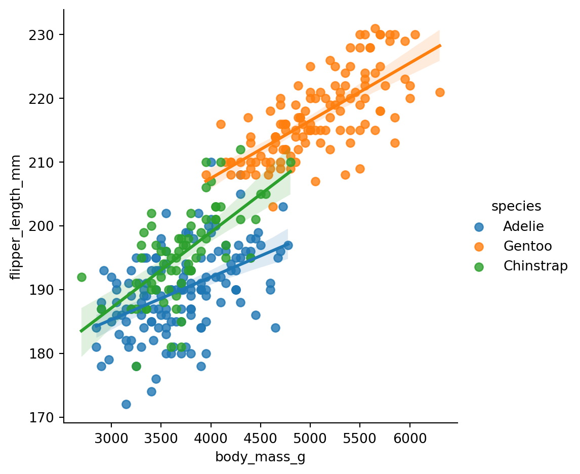
It is also relatively easy to add a regression line to the scatterplot. We can do this with the lmgplot function:
# Create figure and axis objects
fig, ax = plt.subplots()

# Scatter plot with regression lines for each species
sns.lmplot(data=penguins,
           x="body_mass_g",
           y="flipper_length_mm",
           hue="species")

# Add title and axis labels
ax.set_title("Scatter plot of flipper length against body mass") # Title
ax.set_xlabel("Body mass (g)") # x-axis label
ax.set_ylabel("Flipper length (mm)") # y-axis label

# Show plot
plt.show()
C:\ProgramData\anaconda3\Lib\site-packages\seaborn\axisgrid.py:118: UserWarning:
The figure layout has changed to tight
7 Customising Plots
We are only going to focus on seaborn plots in this section, but you can customise matplotlib plots in a similar way. This is largely because seaborn plots are easier to customise than matplotlib plots.
7.1 Changing the Size of Plots
We can change the size of plots by changing the figsize argument in the subplots function. This argument takes a tuple of two numbers, the first of which is the width of the plot and the second of which is the height of the plot. The units of these numbers are inches. For example, if we wanted to create a plot that was 10 inches wide and 5 inches high, we would use the following code:
# Create figure and axis objects
fig, ax = plt.subplots(figsize=(10, 5))

# Plot
sns.scatterplot(data=penguins, # Data
                x="body_mass_g", # x
                y="flipper_length_mm", # y
                hue="species", # Colour by species
                ax=ax) # axis

# Add title and axis labels
ax.set_title("Scatter plot of flipper length against body mass") # Title
ax.set_xlabel("Body mass (g)") # x-axis label
ax.set_ylabel("Flipper length (mm)") # y-axis label

# Show plot
plt.show()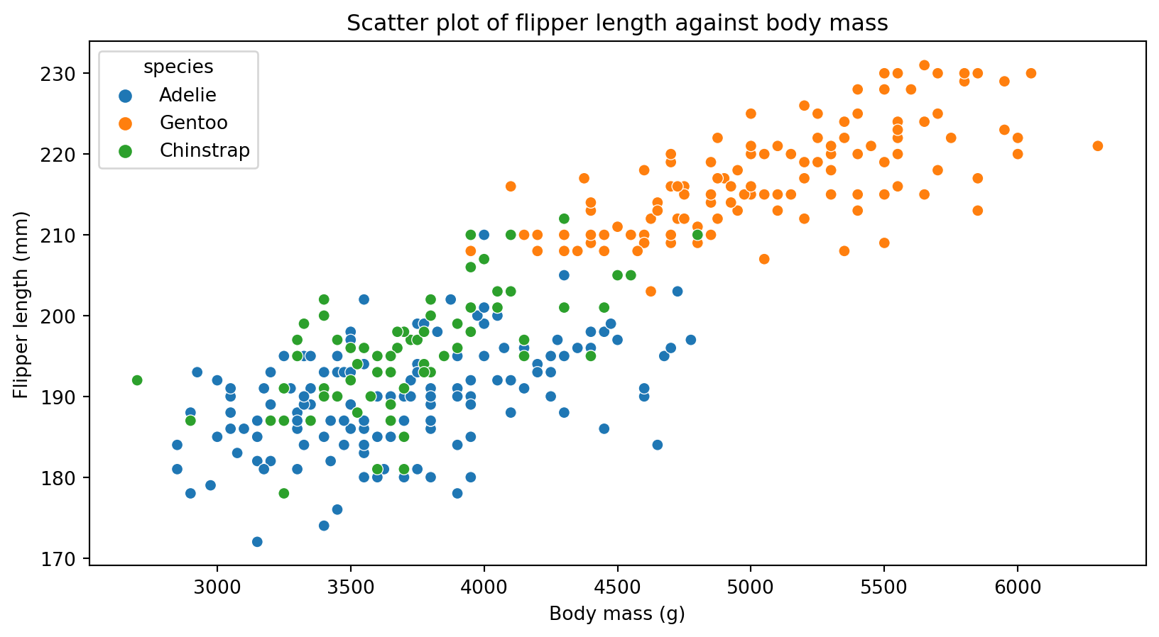
Let’s create two differently sized plots and plot them next to one another:
# Create figure with two subplots of different sizes
fig = plt.figure(figsize=(15, 5))  # Total figure size
gs = gridspec.GridSpec(1, 2, width_ratios=[2, 1])  # Define ratio of subplot widths

# First subplot
ax1 = plt.subplot(gs[0]) # First subplot
sns.scatterplot(data=penguins, # Data
                x="body_mass_g", # x
                y="flipper_length_mm", # y
                hue="species", # Colour by species
                ax=ax1) # axis
ax1.set_title("Scatter plot 1") # Title
ax1.set_xlabel("Body mass (g)") # x-axis label
ax1.set_ylabel("Flipper length (mm)") # y-axis label

# Second subplot
ax2 = plt.subplot(gs[1]) # Second subplot
sns.scatterplot(data=penguins, # Data
                x="body_mass_g", # x
                y="flipper_length_mm", # y
                hue="species", # Colour by species
                ax=ax2) # axis
ax2.set_title("Scatter plot 2") # Title
ax2.set_xlabel("Body mass (g)") # x-axis label
ax2.set_ylabel("Flipper length (mm)") # y-axis label

# Show plots
plt.tight_layout() # Ensure plots are spaced out
plt.show() 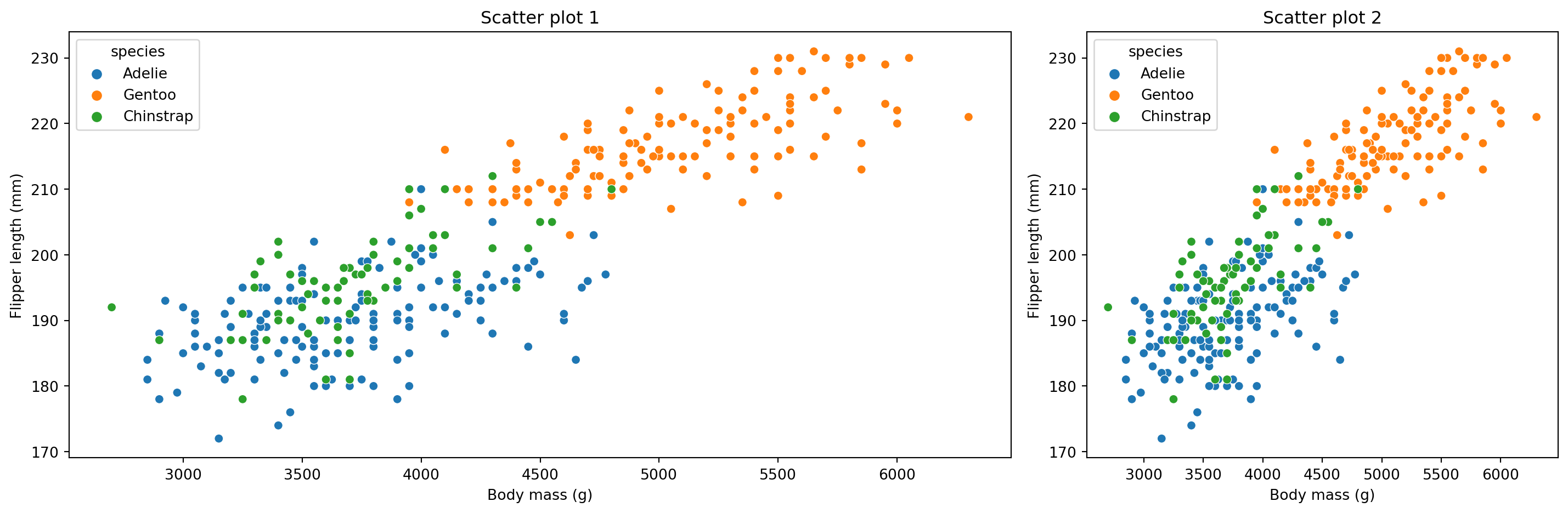
7.2 Changing the Colour Palette
We can change the colour palette of seaborn plots with the palette argument. This argument takes a string that specifies the name of the colour palette. For example, if we wanted to use the “magma” colour palette, we would use the following code:
# Create figure and axis objects
fig, ax = plt.subplots()

# Scatter plot
sns.scatterplot(data=penguins, # Data
                x="body_mass_g", # x
                y="flipper_length_mm", # y
                hue="species", # Colour by species
                palette="magma", # Colour palette
                ax=ax) # axis

# Add title and axis labels
ax.set_title("Scatter plot of flipper length against body mass") # Title
ax.set_xlabel("Body mass (g)") # x-axis label
ax.set_ylabel("Flipper length (mm)") # y-axis label

# Show plot
plt.show()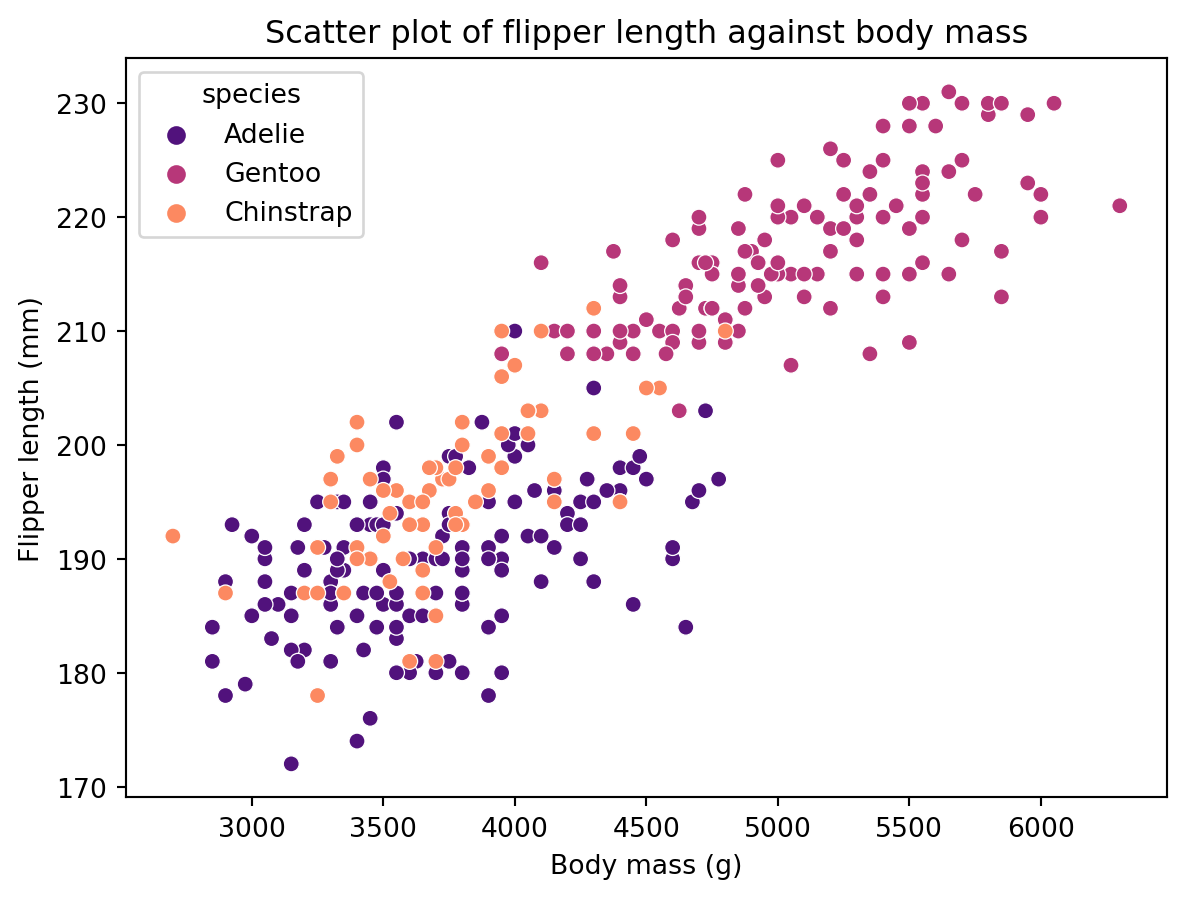
We can also use custom colours in our seaborn plots:
# Create figure and axis objects
fig, ax = plt.subplots()

# Scatter plot
sns.scatterplot(data=penguins, # Data
                x="body_mass_g", # x
                y="flipper_length_mm", # y
                hue="species", # Colour by species
                palette=["#FF0000", "#00FF00", "#0000FF"], # Custom colour palette
                ax=ax) # axis

# Add title and axis labels
ax.set_title("Scatter plot of flipper length against body mass") # Title
ax.set_xlabel("Body mass (g)") # x-axis label
ax.set_ylabel("Flipper length (mm)") # y-axis label

# Show plot
plt.show()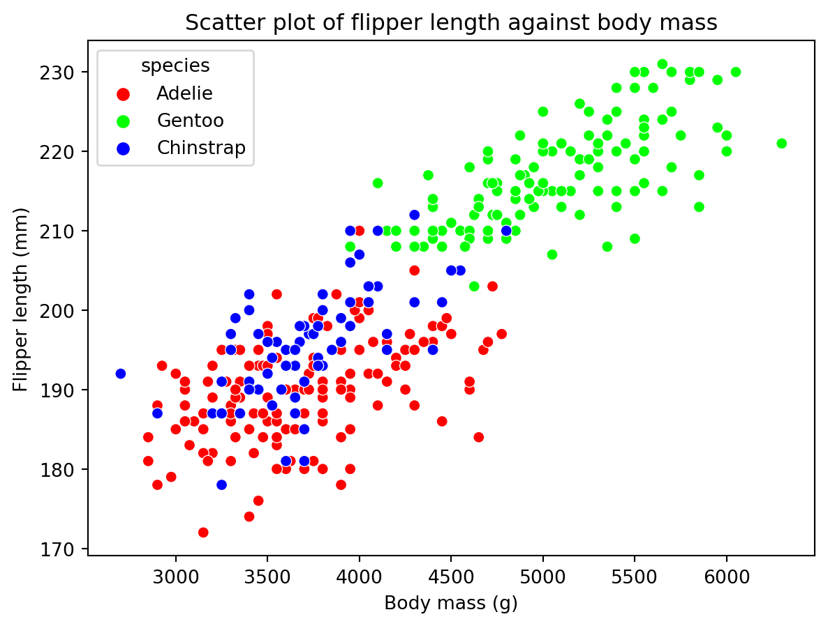
The shape of the points can be changed with the style argument. This argument takes a string that specifies the shape of the points. For example, if we wanted to use triangles, we would use the following code:
# Create figure and axis objects
fig, ax = plt.subplots()

# Scatter plot
sns.scatterplot(data=penguins, # Data
                x="body_mass_g", # x
                y="flipper_length_mm", # y
                hue="species", # Colour by species
                style="species", # Shape of points
                ax=ax) # axis

# Add title and axis labels
ax.set_title("Scatter plot of flipper length against body mass") # Title
ax.set_xlabel("Body mass (g)") # x-axis label
ax.set_ylabel("Flipper length (mm)") # y-axis label

# Show plot
plt.show()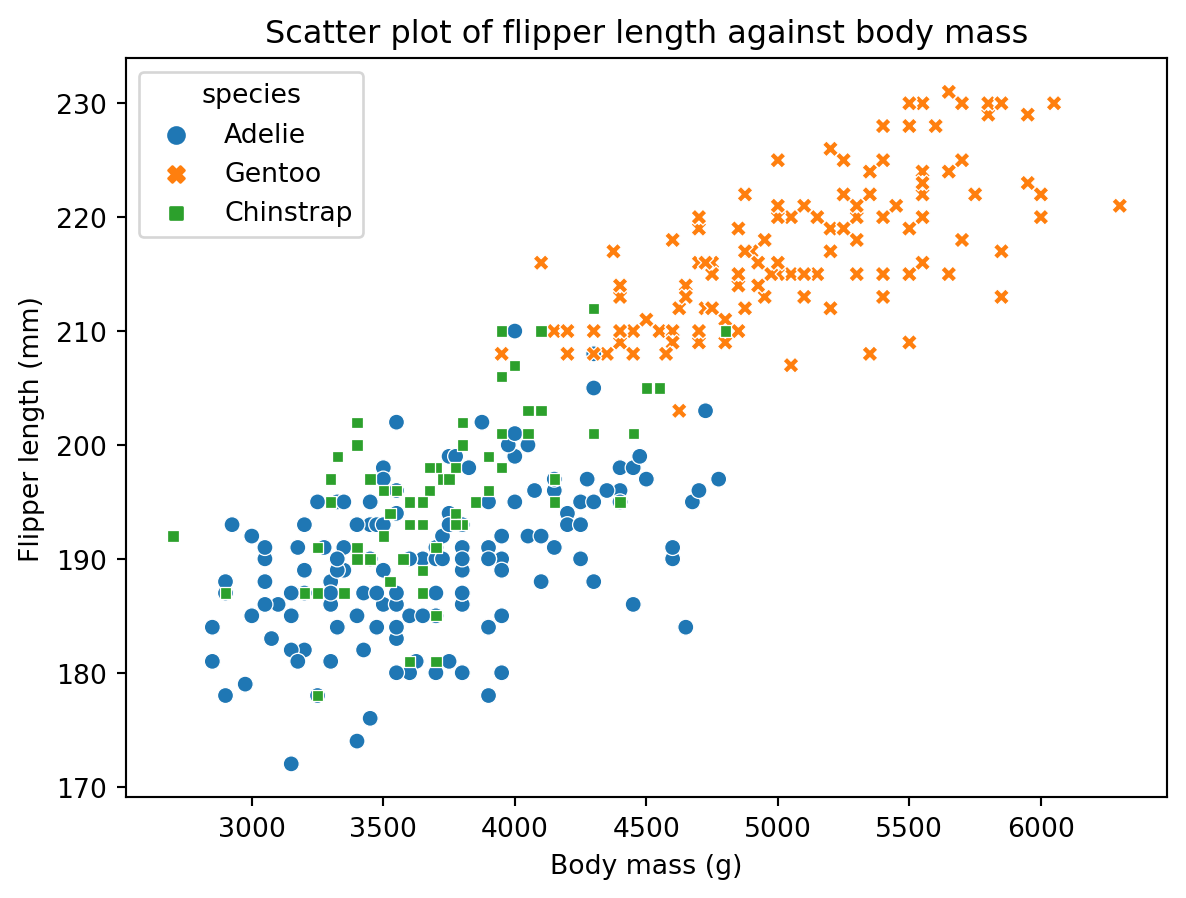
7.3 Changing the Axis Limits
We can change the axis limits with the set_xlim and set_ylim methods. These methods take two numbers, the first of which is the lower limit and the second of which is the upper limit. For example, if we wanted to change the x-axis limits to be between 0 and 5000, we would use the following code (though this doesn’t make much sense):
# Create figure and axis objects
fig, ax = plt.subplots()

# Scatter plot
sns.scatterplot(data=penguins, # Data
                x="body_mass_g", # x
                y="flipper_length_mm", # y
                hue="species", # Colour by species
                ax=ax) # axis

# Add title and axis labels
ax.set_title("Scatter plot of flipper length against body mass") # Title
ax.set_xlabel("Body mass (g)") # x-axis label
ax.set_ylabel("Flipper length (mm)") # y-axis label

# Set x-axis limits
ax.set_xlim(0, 5000)

# Show plot
plt.show()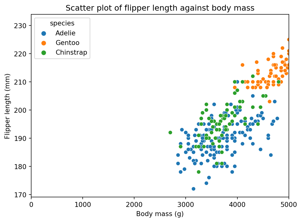
We can change the axis scales with the set_xscale and set_yscale methods. These methods take a string that specifies the scale. For example, if we wanted to change the x-axis scale to be logarithmic, we would use the following code:
# Create figure and axis objects
fig, ax = plt.subplots()

# Scatter plot
sns.scatterplot(data=penguins, # Data
                x="body_mass_g", # x
                y="flipper_length_mm", # y
                hue="species", # Colour by species
                ax=ax) # axis

# Add title and axis labels
ax.set_title("Scatter plot of flipper length against body mass") # Title
ax.set_xlabel("Body mass (g)") # x-axis label
ax.set_ylabel("Flipper length (mm)") # y-axis label

# Set x-axis scale
ax.set_xscale("log")

# Show plot
plt.show()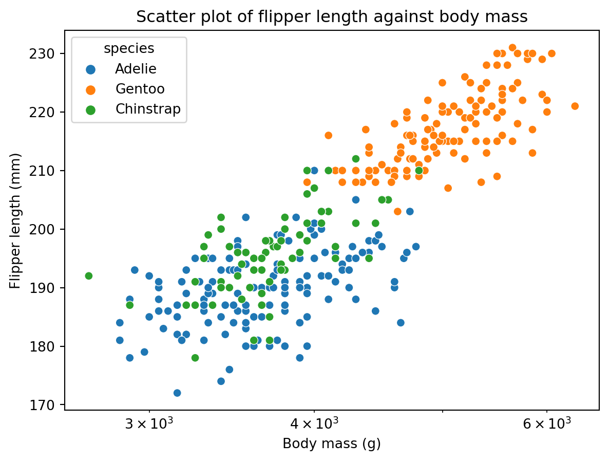
There are lots of ways to customise your plots using seaorn. For more information, see the seaborn documentation or this great tutorial on customising seaborn plots.
8 Saving Plots
We can save plots to a file with the savefig method. This method takes a string that specifies the name of the file to save the plot to. For example, if we wanted to save the plot we created in the previous section to a file called “scatter_plot.png”, we would use the following code:
# Create figure and axis objects
fig, ax = plt.subplots()

# Scatter plot
sns.scatterplot(data=penguins, # Data
                x="body_mass_g", # x
                y="flipper_length_mm", # y
                hue="species", # Colour by species
                ax=ax) # axis

# Add title and axis labels
ax.set_title("Scatter plot of flipper length against body mass") # Title
ax.set_xlabel("Body mass (g)") # x-axis label
ax.set_ylabel("Flipper length (mm)") # y-axis label

# Save plot
plt.savefig("scatter_plot.png")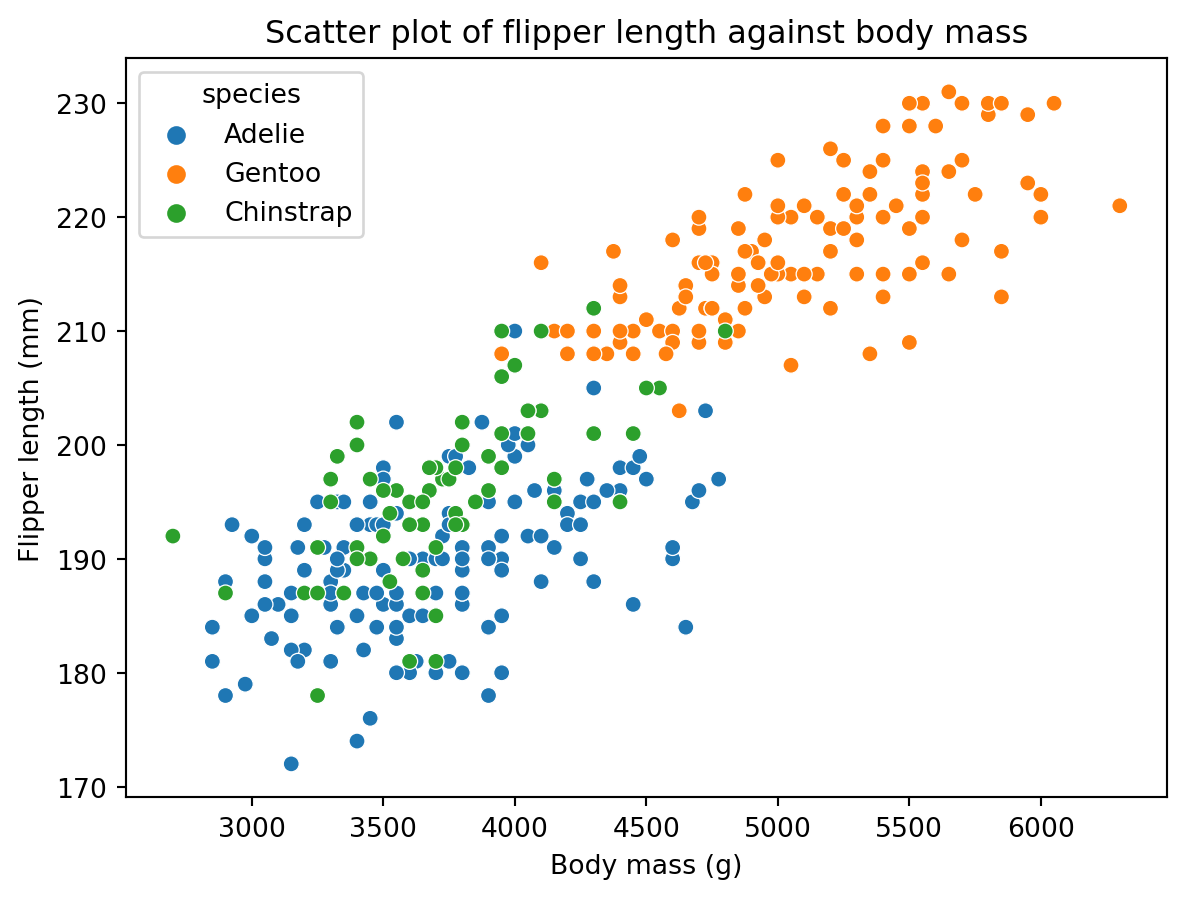
9 Activities
Let’s put what you’ve learnt into practice by using the mpg dataset to create some plots using seaborn. This dataset contains information about fuel consumption and other aspects of car performance for 234 cars. First you will need to import the mpg dataset from the seaborn library:
# Import seaborn
import seaborn as sns

# Load mpg dataset
mpg = sns.load_dataset("mpg")

# Show first 5 rows of mpg dataset
mpg.head()| mpg | cylinders | displacement | horsepower | weight | acceleration | model_year | origin | name | |
|---|---|---|---|---|---|---|---|---|---|
| 0 | 18.0 | 8 | 307.0 | 130.0 | 3504 | 12.0 | 70 | usa | chevrolet chevelle malibu |
| 1 | 15.0 | 8 | 350.0 | 165.0 | 3693 | 11.5 | 70 | usa | buick skylark 320 |
| 2 | 18.0 | 8 | 318.0 | 150.0 | 3436 | 11.0 | 70 | usa | plymouth satellite |
| 3 | 16.0 | 8 | 304.0 | 150.0 | 3433 | 12.0 | 70 | usa | amc rebel sst |
| 4 | 17.0 | 8 | 302.0 | 140.0 | 3449 | 10.5 | 70 | usa | ford torino |
9.1 Create a Histogram
Create a histogram of the mpg variable. Use 20 bins and set the colour of the bars to be blue. Describe this distribution.
💡 Click here to view a solution
# Create figure and axis objects
fig, ax = plt.subplots()

# Histogram
sns.histplot(data=mpg, # Data
             x="mpg", # Variable
             bins=20, # Number of bins
             color="blue", # Colour of bars
             ax=ax) # axis

# Add title and axis labels
ax.set_title("Histogram of mpg") # Title
ax.set_xlabel("mpg") # x-axis label
ax.set_ylabel("Count") # y-axis label

# Show plot
plt.show()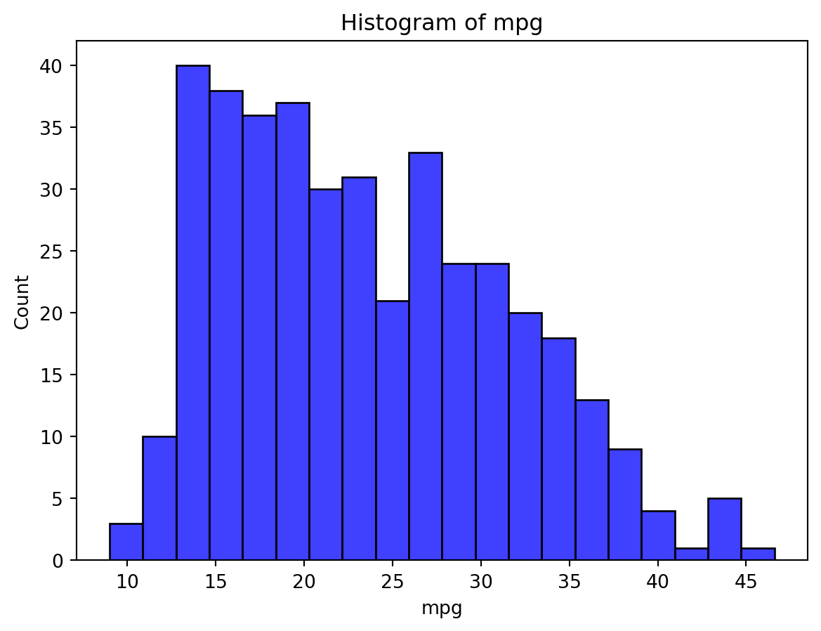
This distribution is unimodal and skewed to the right. Most cars have a fuel consumption of between 15 and 20 miles per gallon.
9.2 Create a Boxplot
Create a boxplot of the mpg variable. What is the median fuel consumption of the cars in this dataset? You should create a second boxplot showing the distribution of the mpg variable for each value of the origin variable. Describe the differences between the distributions.
💡 Click here to view a solution
# Create figure and axis objects
fig, ax = plt.subplots()

# Boxplot
sns.boxplot(data=mpg, # Data
            x="mpg", # Variable
            ax=ax) # axis

# Add title and axis labels
ax.set_title("Boxplot of mpg") # Title

# Show plot
plt.show()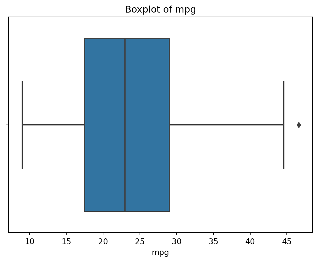
The median fuel consumption of the cars in this dataset is 23.0 miles per gallon. You can also calculate this value using the median function:
# Calculate median
mpg["mpg"].median()23.0# Create figure and axis objects
fig, ax = plt.subplots()
# Boxplot
sns.boxplot(data=mpg, # Data
x="origin", # Variable
y="mpg", # Variable
ax=ax) # axis
# Add title and axis label
ax.set_title("Boxplot of mpg by origin") # Title
ax.set_xlabel("Origin") # x-axis label
ax.set_ylabel("mpg") # y-axis label
# Show plot
plt.show()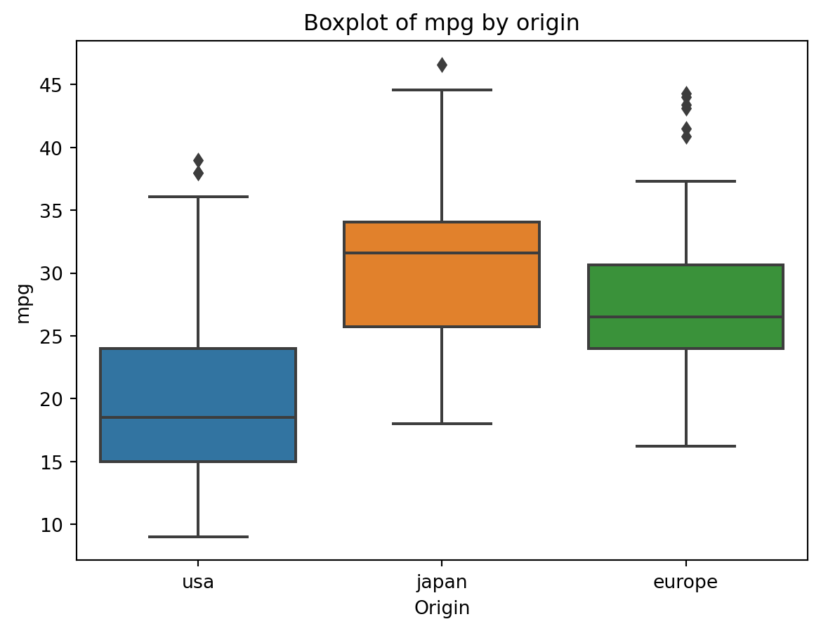
9.3 Create a Scatter Plot
Create a scatter plot of the mpg variable against the weight variable. Colour the points by the origin variable. Describe this relationship - which cars are more fuel efficient?
💡 Click here to view a solution
# Create figure and axis objects
fig, ax = plt.subplots()

# Scatter plot
sns.scatterplot(data=mpg, # Data
                x="weight", # x
                y="mpg", # y
                hue="origin", # Colour by origin
                ax=ax) # axis

# Add title and axis labels
ax.set_title("Scatter plot of mpg against weight") # Title
ax.set_xlabel("Weight (lbs)") # x-axis label
ax.set_ylabel("mpg") # y-axis label

# Show plot
plt.show()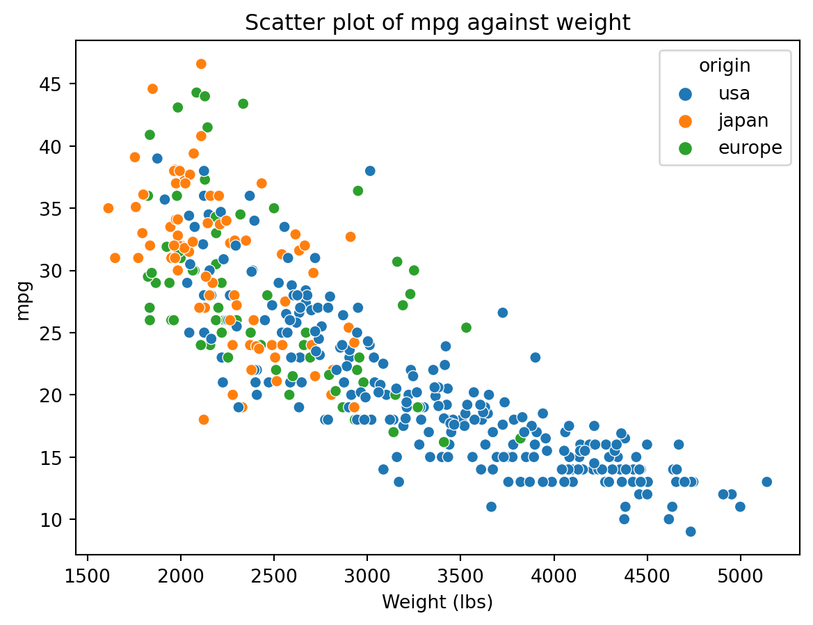
Cars with a lower weight are more fuel efficient, these typically originate from Japan.
10 Recap
seabornis a Python library for creating statistical graphics;seabornis built on top ofmatplotlib;seabornhas a number of functions for creating different types of plots;seabornplots can be customised in a number of ways.