# Country data
country <- c("United Kingdom", "Spain", "Belgium", "Netherlands", "Italy","France", "Sweden", "Switzerland", "Portugal", "Austria", "Germany", "Denmark","Norway","Finland")

# Percent above data
pct_above <- c(67, 60, 50, 50,49, 44, 27, 24, 15, 11, 6, 5, 0, 0)

# Excess deaths data
excess <- c(53300, 31500, 5300, 8700, 24600, 28500, 3300, 2000, 1300, 1000, 4100, 300, 100, 100)

# Time period data
time_period <- c("Mar. 14 - May 1", "Mar. 16 - May 3", "Mar. 16 - Apr. 19", "Mar. 16 - Apr. 26", "March", "Mar. 16 - Apr. 26", "Mar. 16 - May 3", "Mar. 16 - May 3", "Mar. 16 - Apr. 12", "Mar. 16 - Apr. 26", "Mar. 16 - Apr. 12", "Mar. 16 - May 3", "Mar. 16 - Apr. 26", "Mar. 16 - Apr. 26")

# Combine above data frames into one data frame
euro_table <- data.frame(country, pct_above, excess, time_period)1 Objectives
- Overview of
gt; - Create a basic table using
gt; - Introduce concepts of table customisation.
2 Start a Script
For this lab or project, begin by:
- Starting a new
Rscript - Create a good header section and table of contents
- Save the script file with an informative name
- set your working directory
Aim to make the script a future reference for doing things in R!
3 Introduction
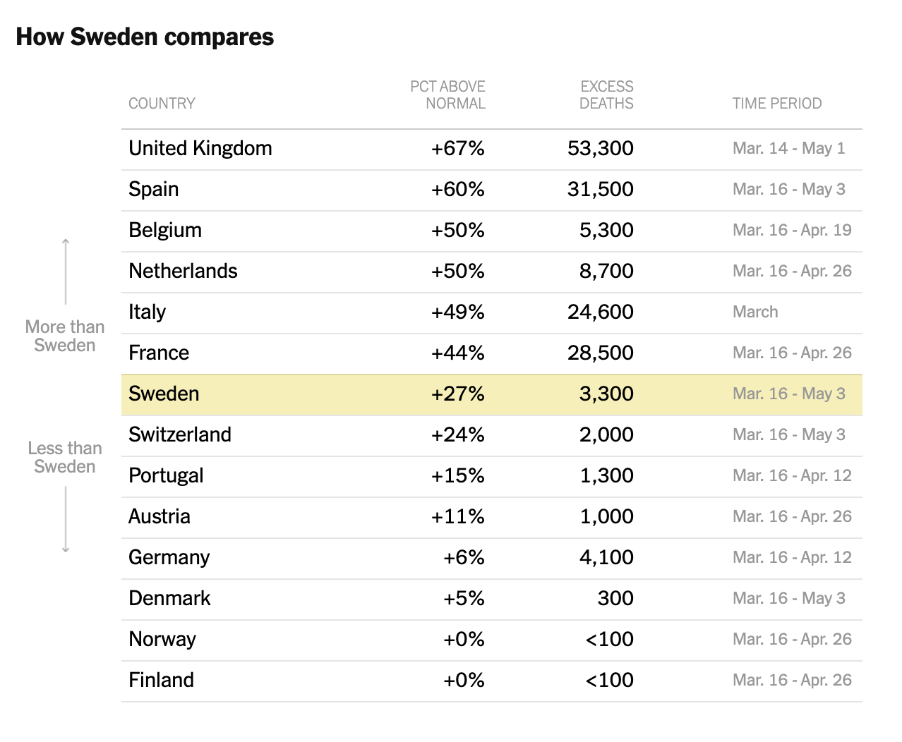
Some people don’t consider tables an effective data visualisation method, but I believe they can have a role in telling your data’s story. Creating good looking tables using R can be cumbersome though, or at least it was until development of the ‘grammar of tables’. This framework gives the various components that form a table explicit names. Such explicit naming helps to streamline table creation. An example of a good-looking, clear table that I have seen can be found in a New York Times (NYT) article discussing how Sweden’s herd immunity approach to managing COVID-19 compared to other European countries that implemented national lockdowns. This is the table as it appears in the NYT - it shows excess deaths for Sweden and other European countries:
In this lab we are going to use the grammar of tables (through the gt package) to replicate the general appearance of the NYT table. Before we start, I want to emphasise that I do not expect you to fully understand this package by the end of the lab. Instead, I want to showcase one method of creating elegant tables using R.
4 Packages and Data
Unfortunately I couldn’t find a source for this data, so we are going to have to create our starting data frame the old fashioned way:
We are also going to need the gt package:
# Load gt package
if(!require("gt")) install.packages("gt")
5 Create a Basic Table
Similar to ggplot2’s ggplot() function for setting up a basic plot, gt has a function, gt(), that sets up a basic table:
# Convert the data frame to a gt table
euro_table_gt <- gt(euro_table)

# View the gt table
euro_table_gt| country | pct_above | excess | time_period |
|---|---|---|---|
| United Kingdom | 67 | 53300 | Mar. 14 - May 1 |
| Spain | 60 | 31500 | Mar. 16 - May 3 |
| Belgium | 50 | 5300 | Mar. 16 - Apr. 19 |
| Netherlands | 50 | 8700 | Mar. 16 - Apr. 26 |
| Italy | 49 | 24600 | March |
| France | 44 | 28500 | Mar. 16 - Apr. 26 |
| Sweden | 27 | 3300 | Mar. 16 - May 3 |
| Switzerland | 24 | 2000 | Mar. 16 - May 3 |
| Portugal | 15 | 1300 | Mar. 16 - Apr. 12 |
| Austria | 11 | 1000 | Mar. 16 - Apr. 26 |
| Germany | 6 | 4100 | Mar. 16 - Apr. 12 |
| Denmark | 5 | 300 | Mar. 16 - May 3 |
| Norway | 0 | 100 | Mar. 16 - Apr. 26 |
| Finland | 0 | 100 | Mar. 16 - Apr. 26 |
As you can see, we can create a simple table with very little effort using gt (and as a bonus it has reasonable defaults that look okay). Our table, however, lacks many of the elements that the NYT version has. For example, the columns with the percentage above normal and the number of deaths have some basic formatting that is not a gt default. But we can do something about that…
6 Customise the Table
Let’s make the table pretty, or at least prettier! We can start with some simple formatting like changing our column names to match those in the NYT article using the rename() function from dplyr:
# Install / load dplyr
if(!require("dplyr")) install.packages("dplyr")

# Modify the column names in the original data frame
euro_table <- euro_table %>% # Pipe the data frame into the rename function
  rename("Country" = country,  # ("New column name" = "old column name")
         "Pct Above Normal" = pct_above, # ("New column name" = "old column name")
         "Excess Deaths" = excess, # ("New column name" = "old column name")
         "Time Period" = time_period) # ("New column name" = "old column name")

# Convert the modified data frame to a gt table
euro_table_gt <- gt(euro_table)

# View the gt table
euro_table_gt| Country | Pct Above Normal | Excess Deaths | Time Period |
|---|---|---|---|
| United Kingdom | 67 | 53300 | Mar. 14 - May 1 |
| Spain | 60 | 31500 | Mar. 16 - May 3 |
| Belgium | 50 | 5300 | Mar. 16 - Apr. 19 |
| Netherlands | 50 | 8700 | Mar. 16 - Apr. 26 |
| Italy | 49 | 24600 | March |
| France | 44 | 28500 | Mar. 16 - Apr. 26 |
| Sweden | 27 | 3300 | Mar. 16 - May 3 |
| Switzerland | 24 | 2000 | Mar. 16 - May 3 |
| Portugal | 15 | 1300 | Mar. 16 - Apr. 12 |
| Austria | 11 | 1000 | Mar. 16 - Apr. 26 |
| Germany | 6 | 4100 | Mar. 16 - Apr. 12 |
| Denmark | 5 | 300 | Mar. 16 - May 3 |
| Norway | 0 | 100 | Mar. 16 - Apr. 26 |
| Finland | 0 | 100 | Mar. 16 - Apr. 26 |
We have started off pretty basic and not actually modified the table yet. gt has a set of fmt_*() functions for formatting columns. As a starting point let’s add separators to the values in the excess death column using the fmt_number() function. This function facilitates formatting of numeric values like so:
# Add separators to the excess death column
euro_table_gt <- euro_table_gt %>% # Pipe the gt table into the fmt_number() function
  fmt_number("Excess Deaths", # ("Column name", ...)
             decimals = 0) # (..., "Number of decimal places")

# View the gt table
euro_table_gt| Country | Pct Above Normal | Excess Deaths | Time Period |
|---|---|---|---|
| United Kingdom | 67 | 53,300 | Mar. 14 - May 1 |
| Spain | 60 | 31,500 | Mar. 16 - May 3 |
| Belgium | 50 | 5,300 | Mar. 16 - Apr. 19 |
| Netherlands | 50 | 8,700 | Mar. 16 - Apr. 26 |
| Italy | 49 | 24,600 | March |
| France | 44 | 28,500 | Mar. 16 - Apr. 26 |
| Sweden | 27 | 3,300 | Mar. 16 - May 3 |
| Switzerland | 24 | 2,000 | Mar. 16 - May 3 |
| Portugal | 15 | 1,300 | Mar. 16 - Apr. 12 |
| Austria | 11 | 1,000 | Mar. 16 - Apr. 26 |
| Germany | 6 | 4,100 | Mar. 16 - Apr. 12 |
| Denmark | 5 | 300 | Mar. 16 - May 3 |
| Norway | 0 | 100 | Mar. 16 - Apr. 26 |
| Finland | 0 | 100 | Mar. 16 - Apr. 26 |
We can also write custom formatters with fmt(), which is useful as we’re trying to replicate someone else’s table. In this case we need to do two slightly ‘off-piste’ actions that requires these custom formatters:
- Add a
+before the percentages and a%after
- Add a
<for countries that have excess numbers of deaths below 100
Let’s write two small functions, plus_percent() and less_than_100(), to format pct_above and excess using the glue package. Do not worry if you don’t fully understand the following code chunk, writing custom functions is advanced!
# Install / load glue
if(!require("glue")) install.packages("glue")

# Add < to excess deaths less than 100
less_than_100 <- function(.x) {
  glue::glue("< {.x}")
}

# Add + and % to percentage above
plus_percent <- function(.x) {
  glue::glue("+ {.x} %")
}
In these functions we are essentially taking observations from our variables of interest {.x} and using the glue package to modify their appearance by adding extra character information either side of them. For pct_above, we want to format the whole column, but for excess, we only want to format rows with values of 100. We can specify that with the rows argument:
# Modify the gt table using our custom functions
euro_table_gt <- euro_table_gt %>%
  # fns allows us to call our custom function
  fmt("Pct Above Normal", fns = plus_percent) %>%
  # rows allows us to specify the exact rows to modify
  fmt("Excess Deaths", rows = `Excess Deaths` == 100,  fns = less_than_100)

# View the gt table
euro_table_gt| Country | Pct Above Normal | Excess Deaths | Time Period |
|---|---|---|---|
| United Kingdom | + 67 % | 53,300 | Mar. 14 - May 1 |
| Spain | + 60 % | 31,500 | Mar. 16 - May 3 |
| Belgium | + 50 % | 5,300 | Mar. 16 - Apr. 19 |
| Netherlands | + 50 % | 8,700 | Mar. 16 - Apr. 26 |
| Italy | + 49 % | 24,600 | March |
| France | + 44 % | 28,500 | Mar. 16 - Apr. 26 |
| Sweden | + 27 % | 3,300 | Mar. 16 - May 3 |
| Switzerland | + 24 % | 2,000 | Mar. 16 - May 3 |
| Portugal | + 15 % | 1,300 | Mar. 16 - Apr. 12 |
| Austria | + 11 % | 1,000 | Mar. 16 - Apr. 26 |
| Germany | + 6 % | 4,100 | Mar. 16 - Apr. 12 |
| Denmark | + 5 % | 300 | Mar. 16 - May 3 |
| Norway | + 0 % | < 100 | Mar. 16 - Apr. 26 |
| Finland | + 0 % | < 100 | Mar. 16 - Apr. 26 |
The table content now broadly matches the NYT article, but there are stylistic differences. In particular, we need to:
- Change font (depending on the cell, we might need to change the size, color, case, or weight)
- Highlight the row with data from Sweden
tab_style() can handle both of these issues. tab_style() takes two additional arguments beyond a gt object: style and locations. style lets us specify how a part of the table should be styled with cell_text(), cell_fill(), or cell_borders(). The locations argument is the real magic of tab_style() as it lets us specify exactly which columns, rows, or cells to style. We want to format some cells in the table body, so we’ll use cells_body(). Let’s highlight Sweden first. We’ll add the highlighting color with cell_fill(color = "#F7EFB2"). As before, we can use the rows argument to tell gt to highlight the row where Country == "Sweden":
# Modify the gt table to include highlighting
euro_table_gt <- euro_table_gt %>%
  tab_style(
    style = cell_fill(color = "#F7EFB2"),  # What to do (i.e. colour cell)
    locations = cells_body(rows = Country == "Sweden")  # Which cell(s)
  )

# View the gt table
euro_table_gt| Country | Pct Above Normal | Excess Deaths | Time Period |
|---|---|---|---|
| United Kingdom | + 67 % | 53,300 | Mar. 14 - May 1 |
| Spain | + 60 % | 31,500 | Mar. 16 - May 3 |
| Belgium | + 50 % | 5,300 | Mar. 16 - Apr. 19 |
| Netherlands | + 50 % | 8,700 | Mar. 16 - Apr. 26 |
| Italy | + 49 % | 24,600 | March |
| France | + 44 % | 28,500 | Mar. 16 - Apr. 26 |
| Sweden | + 27 % | 3,300 | Mar. 16 - May 3 |
| Switzerland | + 24 % | 2,000 | Mar. 16 - May 3 |
| Portugal | + 15 % | 1,300 | Mar. 16 - Apr. 12 |
| Austria | + 11 % | 1,000 | Mar. 16 - Apr. 26 |
| Germany | + 6 % | 4,100 | Mar. 16 - Apr. 12 |
| Denmark | + 5 % | 300 | Mar. 16 - May 3 |
| Norway | + 0 % | < 100 | Mar. 16 - Apr. 26 |
| Finland | + 0 % | < 100 | Mar. 16 - Apr. 26 |
There are also several typographic styles in the table, so let’s address them one at a time. First, Country, Pct Above Normal, and Excess Deaths all have a font size of 15 pixels, are lightly bolded and have a different font than gt’s defaults. We can specify all of these differences with cell_text(). Again, these are cells in the table body, so we’ll use cells_body() to locate them. We can exploit the vars() function to find each of the columns we want to format.
# Edit the gt table
euro_table_gt <- euro_table_gt %>%
  tab_style(
    style = cell_text(size = px(15), weight = "bold", font = "arial"),  # Modify font
    locations = cells_body(vars(Country, `Pct Above Normal`, `Excess Deaths`))  # Which cell(s) to apply modifications to
  )

# View the gt table
euro_table_gt| Country | Pct Above Normal | Excess Deaths | Time Period |
|---|---|---|---|
| United Kingdom | + 67 % | 53,300 | Mar. 14 - May 1 |
| Spain | + 60 % | 31,500 | Mar. 16 - May 3 |
| Belgium | + 50 % | 5,300 | Mar. 16 - Apr. 19 |
| Netherlands | + 50 % | 8,700 | Mar. 16 - Apr. 26 |
| Italy | + 49 % | 24,600 | March |
| France | + 44 % | 28,500 | Mar. 16 - Apr. 26 |
| Sweden | + 27 % | 3,300 | Mar. 16 - May 3 |
| Switzerland | + 24 % | 2,000 | Mar. 16 - May 3 |
| Portugal | + 15 % | 1,300 | Mar. 16 - Apr. 12 |
| Austria | + 11 % | 1,000 | Mar. 16 - Apr. 26 |
| Germany | + 6 % | 4,100 | Mar. 16 - Apr. 12 |
| Denmark | + 5 % | 300 | Mar. 16 - May 3 |
| Norway | + 0 % | < 100 | Mar. 16 - Apr. 26 |
| Finland | + 0 % | < 100 | Mar. 16 - Apr. 26 |
Time Period has a smaller font in grey. It’s also got a margin on the left to push it away from the excess deaths column; we can use the indent argument to replicate that. We need to add the same indent to the Time Period column label, so we’ll add a second tab_style() that finds that location with cells_column_labels().
# Edit the gt table
euro_table_gt <- euro_table_gt %>%
  tab_style(
    style = cell_text(size = px(12), font = "arial", indent = px(65)),  # Modify font
    locations = cells_body(vars("Time Period")) # Which cell(s) to apply modification to
  ) %>%
  tab_style(
    style = cell_text(indent = px(65)),  # Create an indentation
    locations = cells_column_labels(vars("Time Period"))  # Which column to apply indentation to
  )

# View the gt table
euro_table_gt| Country | Pct Above Normal | Excess Deaths | Time Period |
|---|---|---|---|
| United Kingdom | + 67 % | 53,300 | Mar. 14 - May 1 |
| Spain | + 60 % | 31,500 | Mar. 16 - May 3 |
| Belgium | + 50 % | 5,300 | Mar. 16 - Apr. 19 |
| Netherlands | + 50 % | 8,700 | Mar. 16 - Apr. 26 |
| Italy | + 49 % | 24,600 | March |
| France | + 44 % | 28,500 | Mar. 16 - Apr. 26 |
| Sweden | + 27 % | 3,300 | Mar. 16 - May 3 |
| Switzerland | + 24 % | 2,000 | Mar. 16 - May 3 |
| Portugal | + 15 % | 1,300 | Mar. 16 - Apr. 12 |
| Austria | + 11 % | 1,000 | Mar. 16 - Apr. 26 |
| Germany | + 6 % | 4,100 | Mar. 16 - Apr. 12 |
| Denmark | + 5 % | 300 | Mar. 16 - May 3 |
| Norway | + 0 % | < 100 | Mar. 16 - Apr. 26 |
| Finland | + 0 % | < 100 | Mar. 16 - Apr. 26 |
Finally, the column labels are all smaller, gray, and uppercase. Again, we can use cell_text() to specify each of these, including the transform = "uppercase" argument. For locations, we’ll use cells_column_labels() again, and since we want to apply this to all columns, we can use the tidyselect helper everything() to get them all.
# Edit the gt table
euro_table_gt <- euro_table_gt %>%
  tab_style(
    style = cell_text(size = px(11), font = "arial", transform = "uppercase"),  # Modify font
    locations = cells_column_labels(everything())  # Which column headings to apply this to
  )

# View the gt table
euro_table_gt| Country | Pct Above Normal | Excess Deaths | Time Period |
|---|---|---|---|
| United Kingdom | + 67 % | 53,300 | Mar. 14 - May 1 |
| Spain | + 60 % | 31,500 | Mar. 16 - May 3 |
| Belgium | + 50 % | 5,300 | Mar. 16 - Apr. 19 |
| Netherlands | + 50 % | 8,700 | Mar. 16 - Apr. 26 |
| Italy | + 49 % | 24,600 | March |
| France | + 44 % | 28,500 | Mar. 16 - Apr. 26 |
| Sweden | + 27 % | 3,300 | Mar. 16 - May 3 |
| Switzerland | + 24 % | 2,000 | Mar. 16 - May 3 |
| Portugal | + 15 % | 1,300 | Mar. 16 - Apr. 12 |
| Austria | + 11 % | 1,000 | Mar. 16 - Apr. 26 |
| Germany | + 6 % | 4,100 | Mar. 16 - Apr. 12 |
| Denmark | + 5 % | 300 | Mar. 16 - May 3 |
| Norway | + 0 % | < 100 | Mar. 16 - Apr. 26 |
| Finland | + 0 % | < 100 | Mar. 16 - Apr. 26 |
We can now see that the table is broadly similar to the NYT article. We can save the table as an HTML file with gt::gtsave() and then open it in a browser to see the final result.
# Save the gt table as an HTML file
gt::gtsave(euro_table_gt, "euro_table.html")
7 Activities
There are no activities for this lab. If you want to practice using gt there are six practice datasets built into the package. For a more basic tutorial please see here.
8 Recap
gtis a package for creating publication-ready tables in R;gtcan be used to create tables from scratch, or to modify existing tables.