Explore tools for customising plot appearance in R.
2 Introduction
We have made some very basic plots so far, but we can do a lot more. Customising your graphs may, at first glance, appear reasonably trivial but the harsh reality is that many graphing packages in R have terrible defaults that contain lots of chart junk (i.e., unnecessary elements that distract the audience) as we saw in Lab 3.1. Thankfully R also provides great flexibility that facilitates customisation of almost every graph component. In fact, many major organisations actually use custom ggplot2 themes to create their stylised graphics (e.g., BBC). In this section, we will look at some of the ways we can customise our plots.
3 Start a Script
For this lab or project, begin by:
Starting a new R script
Create a good header section and table of contents
Save the script file with an informative name
set your working directory
Aim to make the script a future reference for doing things in R!
4 Data and Packages
# Load packageslibrary(tidyverse)
── Attaching core tidyverse packages ──────────────────────── tidyverse 2.0.0 ──
✔ dplyr     1.1.3     ✔ readr     2.1.4
✔ forcats   1.0.0     ✔ stringr   1.5.0
✔ ggplot2   3.4.4     ✔ tibble    3.2.1
✔ lubridate 1.9.3     ✔ tidyr     1.3.0
✔ purrr     1.0.2
── Conflicts ────────────────────────────────────────── tidyverse_conflicts() ──
✖ dplyr::filter() masks stats::filter()
✖ dplyr::lag()    masks stats::lag()
ℹ Use the conflicted package (<http://conflicted.r-lib.org/>) to force all conflicts to become errors
# Simulate data for line plotsnewdata <-data.frame(x =runif(24, -2, 2), # Create a variable x with 24 values between -2 and 2y =rnorm(24)) # Create a variable y with 24 random normal values
5 Customising base R Plots
5.1 Histograms
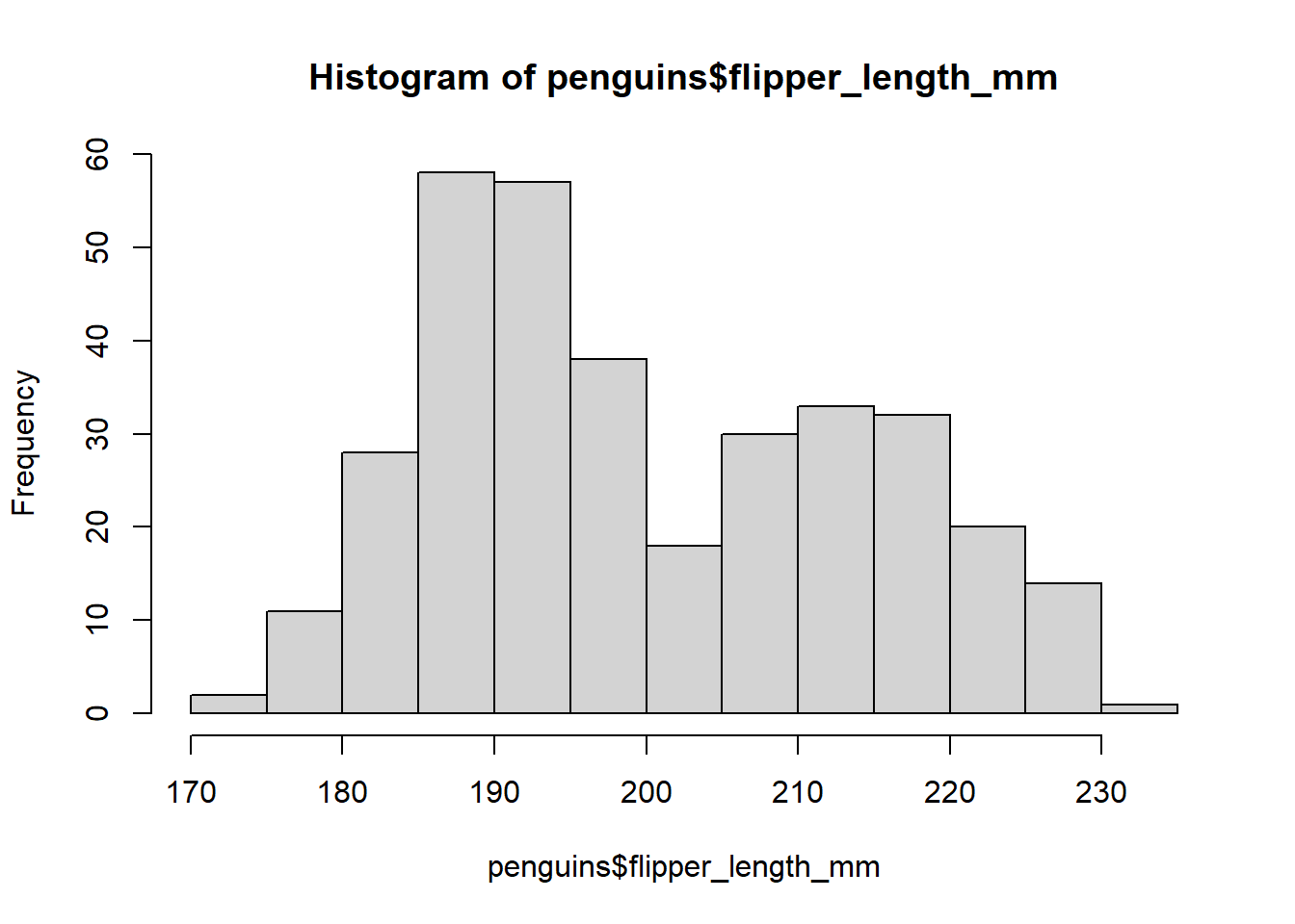
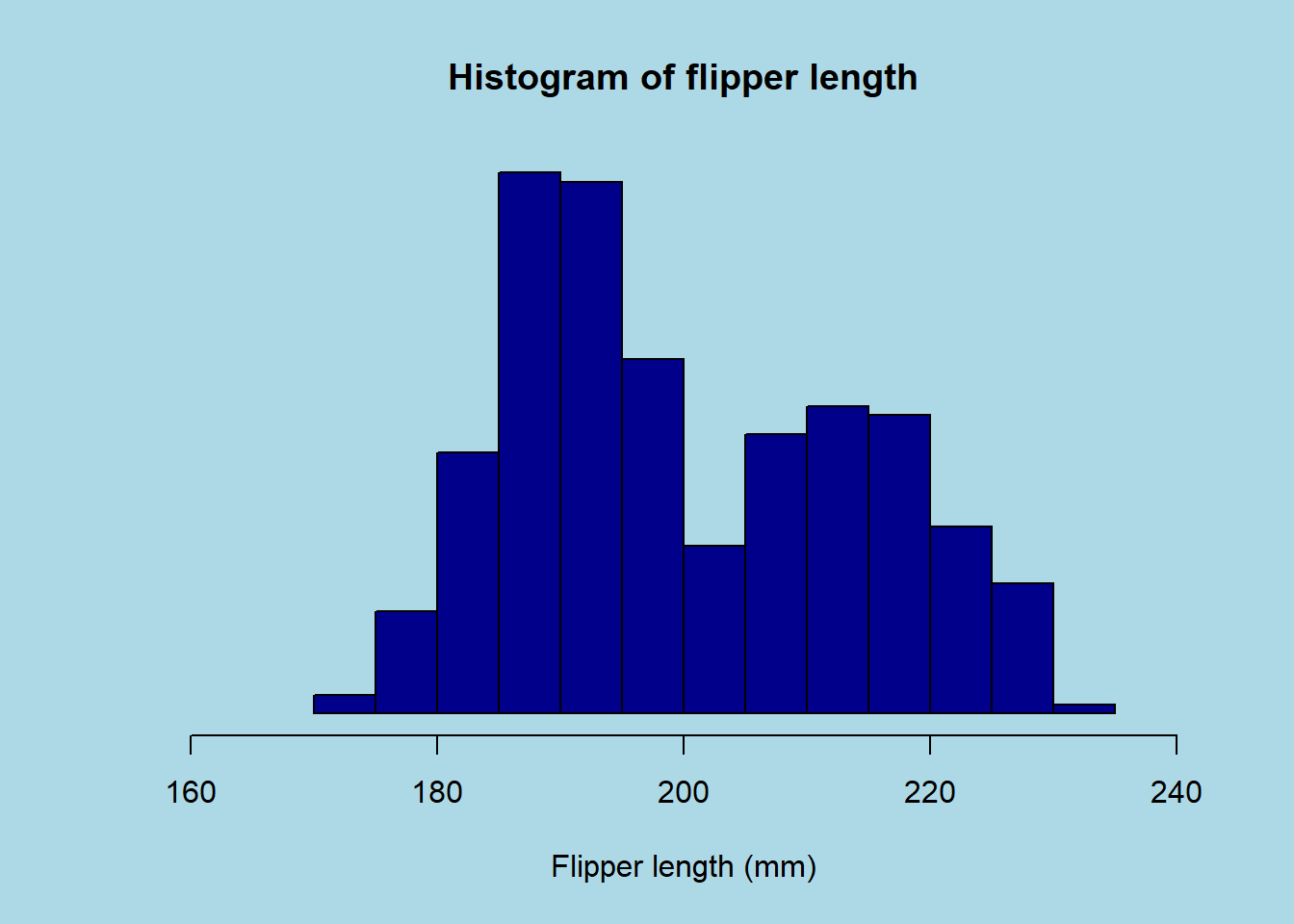
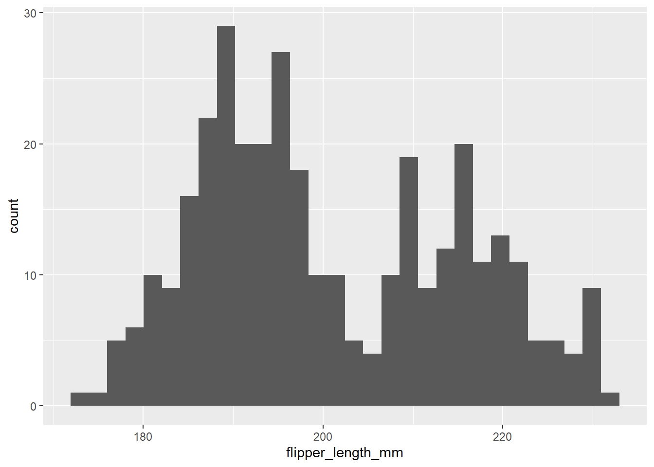
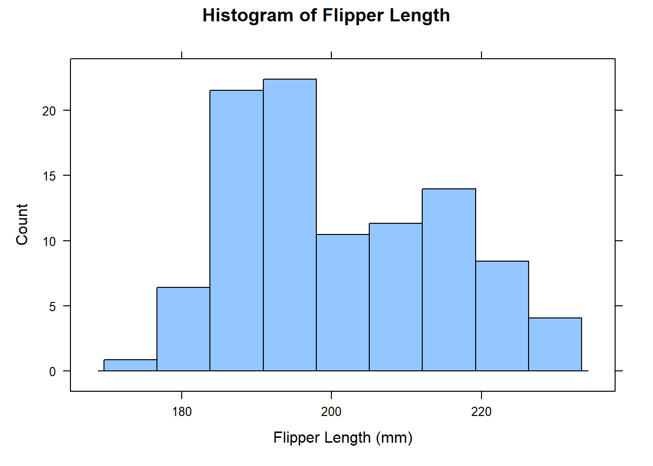
Let’s start by re-creating a histogram of the flipper length of the penguins. We can use the hist() function to do this:
# Create histogram of flipper lengthhist(penguins$flipper_length_mm) # Specify data
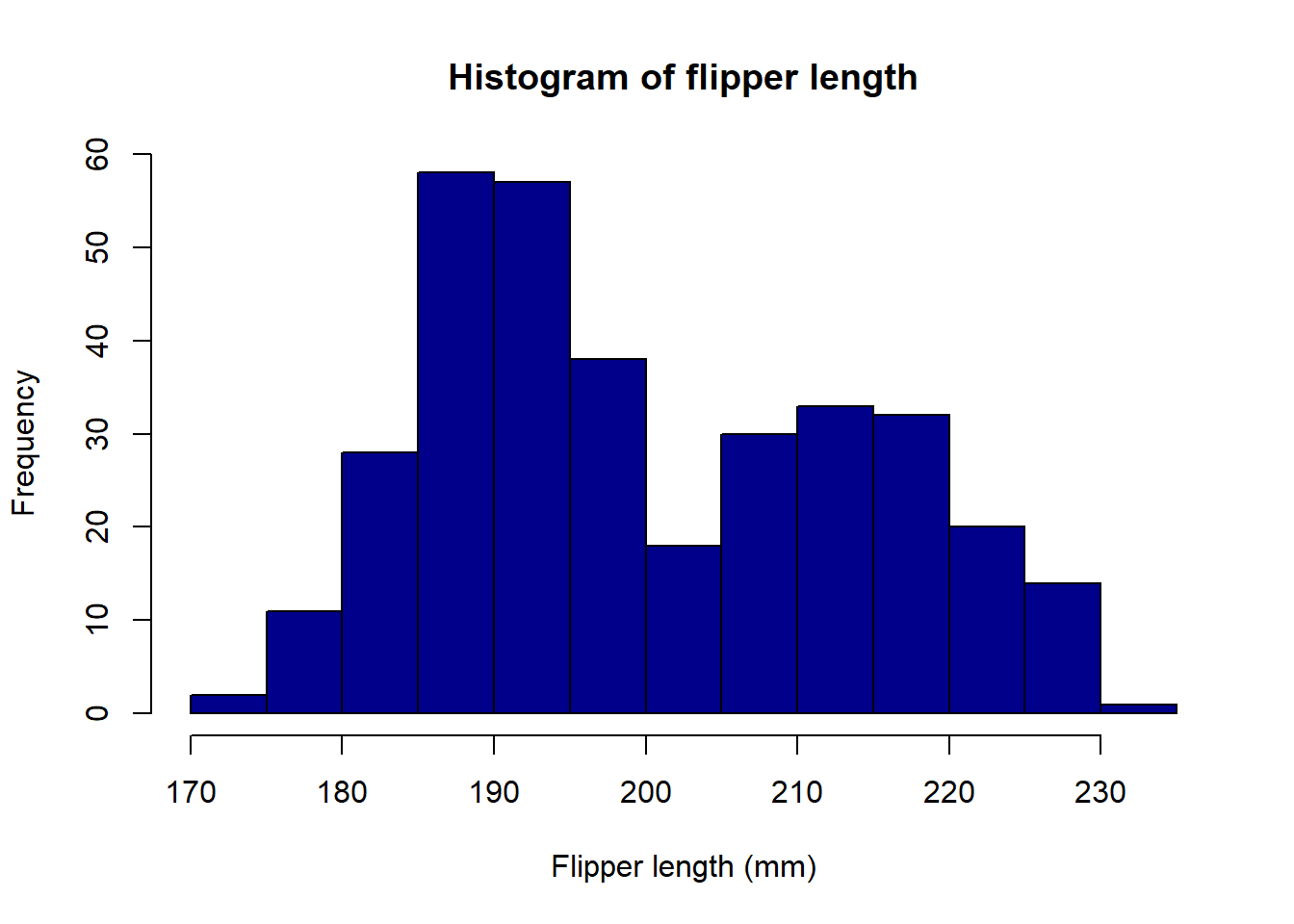
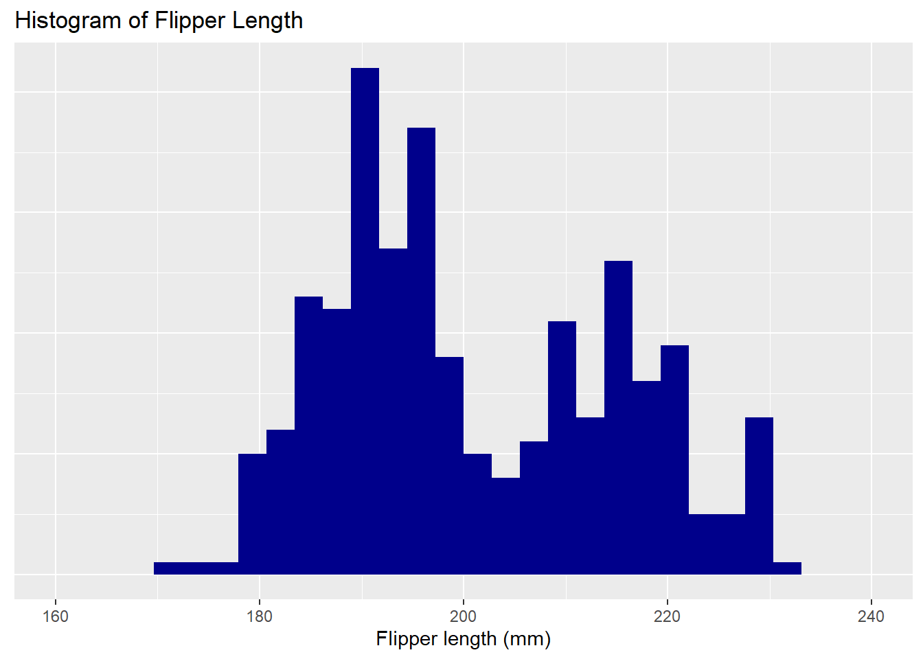
We can modify the aesthetics of the histogram using the col argument and provide context using the main and xlab arguments:
# Create histogram of flipper length hist(penguins$flipper_length_mm, # Specify databreaks =20, # Change number of binscol ="darkblue", # Change colourmain ="Histogram of flipper length", # Add titlexlab ="Flipper length (mm)") # Add x-axis label
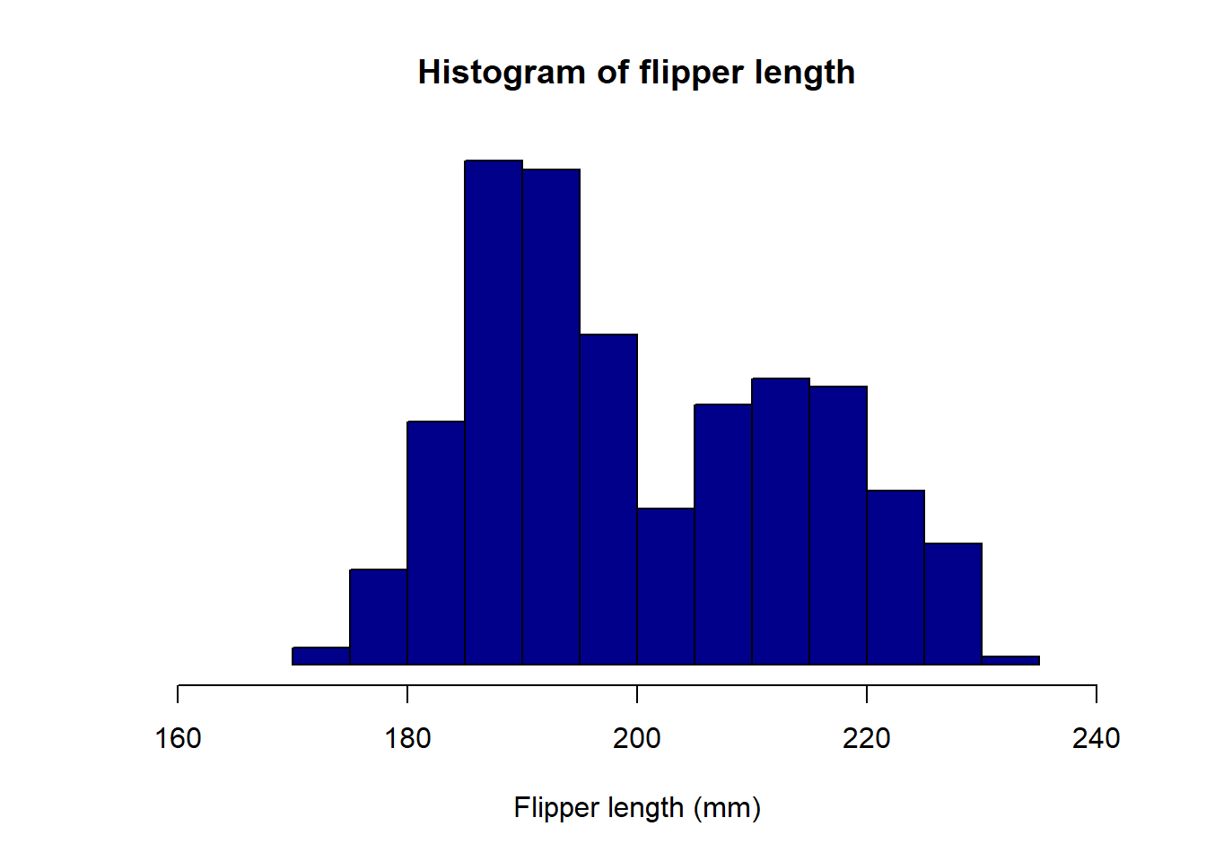
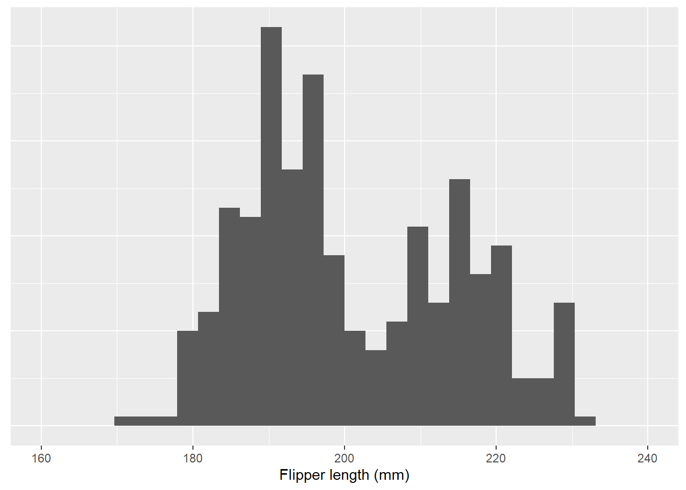
These are only some of the aesthetic options we can modify. We can also change the axis limits, axis labels, axis tick marks, and more. Let’s say we want to change the x-axis limits to 160 and 240, the x-axis label to “Flipper length (mm)”, and remove the y-axis tick marks and title. We can do this using the xlim, xlab, yaxt and ylab arguments, respectively:
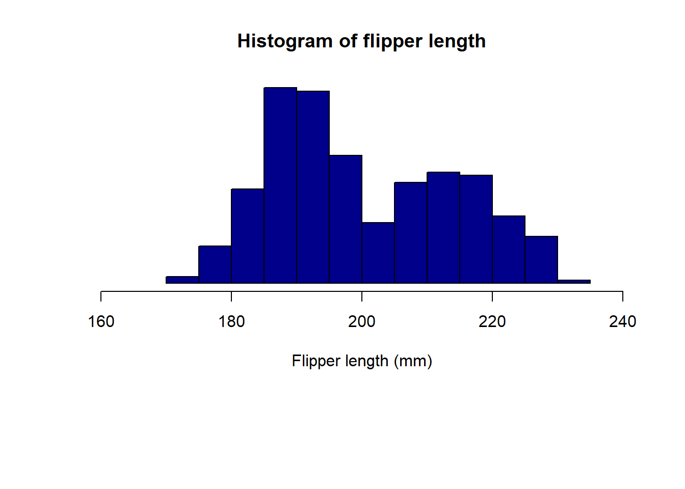
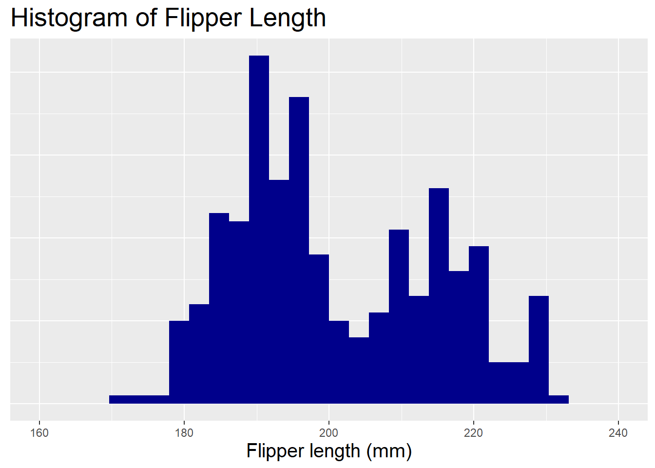
We can modify the plot margins using the par() function. The par() function is used to set or query graphical parameters. The mar argument is used to set the margins of the plot. The default margins are c(5, 4, 4, 2) + 0.1. The numbers in the vector are the number of lines of margin to be specified on the four sides of the plot (bottom, left, top, and right). The default unit is lines, but other units can be specified using the mar argument. For example, if we want to change the bottom margin to 10 lines, we can do the following:
We can also modify the background if we really want! We can do this using the par() function and the bg argument. The bg argument is used to set the background colour of the plot. The default background colour is white. We can change the background colour to light blue using the following code:
# Change the bottom margin back to the defaultpar(mar =c(5, 4, 4, 2) +0.1)# Change the background colour to light bluepar(bg ="lightblue")# Create histogram of flipper lengthhist(penguins$flipper_length_mm, # Specify databreaks =20, # Change number of binscol ="darkblue", # Change colourmain ="Histogram of flipper length", # Add titlexlab ="Flipper length (mm)", # Add x-axis labelxlim =c(160, 240), # Change x-axis limitsyaxt ="n", # Remove y-axis tick marksylab ="") # Remove y-axis label
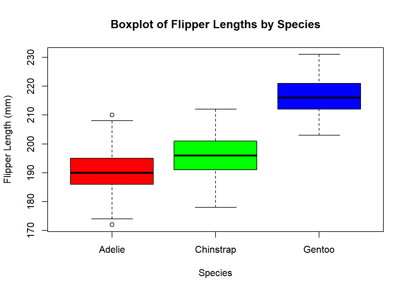
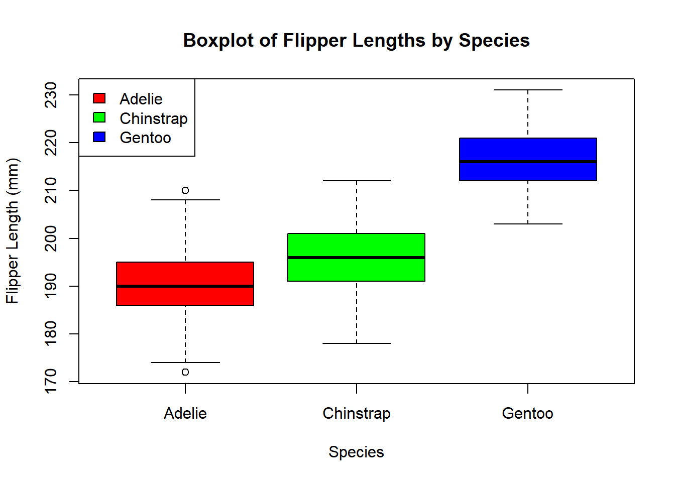
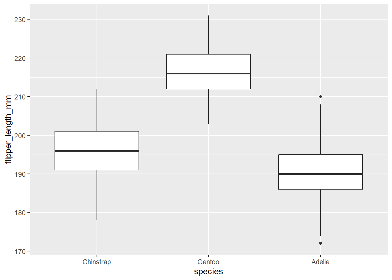
5.2 Boxplots
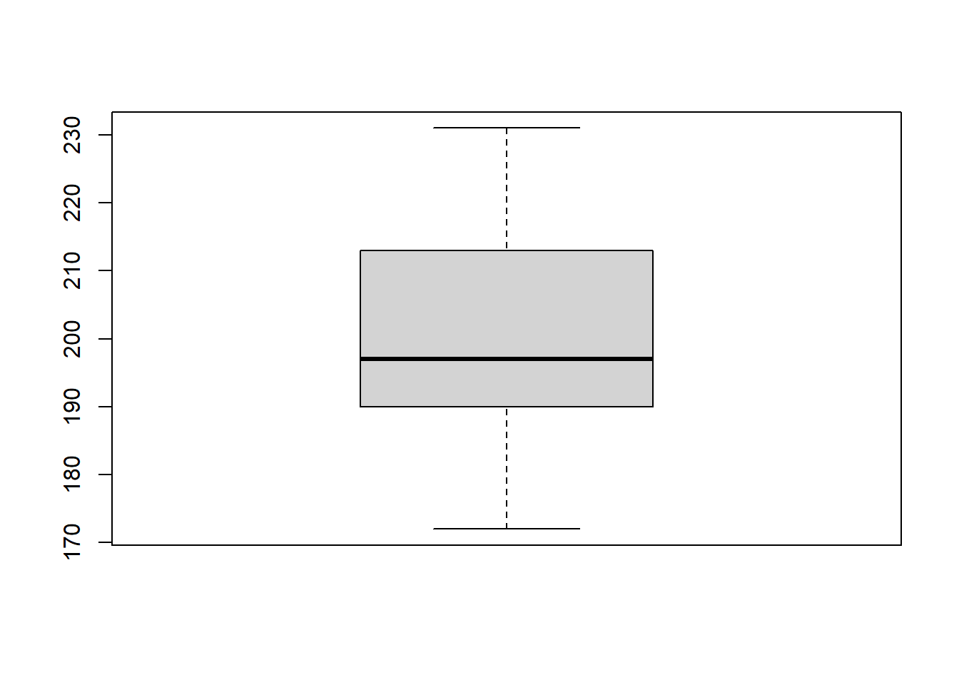
Let’s start by re-creating a boxplot of the flipper length of the penguins. We can use the boxplot() function to do this:
# Change the background colour back to whitepar(bg ="white")# Create boxplot of flipper lengthboxplot(penguins$flipper_length_mm) # Specify data
We can modify the aesthetics of the boxplot using the col argument and provide context using the main and xlab arguments:
Now it isn’t strictly necessary here as each penguin species is already labelled on the x-axis, but we could add a legend to the plot using the legend() function:
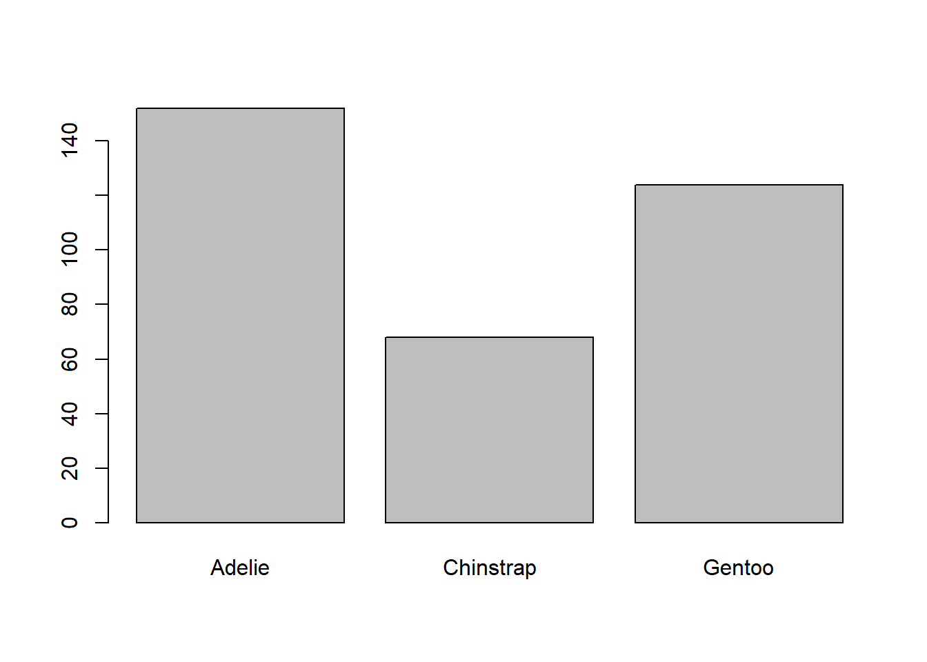
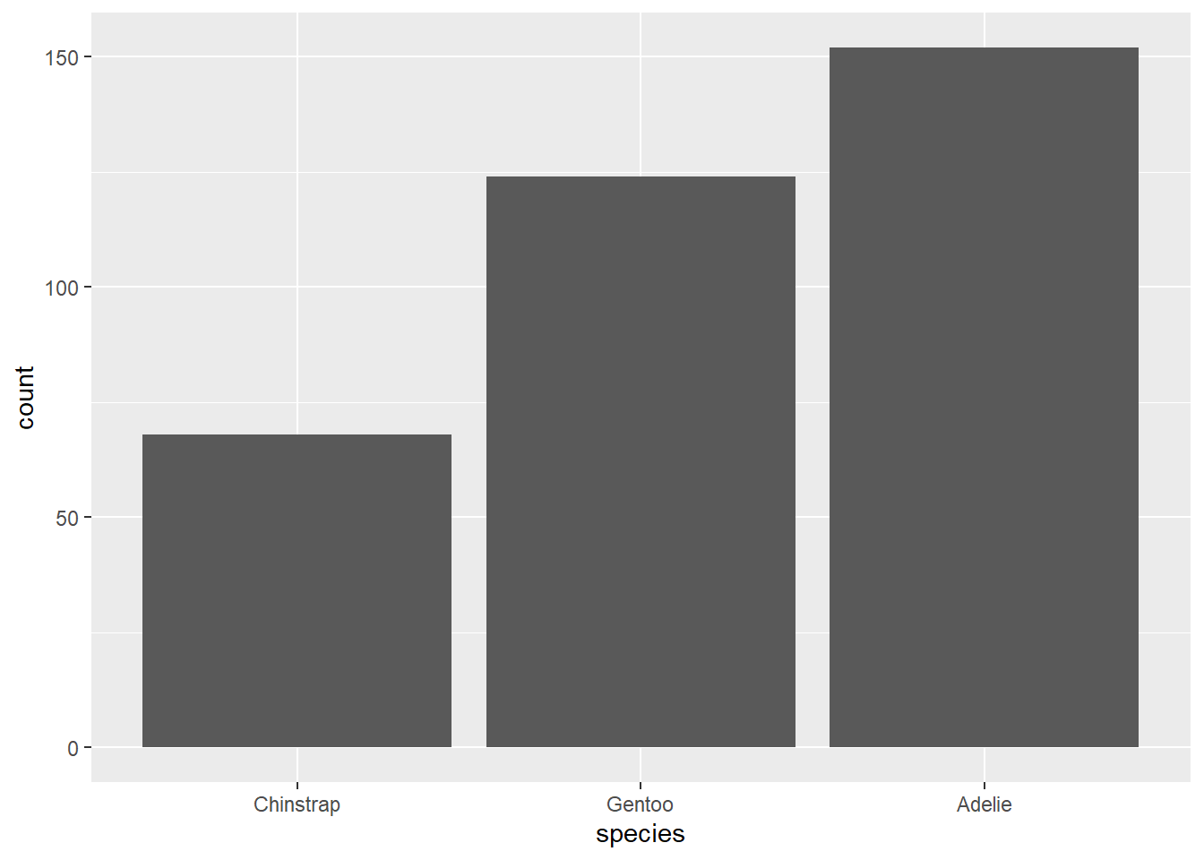
Let’s start by re-creating a barplot of the species of penguins in the dataset. We can use the barplot() function to do this:
# Create barplot of speciesbarplot(table(penguins$species)) # Specify data
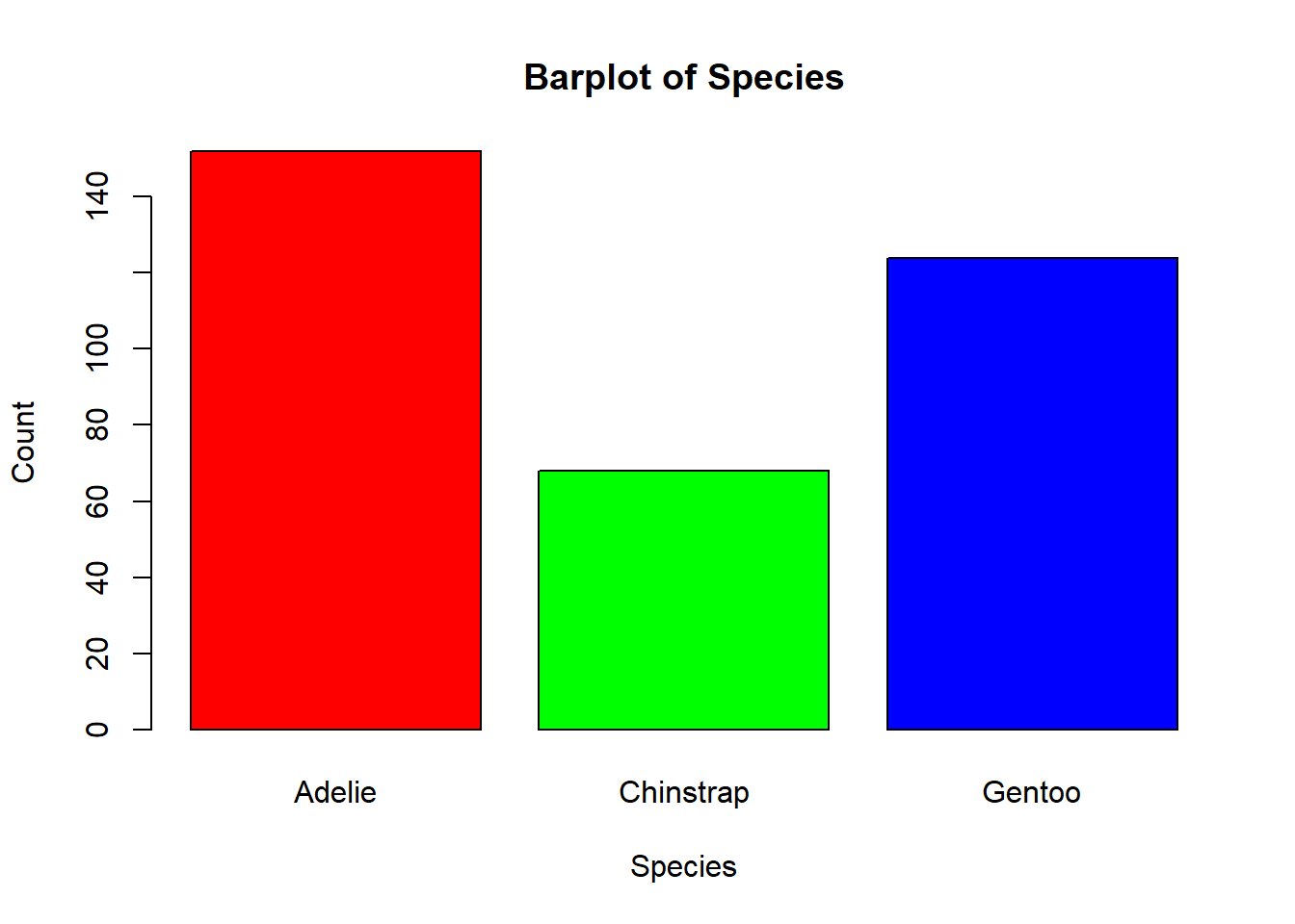
The barplot() function has a number of arguments that you can use to customise the barplot. We can change the aesthetics of the boxplot using the col argument and provide context using the main and xlab arguments:
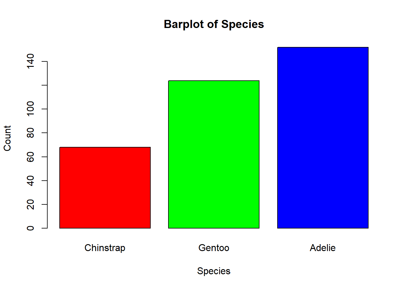
To view your colour options you can run ?colors() in the console. If you want to change the order of the bars, you can also re-order the factor levels of the species variable to make the plot easier to interpret:
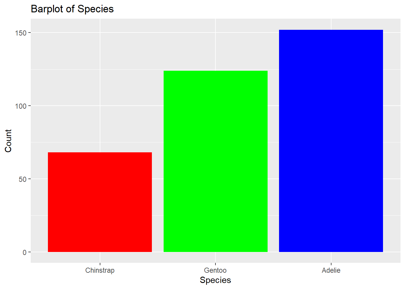
# Reorder the levels of the factorpenguins$species <-factor(penguins$species, levels =c("Chinstrap", "Gentoo", "Adelie"))# Barplot showing speciesbarplot(table(rev(penguins$species)), # Specify datamain ="Barplot of Species", # Add titlexlab ="Species", # Add x-axis labelylab ="Count", # Add y-axis labelcol =c("red", "green", "blue")) # Change colour
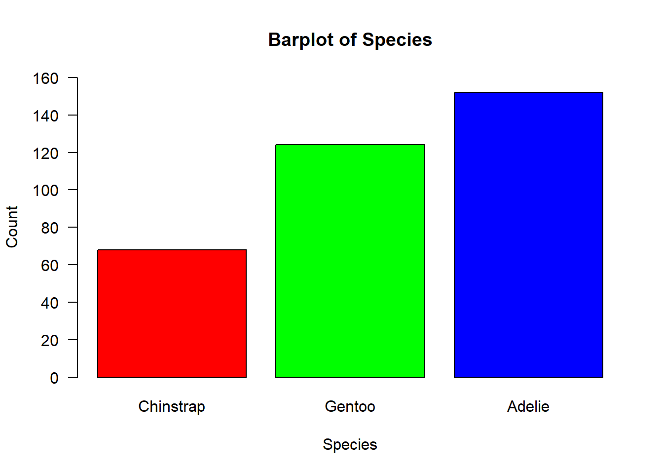
We can also change the y-axis limits as they currently do not fit the data range for the Adelie pengiuns:
# Barplot showing speciesbarplot(table(penguins$species), # Specify datamain ="Barplot of Species", # Add titlexlab ="Species", # Add x-axis labelylab ="Count", # Add y-axis labelcol =c("red", "green", "blue"), # Change colourylim =c(0, 160), # Change y-axis limitsyaxt ="n") # Remove y-axis tick marks # Add custom y-axis tick marksaxis(side =2, # Specify side of plotat =seq(0, 160, by =20), # Specify tick mark positionslas =2) # Specify tick mark orientation - 2 = horizontal and 3 = vertical
5.4 Scatterplots
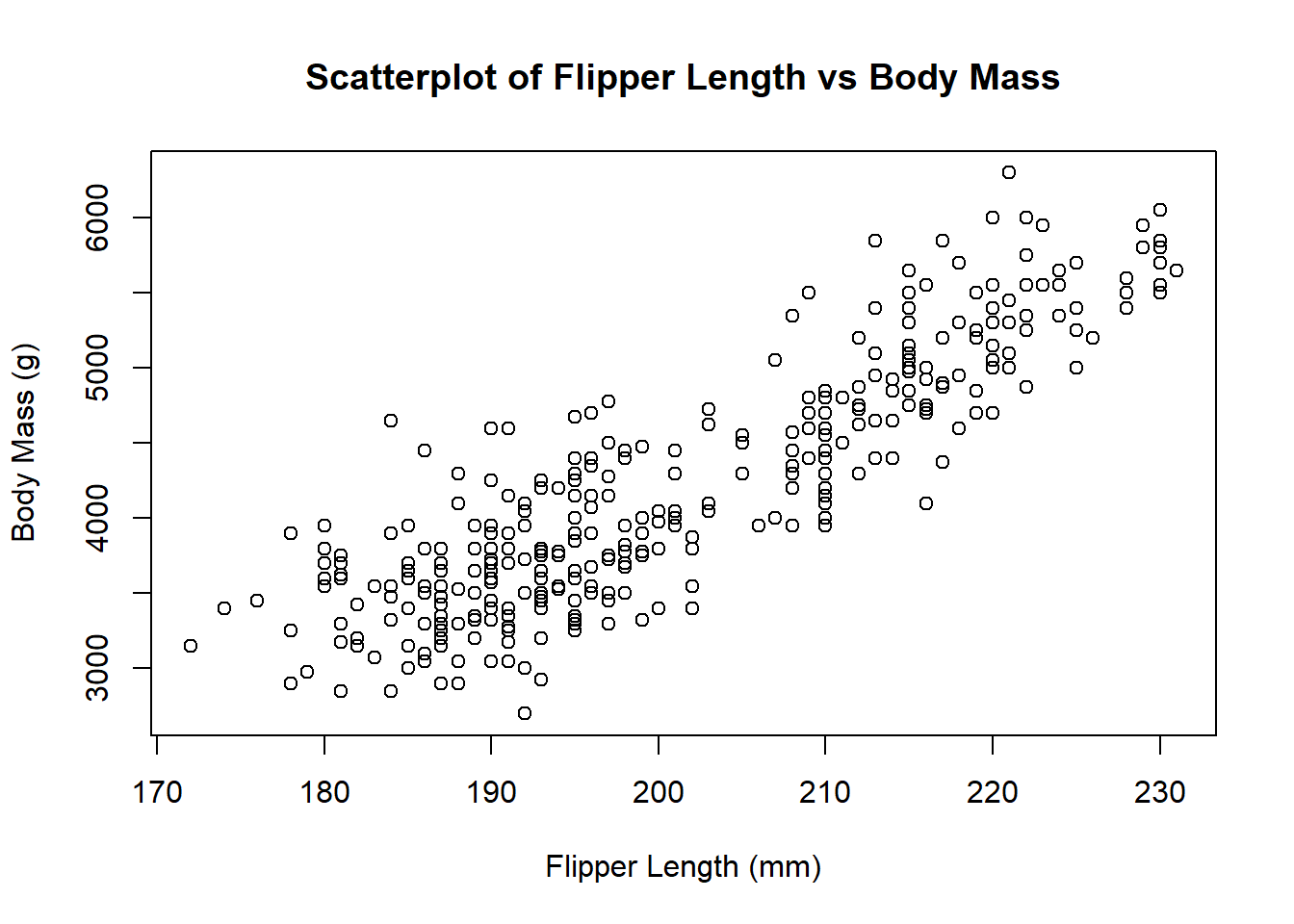
Let’s start by re-creating a scatterplot of flipper length against body mass for the penguins dataset. We can do this using the plot() function:
# Scatterplot of flipper length against body massplot(penguins$flipper_length_mm, # Specify data penguins$body_mass_g, # Specify datamain ="Scatterplot of Flipper Length vs Body Mass", # Add titlexlab ="Flipper Length (mm)", # Add x-axis labelylab ="Body Mass (g)") # Add y-axis label
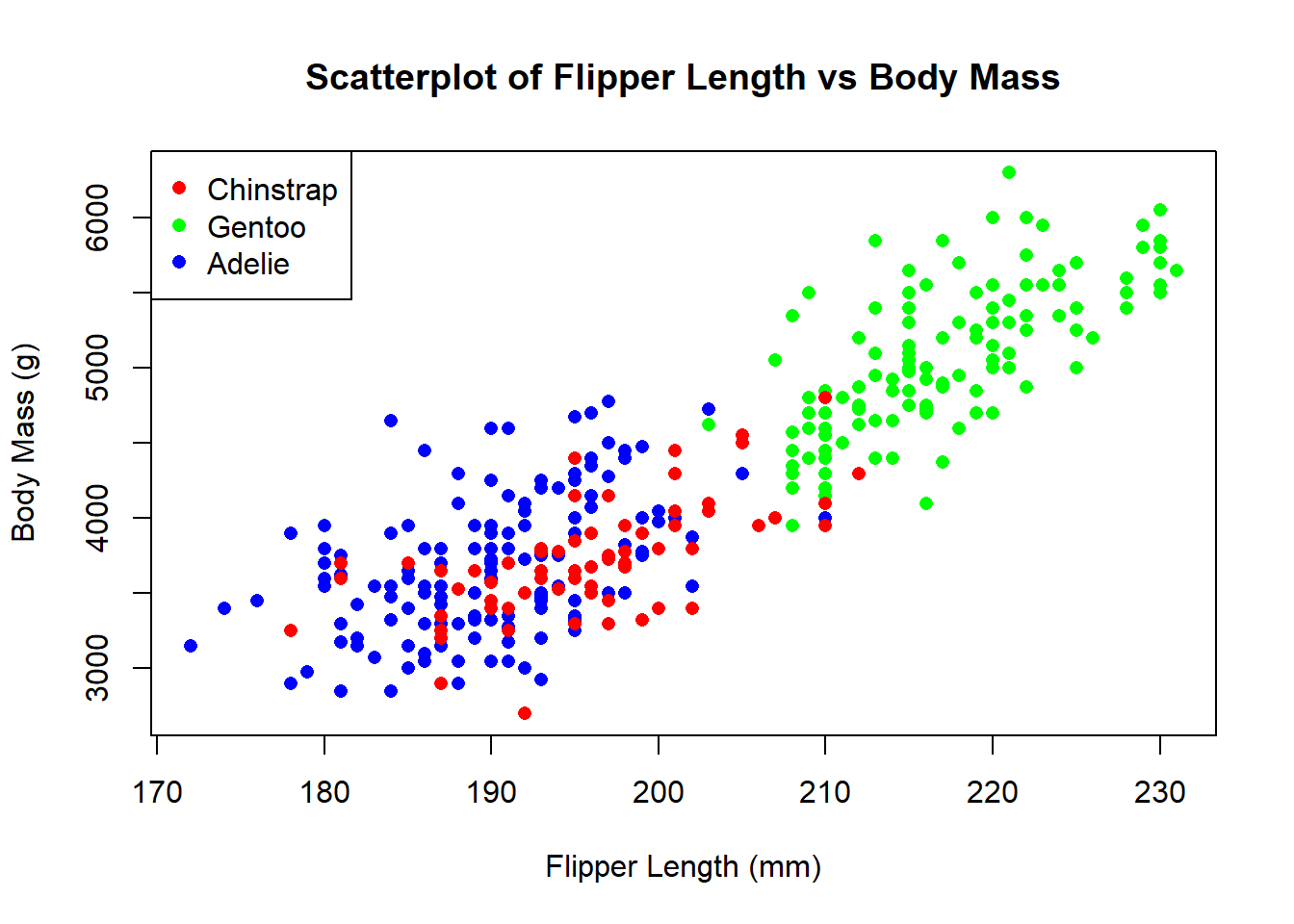
We can also add some additional context by colouring the points by species:
# Scatterplot of flipper length against body massplot(penguins$flipper_length_mm, # Specify data penguins$body_mass_g, # Specify datamain ="Scatterplot of Flipper Length vs Body Mass", # Add titlexlab ="Flipper Length (mm)", # Add x-axis labelylab ="Body Mass (g)", # Add y-axis labelcol =c("red", "green", "blue")[penguins$species], # Change colourpch =16) # Change point symbol# Add legendlegend("topleft", # Specify position of legendlegend =levels(penguins$species), # Specify legend labelscol =c("red", "green", "blue"), # Specify legend colourspch =16) # Specify legend symbol
If you want to view which legend symbols are available, you can use the ?points function to view the help file for the points() function. This will show you the different legend symbols that are available. You can also change the size of the legend symbols using the cex argument.
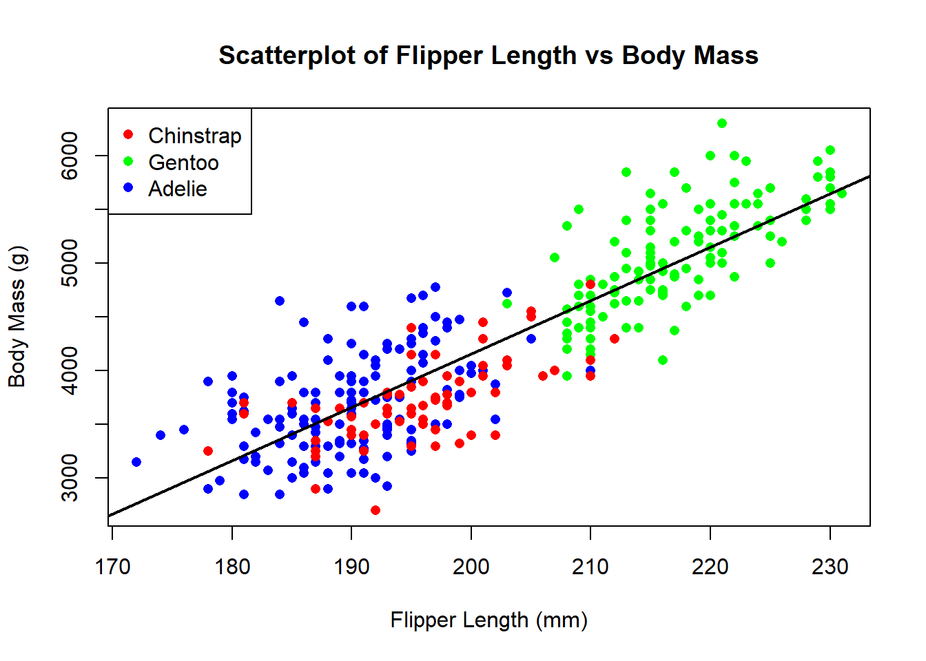
You can also add trend lines to the scatterplot using the abline() function. For example, if we want to add a linear trend line to the scatterplot, we can do the following:
# Scatterplot of flipper length against body massplot(penguins$flipper_length_mm, # Specify data penguins$body_mass_g, # Specify datamain ="Scatterplot of Flipper Length vs Body Mass", # Add titlexlab ="Flipper Length (mm)", # Add x-axis labelylab ="Body Mass (g)", # Add y-axis labelcol =c("red", "green", "blue")[penguins$species], # Change colourpch =16) # Change point symbol# Add legendlegend("topleft", # Specify position of legendlegend =levels(penguins$species), # Specify legend labelscol =c("red", "green", "blue"), # Specify legend colourspch =16) # Specify legend symbol# Add linear trend line for each speciesabline(lm(penguins$body_mass_g ~ penguins$flipper_length_mm), # Specify linear modelcol ="black", # Change colourlwd =2) # Change line width
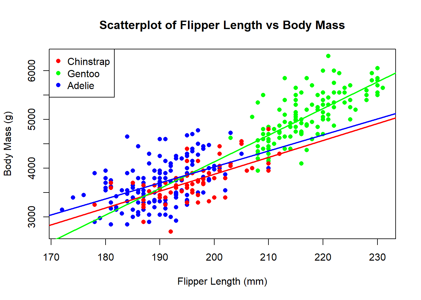
This trend line is for all three species. If we want to add one for each species it becomes a bit more complicated as we have to fit a linear model for each species and then add the trend line for each species:
# Scatterplot of flipper length against body massplot(penguins$flipper_length_mm, # Specify data penguins$body_mass_g, # Specify datamain ="Scatterplot of Flipper Length vs Body Mass", # Add titlexlab ="Flipper Length (mm)", # Add x-axis labelylab ="Body Mass (g)", # Add y-axis labelcol =c("red", "green", "blue")[penguins$species], # Change colourpch =16) # Change point symbol# Add legendlegend("topleft", # Specify position of legendlegend =levels(penguins$species), # Specify legend labelscol =c("red", "green", "blue"), # Specify legend colourspch =16) # Specify legend symbol# Add trend lines for each speciesspecies_levels <-levels(penguins$species)colors <-c("red", "green", "blue")for (i inseq_along(species_levels)) { species_data <-subset(penguins, species == species_levels[i]) fit <-lm(body_mass_g ~ flipper_length_mm, data = species_data)abline(fit, col = colors[i], lw =2)}
6 Customising ggplot2 Plots
6.1 Histograms
Let’s start by re-creating the histogram of flipper length for the penguins dataset. We can do this using the geom_histogram() function:
# Create histogram of flipper lengthggplot(data = penguins, aes(x = flipper_length_mm)) +# Specify data and aesthetic mappingsgeom_histogram() # Add histogram layer
`stat_bin()` using `bins = 30`. Pick better value with `binwidth`.
We can see that this produces the same histogram as the base R version. These are only some of the aesthetic options we can modify. We can also change the axis limits, axis labels, axis tick marks, and more. Let’s say we want to change the x-axis limits to 160 and 240, the x-axis label to “Flipper length (mm)”, and remove the y-axis tick marks and title. We can do this by using the xlim(), xlab(), ylab(), and theme() functions:
`stat_bin()` using `bins = 30`. Pick better value with `binwidth`.
This produces a ggplot2 plot that closely resembles the base R plot we created earlier. However, we can do more with ggplot2. For example, we can change the colour of the bars using the fill argument:
`stat_bin()` using `bins = 30`. Pick better value with `binwidth`.
You can change the size of any text on the ggplot2 plot using the size argument. For example, let’s say we want to increase the size of the title and axis labels:
`stat_bin()` using `bins = 30`. Pick better value with `binwidth`.
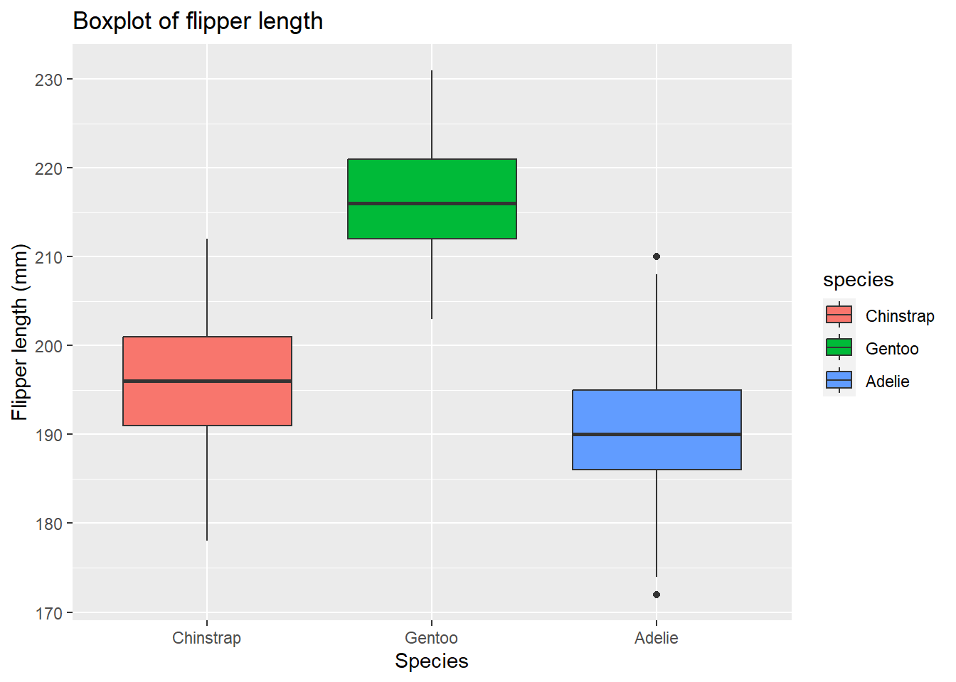
6.2 Boxplots
Let’s re-create the same boxplot using ggplot2:
# Create boxplot of flipper lengthggplot(data = penguins, aes(x = species, y = flipper_length_mm)) +# Specify data and aesthetic mappingsgeom_boxplot() # Add boxplot layer
We can also add the same customisations as before:
# Create boxplot of flipper lengthggplot(data = penguins, aes(x = species, y = flipper_length_mm)) +# Specify data and aesthetic mappingsgeom_boxplot(data = penguins, aes(fill = species)) +# Add boxplot layer and change colour by species labs(title ="Boxplot of flipper length", # Add titlex ="Species", # Add x-axis labely ="Flipper length (mm)") # Add y-axis label
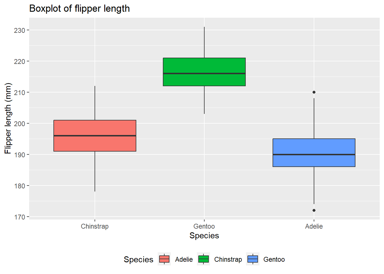
It is possible to modify the legend title and labels using the labs() function. For example, let’s say we want to change the legend title to “Species” and the legend labels to “Adelie”, “Chinstrap”, and “Gentoo”. We can also change the position:
# Create boxplot of flipper lengthggplot(data = penguins, aes(x = species, y = flipper_length_mm)) +# Specify data and aesthetic mappingsgeom_boxplot(data = penguins, aes(fill = species)) +# Add boxplot layer and change colour by species labs(title ="Boxplot of flipper length", # Add titlex ="Species", # Add x-axis labely ="Flipper length (mm)", # Add y-axis labelfill ="Species") +# Change legend titlescale_fill_discrete(labels =c("Adelie", "Chinstrap", "Gentoo")) +# Change legend labelstheme(legend.position ="bottom") # Change legend position
6.3 Barplots
Now let’s re-create the same barplot using ggplot2:
# Create barplot of speciesggplot(data = penguins, aes(x = species)) +# Specify data and aesthetic mappingsgeom_bar() # Add bar plot layer
We can see that this produces the same barplot as the base R version. We can also add the same customisations as before:
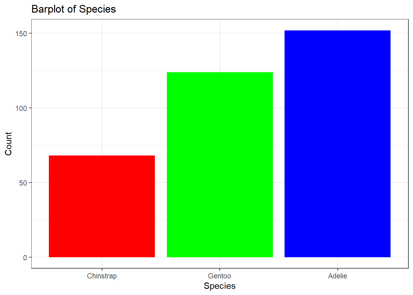
# Create barplot of speciesggplot(data = penguins, aes(x = species)) +# Specify data and aesthetic mappingsgeom_bar(fill =c("red", "green", "blue")) +# Add bar plot layer and change colourlabs(title ="Barplot of Species", # Add titlex ="Species", # Add x-axis labely ="Count") # Add y-axis label
There is a way to modify the entire theme of the plot using the theme() function. There are several pre-defined themes available in ggplot2, such as theme_bw(), theme_classic(), and theme_minimal().
# Create barplot of speciesggplot(data = penguins, aes(x = species)) +# Specify data and aesthetic mappingsgeom_bar(fill =c("red", "green", "blue")) +# Add bar plot layer and change colourlabs(title ="Barplot of Species", # Add titlex ="Species", # Add x-axis labely ="Count") +# Add y-axis labeltheme_bw() # Change theme
6.4 Scatterplots
Let’s start by re-creating a scatterplot of flipper length against body mass for the penguins data set using ggplot2:
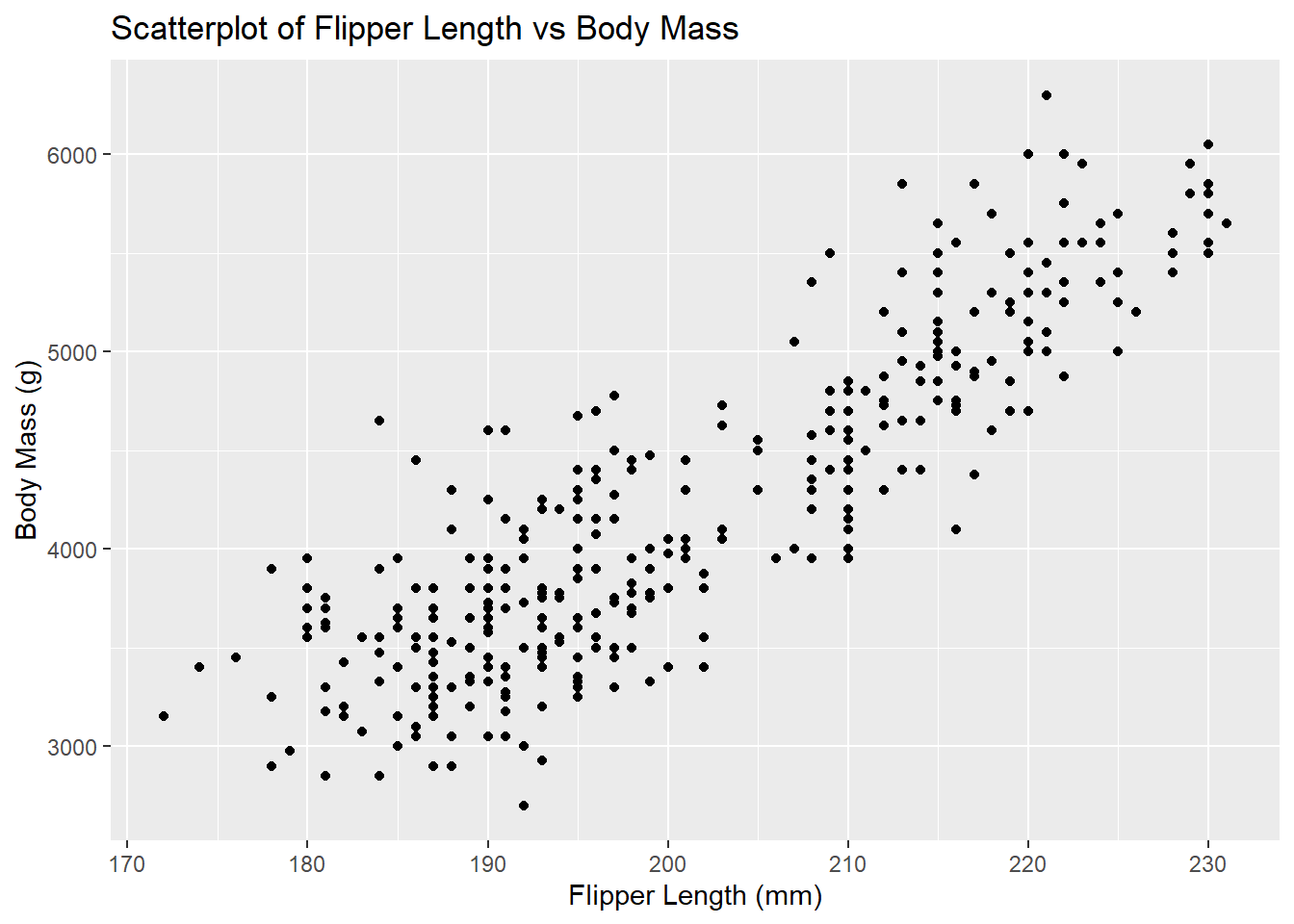
# Create scatterplot of flipper length against body massggplot(data = penguins, aes(x = flipper_length_mm, y = body_mass_g)) +# Specify data and aesthetic mappingsgeom_point() +# Add scatterplot layerlabs(title ="Scatterplot of Flipper Length vs Body Mass", # Add titlex ="Flipper Length (mm)", # Add x-axis labely ="Body Mass (g)") # Add y-axis label
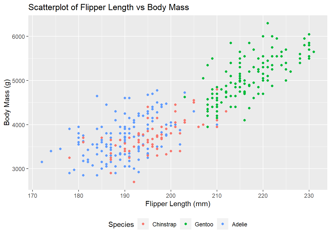
This is a nice plot, but we can add some additional context by colouring the points by species:
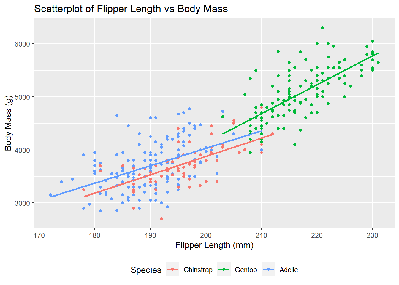
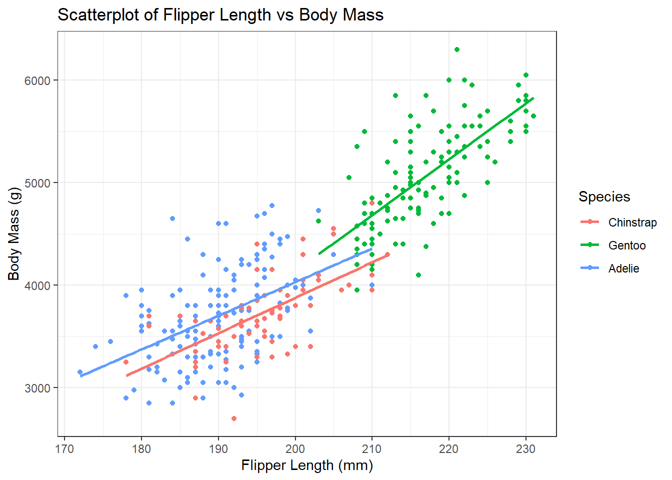
# Create scatterplot of flipper length against body massggplot(data = penguins, aes(x = flipper_length_mm, y = body_mass_g, colour = species)) +# Specify data and aesthetic mappingsgeom_point() +# Add scatterplot layerlabs(title ="Scatterplot of Flipper Length vs Body Mass", # Add titlex ="Flipper Length (mm)", # Add x-axis labely ="Body Mass (g)", # Add y-axis labelcolour ="Species") +# Add legend title theme(legend.position ="bottom") # Change legend position
Adding trendlines for each species is much easier in ggplot2 than in base R. We can do this using the geom_smooth() function:
# Create scatterplot of flipper length against body massggplot(data = penguins, aes(x = flipper_length_mm, y = body_mass_g, colour = species)) +# Specify data and aesthetic mappingsgeom_point() +# Add scatterplot layergeom_smooth(method ="lm", se =FALSE) +# Add trendline layerlabs(title ="Scatterplot of Flipper Length vs Body Mass", # Add titlex ="Flipper Length (mm)", # Add x-axis labely ="Body Mass (g)", # Add y-axis labelcolour ="Species") +# Add legend title theme(legend.position ="bottom") # Change legend position
`geom_smooth()` using formula = 'y ~ x'
6.5 Custom Themes
There is a way to modify the entire theme of the plot using the theme() function. There are several pre-defined themes available in ggplot2, such as theme_bw(), theme_classic(), and theme_minimal().
# Create scatterplot of flipper length against body massggplot(data = penguins, aes(x = flipper_length_mm, y = body_mass_g, colour = species)) +# Specify data and aesthetic mappingsgeom_point() +# Add scatterplot layergeom_smooth(method ="lm", se =FALSE) +# Add trendline layerlabs(title ="Scatterplot of Flipper Length vs Body Mass", # Add titlex ="Flipper Length (mm)", # Add x-axis labely ="Body Mass (g)", # Add y-axis labelcolour ="Species") +# Add legend title theme_bw() # Change theme
`geom_smooth()` using formula = 'y ~ x'
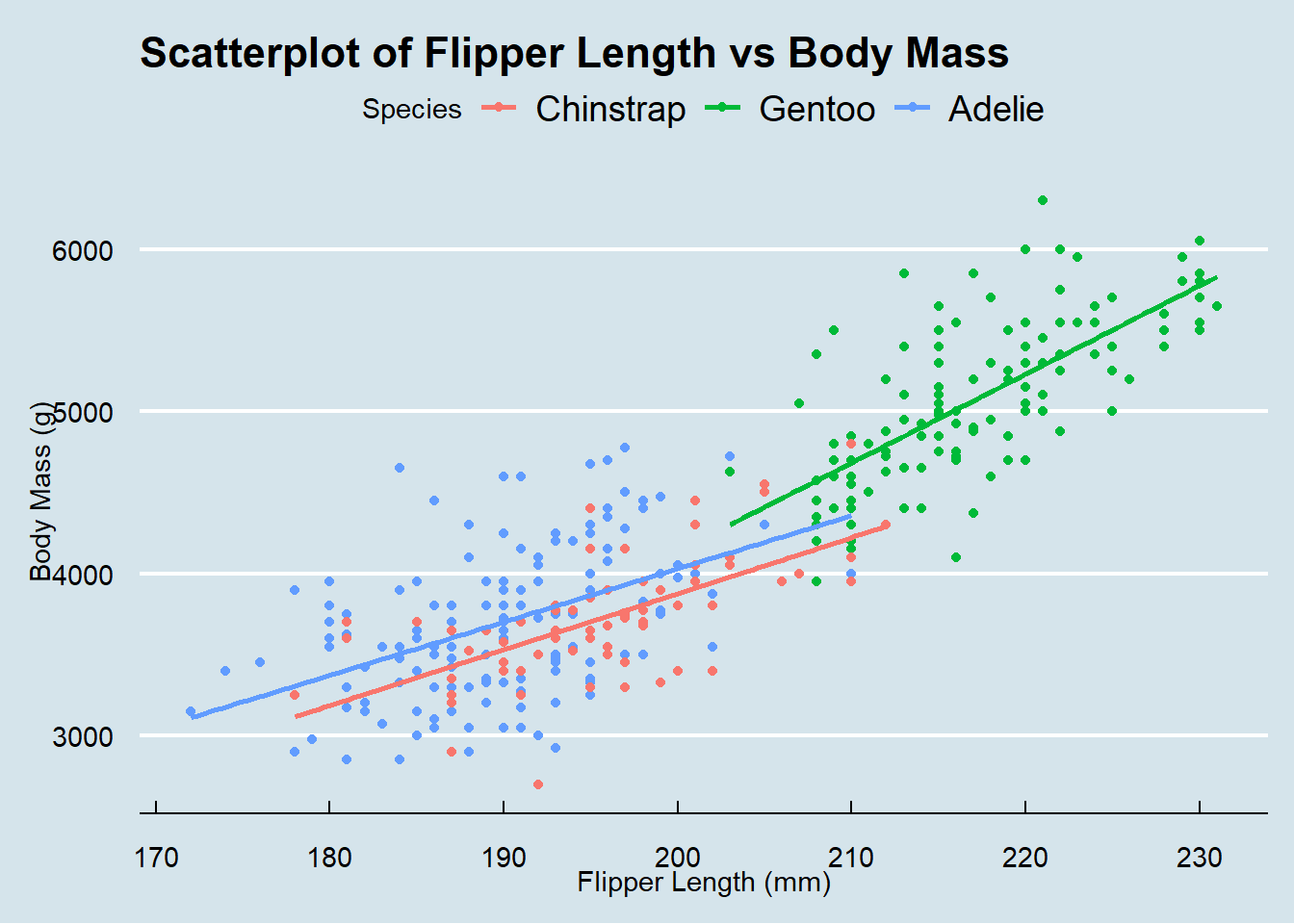
There are several packages that provide additional themes, some even with different default color palettes. As an example, Jeffrey Arnold has put together the library ggthemes with several custom themes imitating popular designs. For a list you can visit the ggthemes package site. Without any coding you can just adapt several styles, some of them well known for their style and aesthetics. For example, the theme_economist() function imitates the style of the Economist magazine:
# Load ggthemes packagelibrary(ggthemes)# Create scatterplot of flipper length against body massggplot(data = penguins, aes(x = flipper_length_mm, y = body_mass_g, colour = species)) +# Specify data and aesthetic mappingsgeom_point() +# Add scatterplot layergeom_smooth(method ="lm", se =FALSE) +# Add trendline layerlabs(title ="Scatterplot of Flipper Length vs Body Mass", # Add titlex ="Flipper Length (mm)", # Add x-axis labely ="Body Mass (g)", # Add y-axis labelcolour ="Species") +# Add legend title theme_economist() # Change theme
`geom_smooth()` using formula = 'y ~ x'
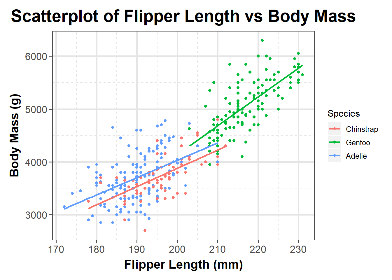
If you want to change the theme for an entire session you can use theme_set as in theme_set(theme_bw()). The default is called theme_gray (or theme_grey). If you wanted to create your own custom theme, you could extract the code directly from the grey theme and modify. Note that the rel() function change the sizes relative to the base_size.
Have a look on the modified aesthetics with its new look of panel and gridlines as well as axes ticks, texts and titles:
# Create scatterplot of flipper length against body massggplot(data = penguins, aes(x = flipper_length_mm, y = body_mass_g, colour = species)) +# Specify data and aesthetic mappingsgeom_point() +# Add scatterplot layergeom_smooth(method ="lm", se =FALSE) +# Add trendline layerlabs(title ="Scatterplot of Flipper Length vs Body Mass", # Add titlex ="Flipper Length (mm)", # Add x-axis labely ="Body Mass (g)", # Add y-axis labelcolour ="Species") +# Add legend title theme_custom() # Change theme
`geom_smooth()` using formula = 'y ~ x'
7 Customising lattice Plots
7.1 Histograms
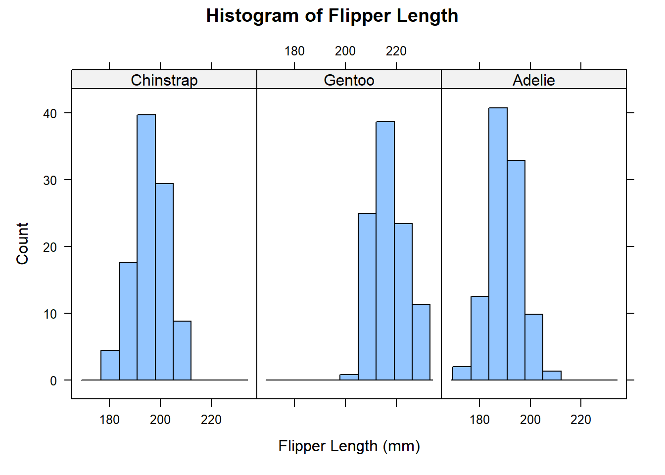
Let’s start by re-creating the histogram of flipper length for the penguins data set using lattice:
# Create histogram of flipper lengthhistogram(~ flipper_length_mm, data = penguins, # Specify formula and datamain ="Histogram of Flipper Length", # Add titlexlab ="Flipper Length (mm)", # Add x-axis labelylab ="Count") # Add y-axis label
We can add some additional context by faceting the histogram by species:
# Create histogram of flipper lengthhistogram(~ flipper_length_mm | species, data = penguins, # Specify formula and datamain ="Histogram of Flipper Length", # Add titlexlab ="Flipper Length (mm)", # Add x-axis labelylab ="Count") # Add y-axis label
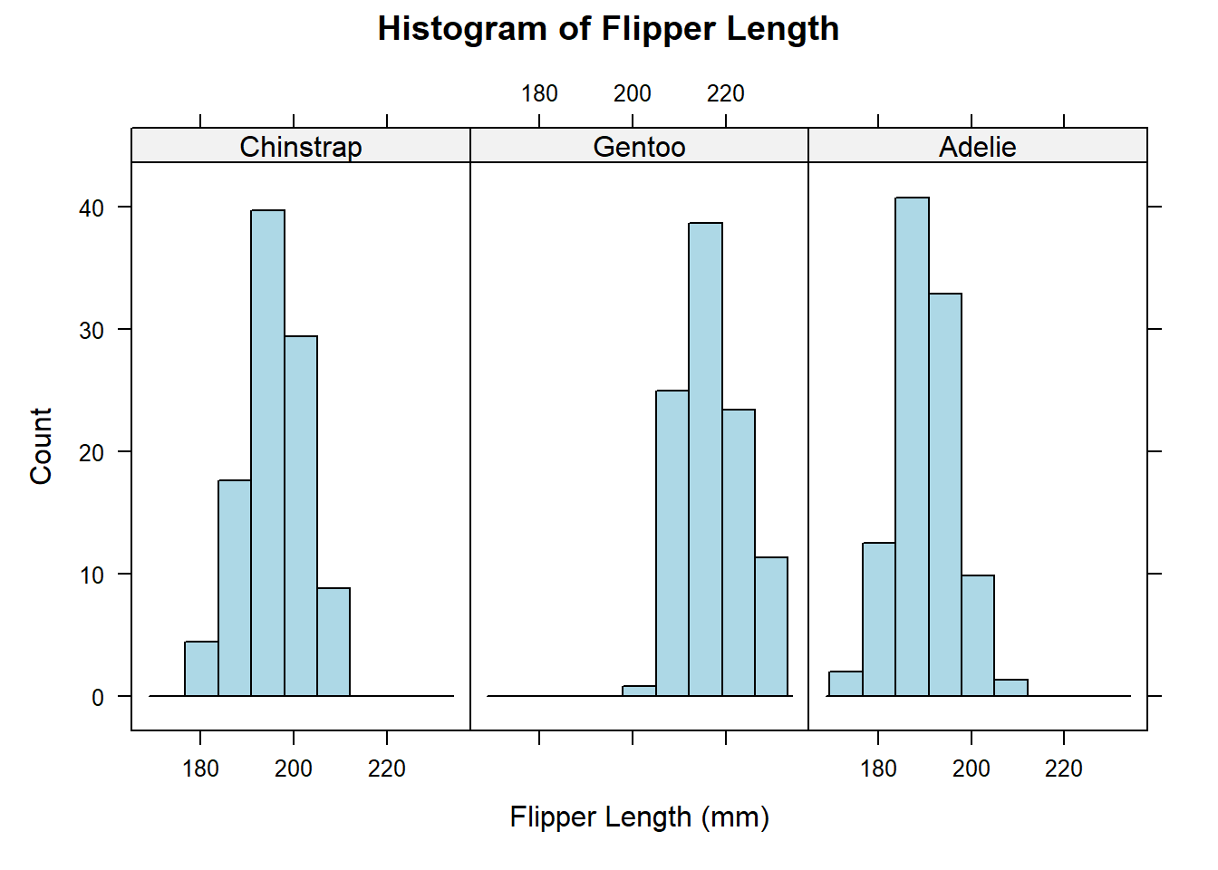
We can also change the histogram colour:
# Create histogram of flipper lengthhistogram(~ flipper_length_mm | species, data = penguins, # Specify formula and datamain ="Histogram of Flipper Length", # Add titlexlab ="Flipper Length (mm)", # Add x-axis labelylab ="Count", # Add y-axis labelcol ="lightblue") # Change colour
7.2 Boxplots
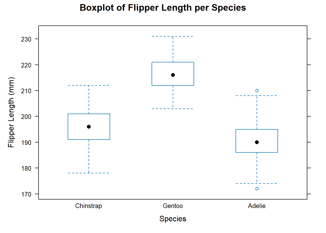
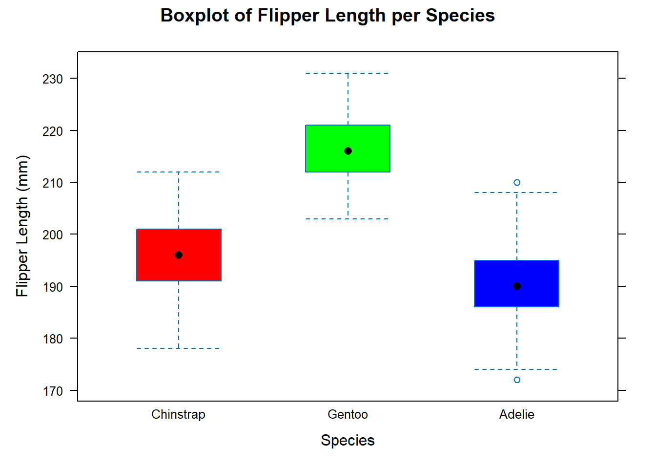
Let’s start by re-creating a boxplot of flipper length per species for the penguins data set using lattice:
# Create boxplot of flipper length per speciesbwplot(flipper_length_mm ~ species, data = penguins, # Specify formula and datamain ="Boxplot of Flipper Length per Species", # Add titlexlab ="Species", # Add x-axis labelylab ="Flipper Length (mm)") # Add y-axis label
We can also add the same customisations as before:
# Create boxplot of flipper length per speciesbwplot(flipper_length_mm ~ species, data = penguins, # Specify formula and datamain ="Boxplot of Flipper Length per Species", # Add titlexlab ="Species", # Add x-axis labelylab ="Flipper Length (mm)", # Add y-axis labelfill =c("red", "green", "blue")) # Change colour
7.3 Scatterplots
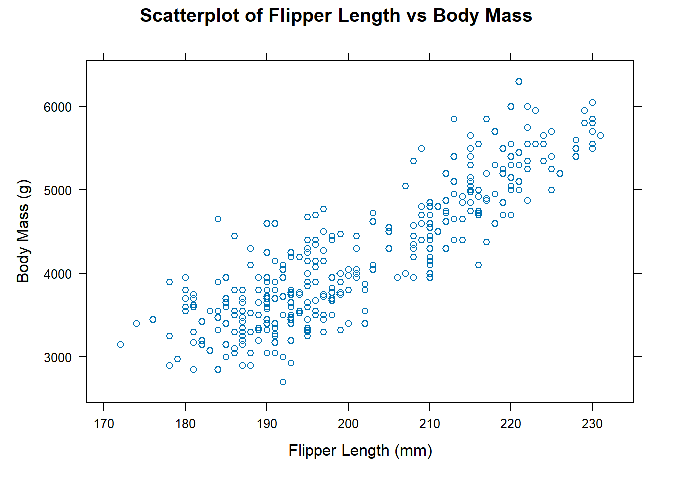
Let’s start by re-creating a scatterplot of flipper length against species for the penguins data set using lattice:
# Create scatterplot of flipper length against body massxyplot(body_mass_g ~ flipper_length_mm, data = penguins, # Specify formula and datamain ="Scatterplot of Flipper Length vs Body Mass", # Add titlexlab ="Flipper Length (mm)", # Add x-axis labelylab ="Body Mass (g)") # Add y-axis label
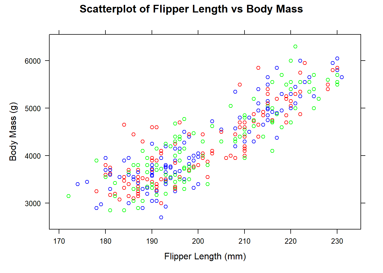
We can also add the same customisations as before:
# Create scatterplot of flipper length against body massxyplot(body_mass_g ~ flipper_length_mm, data = penguins, # Specify formula and datamain ="Scatterplot of Flipper Length vs Body Mass", # Add titlexlab ="Flipper Length (mm)", # Add x-axis labelylab ="Body Mass (g)", # Add y-axis labelcol =c("red", "green", "blue")) # Change colour
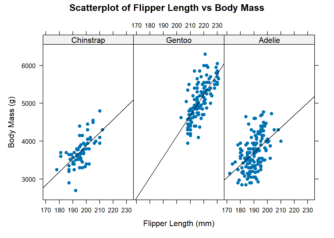
We should really add a legend to facilitate reader understanding as well as some regression lines for each species. Let’s also fill the circles:
# Create scatterplot of flipper length against body massxyplot(body_mass_g ~ flipper_length_mm | species, data = penguins, # Specify formula and datamain ="Scatterplot of Flipper Length vs Body Mass", # Add titlexlab ="Flipper Length (mm)", # Add x-axis labelylab ="Body Mass (g)", # Add y-axis labelpch =19, # Fill circlespanel =function(x, y, ...) { # Add regression linespanel.xyplot(x, y, ...)panel.lmline(x, y, col ="black") })
8 Saving Plots
8.1 Saving Plots in RStudio
You can save plots in RStudio by clicking on the Export button in the Plots pane. This will open a pop-up window where you can select the file type and location to save the plot.
8.2 Saving Plots in R
You can also save plots in R using the ggsave() function. This function takes the following arguments:
filename: The name of the file to save the plot to.
plot: The plot to save.
device: The graphics device to use. The default is png.
width: The width of the plot in inches.
height: The height of the plot in inches.
units: The units to use for the width and height. The default is in.
dpi: The resolution of the plot in dots per inch. The default is 300.
Let’s save the scatterplot we created earlier as a png file. This will be saved to your working directory!
# Create scatterplot of flipper length against body massggplot(data = penguins, aes(x = flipper_length_mm, y = body_mass_g, colour = species)) +# Specify data and aesthetic mappingsgeom_point() +# Add scatterplot layergeom_smooth(method ="lm", se =FALSE) +# Add trendline layerlabs(title ="Scatterplot of Flipper Length vs Body Mass", # Add titlex ="Flipper Length (mm)", # Add x-axis labely ="Body Mass (g)", # Add y-axis labelcolour ="Species") +# Add legend title theme(legend.position ="bottom") # Change legend position# Save plot as png fileggsave(filename ="scatterplot.png", plot =last_plot())
9 Activities
Let’s use the diamond data from ggplot2 to practice creating different types of plots. The diamond data set contains information about 53,940 diamonds including their cut, colour, clarity, carat, and price.
9.1 Load the data
Start by loading it ggplot2 into your workspace. Then, load the data into your workspace using the data() function.
💡 Click here to view a solution
# Load the ggplot2 packagelibrary(ggplot2)# Load the datadata(diamonds)
9.2 Create a Histogram
Create a histogram of the price variable using either Base R or ggplot2. Use a bindwith of 1000 and colour the bars by cut if using ggplot2 (this won’t easily work for `Base R). Add a title and axis labels.
# Create histogram using ggplot2ggplot(data = diamonds, aes(x = price, fill = cut)) +# Specify data and aesthetic mappingsgeom_histogram(binwidth =1000) +# Add histogram layerlabs(title ="Histogram of Price", # Add titlex ="Price", # Add x-axis labely ="Count", # Add y-axis labelfill ="Cut") +# Add legend titletheme(legend.position ="bottom") # Change legend position
9.3 Create a Boxplot
Create a boxplot of the price variable by cut using either ggplot2 or lattice. Add a title and axis labels.
💡 Click here to view a ggplot2 solution
# Create boxplot using ggplot2ggplot(data = diamonds, aes(x = cut, y = price)) +# Specify data and aesthetic mappingsgeom_boxplot() +# Add boxplot layerlabs(title ="Boxplot of Price by Cut", # Add titlex ="Cut", # Add x-axis labely ="Price") +# Add y-axis labeltheme(legend.position ="bottom") # Change legend position
💡 Click here to view a lattice solution
# Create boxplot using latticebwplot(price ~ cut, data = diamonds, # Specify data and variablesmain ="Boxplot of Price by Cut", # Add titlexlab ="Cut", ylab ="Price") # Add axis labels
9.4 Create a scatterplot
Create a scatterplot of price vs. carat using either Base R or ggplot2. Add a title and axis labels. Colour the points by cut. Describe the relationship between price and carat.
💡 Click here to view a Base R solution
# Define a colour for each cutcut_colours <-setNames(rainbow(length(levels(diamonds$cut))), levels(diamonds$cut))# Create scatterplot using base Rplot(diamonds$carat, diamonds$price, # Specify datamain ="Price vs. Carat", # Add titlexlab ="Carat", ylab ="Price", # Add axis labelscol = cut_colours[diamonds$cut], # Add colourspch =16) # Add solid points
There are too many points on this plot. Let’s try to reduce the number of points by sampling 1000 points from each cut.
# Sample 1000 points from each cutdiamonds_sample <- diamonds %>%# Specify datagroup_by(cut) %>%# Group by cutsample_n(1000) # Sample 1000 points from each cut# Create scatterplot using base Rplot(diamonds_sample$carat, diamonds_sample$price, # Specify datamain ="Price vs. Carat", # Add titlexlab ="Carat", ylab ="Price", # Add axis labelscol = cut_colours[diamonds_sample$cut], # Add colourspch =16) # Add solid points
The relationship between price and carat is positive and linear. As carat increases, price increases.
💡 Click here to view a ggplot2 solution
# Create scatterplot using ggplot2ggplot(data = diamonds, aes(x = carat, y = price, colour = cut)) +# Specify data and aesthetic mappingsgeom_point() +# Add scatterplot layerlabs(title ="Price vs. Carat", # Add titlex ="Carat", y ="Price", # Add axis labelscolour ="Cut") +# Add legend titletheme(legend.position ="bottom") # Change legend position
There are too many points on this plot. Let’s try to reduce the number of points by sampling 1000 points from each cut.
# Sample 1000 points from each cutdiamonds_sample <- diamonds %>%# Specify datagroup_by(cut) %>%# Group by cutsample_n(1000) # Sample 1000 points from each cut# Create scatterplot using ggplot2ggplot(data = diamonds_sample, aes(x = carat, y = price, colour = cut)) +# Specify data and aesthetic mappingsgeom_point() +# Add scatterplot layerlabs(title ="Price vs. Carat", # Add titlex ="Carat", y ="Price", # Add axis labelscolour ="Cut") +# Add legend titletheme(legend.position ="bottom") # Change legend position
9.5 Create a theme
Modify the theme_grey() theme to change the text colour to red. You can also change the gridlines to black. Now apply this theme to the ggplot2 scatterplot you created in the previous exercise.
💡 Click here to view a solution
# Create a thememy_theme <-theme_grey() +# Start with theme_grey()theme(text =element_text(colour ="red"), # Change text colour to redpanel.grid.major =element_line(colour ="black")) # Change gridlines to black# Create scatterplot using ggplot2ggplot(data = diamonds_sample, aes(x = carat, y = price, colour = cut)) +# Specify data and aesthetic mappingsgeom_point() +# Add scatterplot layerlabs(title ="Price vs. Carat", # Add titlex ="Carat", y ="Price", # Add axis labelscolour ="Cut") +# Add legend title my_theme # Apply theme
It’s not the most aesthetically pleasing plot, but it’s a start! Make some more changes to the theme to make it look better.
9.6 Which framework is easier to customise?
Which framework do you prefer for creating plots? Why? Write a short paragraph describing your thoughts.
9.7 Make your own plot
Create a plot of your choice using either Base R, ggplot2 or lattice and the diamond data. Be creative!
10 Recap
Data visualisations can be customised to make them more informative and aesthetically pleasing;
There are three main frameworks for creating data visualisations in R: Base R, ggplot2 and lattice;
Base R plots are built up using a series of functions;
Base R plots can be customised using arguments;
ggplot2 is a popular framework for creating data visualisations;
ggplot2 plots are built up in layers;
ggplot2 plots can be customised using themes;
lattice plots are built up using a series of functions;