Create a good header section and table of contents
Save the script file with an informative name
set your working directory
Aim to make the script a future reference for doing things in R!
3 Introduction
ggplot2 is the most widely used package for data visualisation in R. Its consistent syntax, useful defaults, and flexibility make it a fantastic tool for creating high-quality figures. Although ggplot2 is great, there are other data visualisation tools that deserve a place in a data scientist’s toolbox. We’ll begin our foray into the interactive world with plotly, which is a high-level interface to plotly.js and provides an easy-to-use user interface to generate slick interactive graphics. These interactive graphs give the user the ability to zoom the plot in and out, hover over a point to get additional information, filter to groups of points, and much more. Such interactivity contribute to an engaging user experience and allows information to be displayed in ways that are not possible with static figures.
3.1 htmlwidgets
The .js in plotly.js is short for JavaScript. JavaScript is a programming language that runs a majority of the internet’s interactive webpages. To make a webpage interactive, JavaScript code is embedded into HTML which is run by the user’s web browser. As the user interacts with the page, the JavaScript renders new HTML, providing the interactive experience that we are looking for. htmlwidgets is the framework that allows for the creation of R bindings to JavaScript libraries. These JavaScript visualizations can be embedded into R Markdown documents (html) or shiny apps.
4 Packages and Data
We’re going to look at a dataset about TV shows that was collected from IMDb (The Internet Movie Database). You will need to download this dataset from here and save it with your other lab datasets. It’s a relatively basic dataset. It contains 48 observations of 6 variables. The variables are:
title - the title of the TV show;
seasonNumber - the number of seasons the show has had;
av_rating - the average rating of the show;
share - percentage share of all TV sets in use that were tuned to the show;
genres - the genre(s) of the show;
statuts - whether the show is considered to be a riser (better) or faller (worse).
As we can see, the tv_shows data frame contains basic information such as the show title, season number and genre as well as the average rating, audience share and status. We’ll use this data to create some interactive plots.
5 plotly
There are two main approaches to initialize a plotly object: transforming a ggplot2 object with ggplotly() or setting up aesthetics mappings with plot_ly() directly.
5.1 ggplotly()
ggplotly() takes existing ggplot2 objects and converts them into interactive plotly graphics. This makes it easy to create interactive figures while using the ggplot2 syntax that we’re already used to. Additionally, ggplotly() allows us to use ggplot2 functionality that would not be as easily replicated with plotly and tap into the wide range of ggplot2 extension packages. Let’s start by making a static graph:
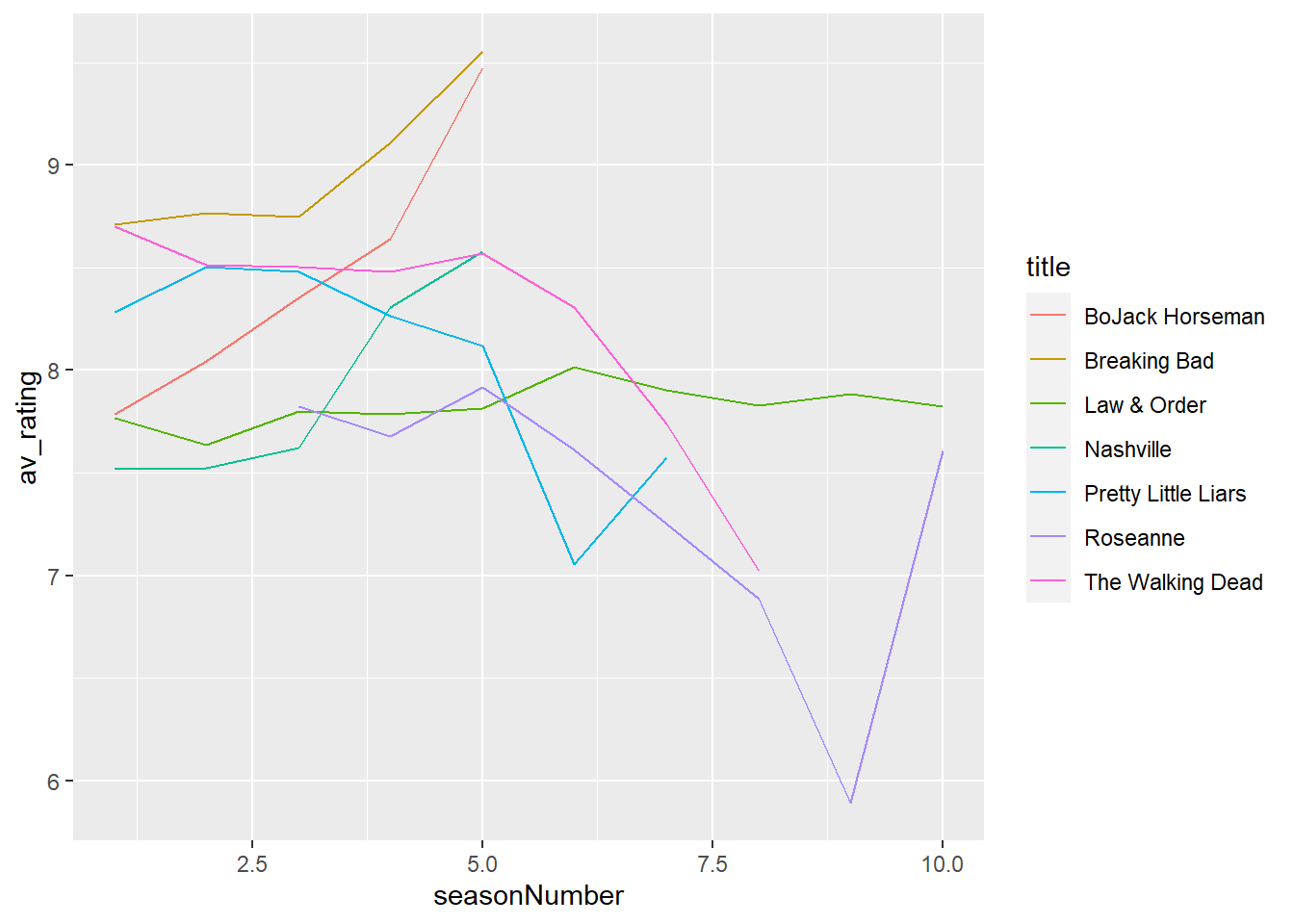
# create a static ggplot2 plotmy_plot <-# assign your ggplot2 object to a nameggplot(tv_shows) +# call ggplot() on the tv_shows data frameaes(x = seasonNumber, # set the x aesthetic to seasonNumbery = av_rating, # set the y aesthetic to av_ratinggroup = title, # set the group aesthetic to titlecolour = title) +# set the colour aesthetic to titlegeom_line() # add a line layer# view the plotmy_plot
Okay, this graph before ain’t very pretty. Let’s make it look a little nicer:
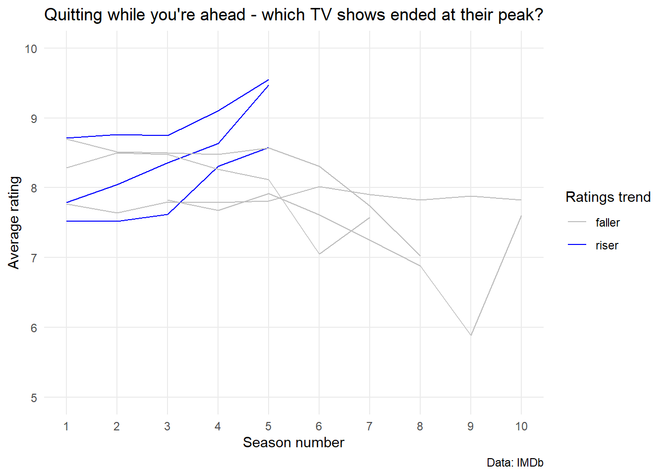
# create a nicer looking plotmy_improved_plot <-# assign your ggplot2 object to a nameggplot(tv_shows) +# call ggplot() on the tv_shows data frameaes(x = seasonNumber, # set the x aesthetic to seasonNumbery = av_rating, # set the y aesthetic to av_ratinggroup = title, # set the group aesthetic to titlecolour = status) +# set the colour aesthetic to statusgeom_line() +# add a line layertheme_minimal() +# set the theme to minimallabs(title ="Quitting while you're ahead - which TV shows ended at their peak?", # set the titlex ="Season number", # set the x axis labely ="Average rating", # set the y axis labelcaption ="Data: IMDb", # set the captioncolour ="Ratings trend") +# set the colour legend titlescale_x_continuous(breaks =c(1:10)) +# set the x axis breaksexpand_limits(y =c(5,10)) +# set the y axis limitstheme(panel.grid.minor =element_blank()) +# remove minor grid linesscale_colour_manual(values =c ("riser"="blue", "faller"="grey")) # set the colour scale# view the plotmy_improved_plot
After assigning your ggplot2 object to a name, the only step to plotly-ize it is calling ggplotly() on that object. The difference between the two is that the plotly figure is interactive. Try it out for yourself! Some of the interactive features to try out include hovering over a point to see the exact x and y values, zooming in by selecting (click+drag) a region, and subsetting to specific groups by clicking their names in the legend.
# Convert to plotlyggplotly(my_improved_plot)
The difference between the two is that the plotly figure is interactive. Try it out for yourself! Some of the interactive features to try out include hovering over a point to see the exact x and y values, zooming in by selecting (click+drag) a region, and subsetting to specific groups by clicking their names in the legend.
5.2 plot_ly()
plot_ly() is the base plotly command to initialize a plot from a data frame, similar to ggplot() from ggplot2. Let’s dig in to see how this works:
# create a plotly plottv_shows %>%# call the tv_shows data frameplot_ly(x =~ seasonNumber, # set the x aesthetic to seasonNumbery =~ av_rating, # set the y aesthetic to av_ratingcolor =~ status) # set the colour aesthetic to status
Although we did not specify the plot type, it defaulted to a scatter plot. This is no good to us as we want a line graph, so we need to use the add_lines() function:
# add a line layerplot_ly(tv_shows) %>%# call the tv_shows data frameadd_lines( # add a line layerx =~ seasonNumber, # set the x aesthetic to seasonNumbery =~ av_rating, # set the y aesthetic to av_ratingcolor =~ status) # set the colour aesthetic to status
Woah, that doesn’t look right! We need to group our data by TV show to prevent all the dots joining:
# replot with groupingplot_ly(tv_shows) %>%# call the tv_shows data framegroup_by(title) %>%# group_by() function from dplyradd_lines( # add a line layerx =~ seasonNumber, # set the x aesthetic to seasonNumbery =~ av_rating, # set the y aesthetic to av_ratingcolor =~ status) # set the colour aesthetic to status
Much better! We still need to improve the graph though. Let’s add the TV show title to points when we hover over them:
# add hover textplot_ly(tv_shows) %>%# call the tv_shows data framegroup_by(title) %>%# group_by() function from dplyradd_lines( # add a line layerx =~ seasonNumber, # set the x aesthetic to seasonNumbery =~ av_rating, # set the y aesthetic to av_ratingcolor =~ status, # set the colour aesthetic to statustext =~ title, # What to texthoverinfo ='text') # Tells plotly what information will be shown
We can also tidy up our axis titles and main title:
# tidy up the plotplot_ly(tv_shows) %>%# call the tv_shows data framegroup_by(title) %>%# group_by() function from dplyradd_lines( # add a line layerx =~ seasonNumber, # set the x aesthetic to seasonNumbery =~ av_rating, # set the y aesthetic to av_ratingcolor =~ status, # set the colour aesthetic to statustext =~ title, # What to texthoverinfo ='text'# Tells plotly what information will be shown ) %>%layout(title ="Quitting while you're ahead - which TV shows ended at their peak?", # set the titlexaxis =list(title ="Season number"), # set the x axis labelyaxis =list(title ="Average rating")) # set the y axis label
I personally prefer to create my graphs using ggplot2 then convert them using ggplotly(). If you want to learn more about using plot_ly() I recommend you take a look at Sievert (2019), which is a free online book dedicated to interactive visualisations using plotly in R. I hope you will agree that there is not much of a learning curve for plotly due to the intuitive syntax.
6 Activities
6.1 Interactive Plot
Take one of your existing ggplots and turn it into an interactive visualisation using ggplotly().
6.2 Plotly
Try to replicate your ggplot from exercise one using plot_ly().
6.3 Penguins
Use the penguins dataset from the palmerpenguins package to create an interactive plotly graph. You can use the ggplotly() function to convert your ggplot to plotly. I would suggest that you make a scatterplot of bill length vs bill depth and colour the points by species. You can also add a trendline using geom_smooth().
💡 Click here to view a solution
# Load packageslibrary(palmerpenguins)library(ggplot2)library(plotly)# Import datapenguins <- penguins# Create ggplotpenguins_plot <-# Create a ggplotggplot(penguins) +# Call the penguins data frameaes(x = bill_length_mm, # Set the x aesthetic to bill_length_mmy = bill_depth_mm, # Set the y aesthetic to bill_depth_mmcolour = species) +# Set the colour aesthetic to speciesgeom_point() +# Add a point layergeom_smooth(method ="lm", se =FALSE) +# Add a trendlinelabs(title ="Bill length vs bill depth", # Set the titlex ="Bill length (mm)", # Set the x axis labely ="Bill depth (mm)", # Set the y axis labelcolour ="Species") +# Set the colour legend titletheme_minimal() # Set the theme# Convert to plotlyggplotly(penguins_plot)
7 Recap
ggplot2 is a package for creating static graphs;
plotly is a package for creating interactive graphs;
ggplotly() is a function that converts ggplot2 graphs to plotly graphs;
plot_ly() is the base function for creating plotly graphs.